French dairy brand redesigned for global audiences

Isigny Sainte-Mère, an iconic dairy company based in Normandy, northern France, has launched its latest redesign which aims to heighten overseas brand awareness. The farmer-run cooperative worked with bluemarlin, an international strategic brand design agency, to update its story, packaging identity and communication strategy.
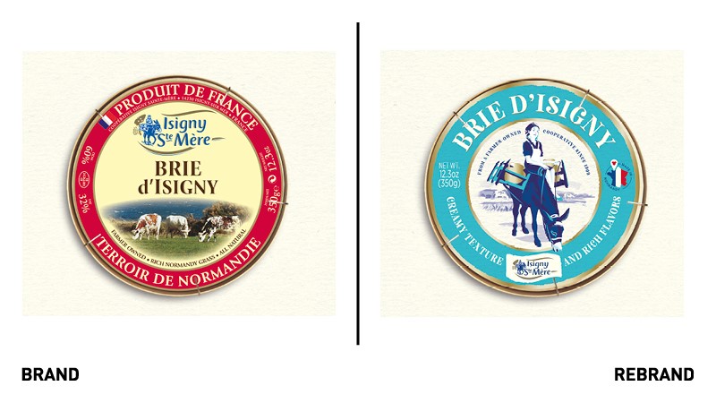
In addition to demonstrating the brand’s now global outlook, bluemarlin also had to reflect Isigny Sainte-Mère’s long and proud history as the ‘grand cru’ of the dairy world.
Andrew Eyles, CEO and founder at bluemarlin, says, “As love of product, legacy and location are everything to Isigny Sainte-Mère, it was so important for us to go in deep. We were able to learn about the brand’s progression, where it had triumphed – or gone a little off track.”
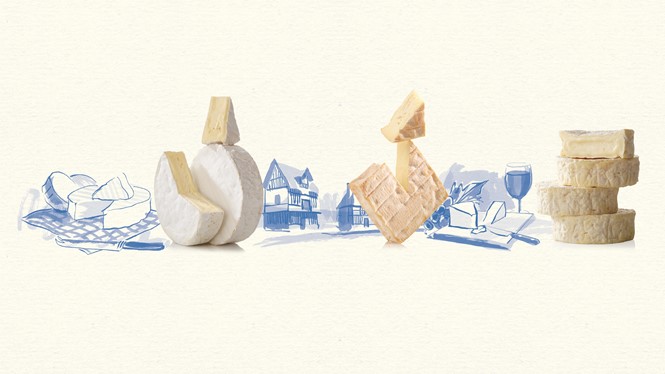
The research phase saw the agency sift through Isigny Sainte-Mère’s extensive archives, including photographs of multigenerational farmers and records of every iteration of the brand over the past century and longer. Bluemarlin decided to revive the brand’s unique qualities after realising some of its key assets had been ignored over time. Playing on modern consumers’ recognition of authenticity and natural produce, the brand would return to its former story of legacy and integrity.
Tom Rougereau, marketing manager at Isigny Sainte-Mère, says, “People all over the world are developing a greater appreciation for real food, from real places, made by real farmers, with real integrity. Our rebrand speaks to that evolution in consumer thinking.”

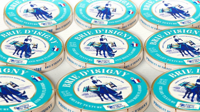
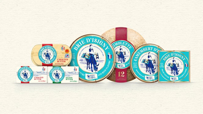
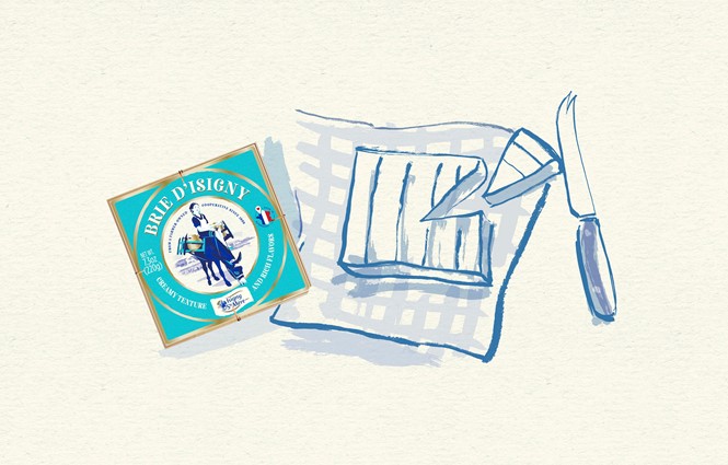
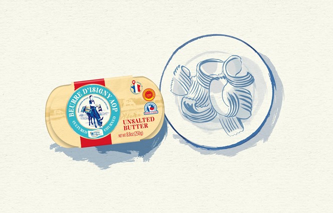
One such important brand asset, Marthe the milkmaid and her donkey, returns to the brand’s central story once again, with a refreshed and streamlined look. Other visual revisions include the introduction of a teal masterbrand colour. Aiming to encapsulate the company’s proximity to the sea, bluemarlin also hopes this will contribute to greater standout.
Finally, in an attempt to calm the packaging’s busy look, the agency removed some of the on-pack copy. What remained was paired with Neato Serif, Axis Extra Bold and Gotham Medium; a more curated font portfolio.