Danish cultural icon Tuborg receives brand refresh
British-based brand agency Robot Food’s work sought to unify and strengthen the brand world in order to find relevance for modern Danes. Driven by a brief of branding Tuborg to not just be for dads, the agency created an all-encompassing revised brand world.
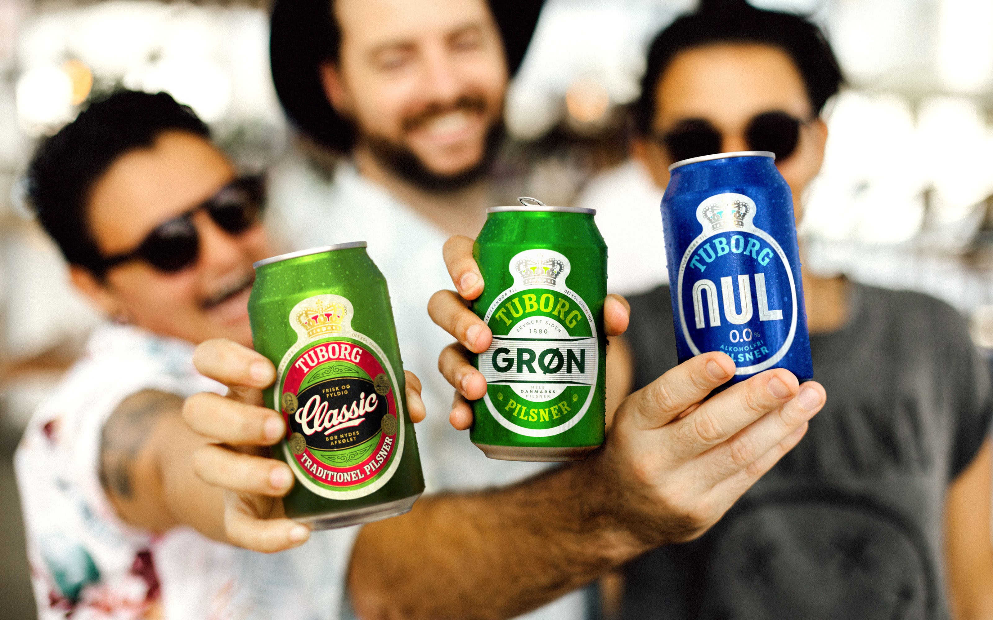
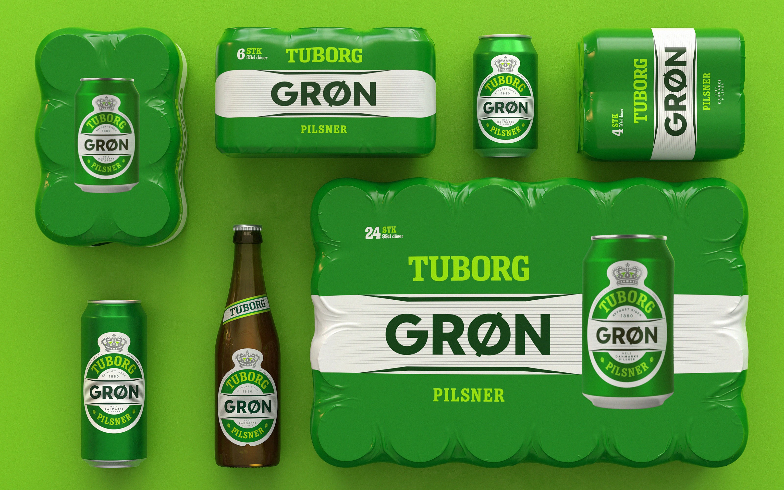
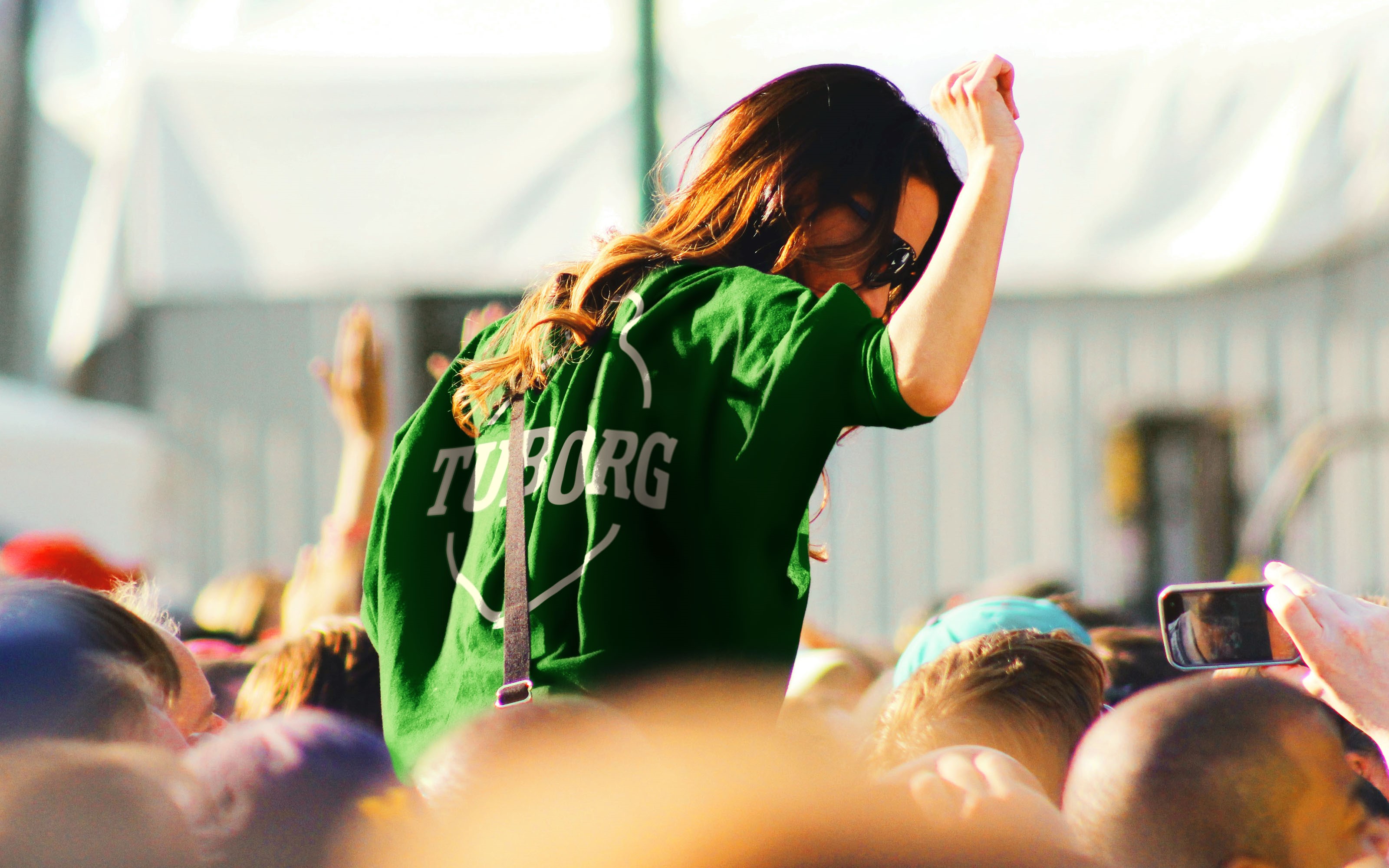
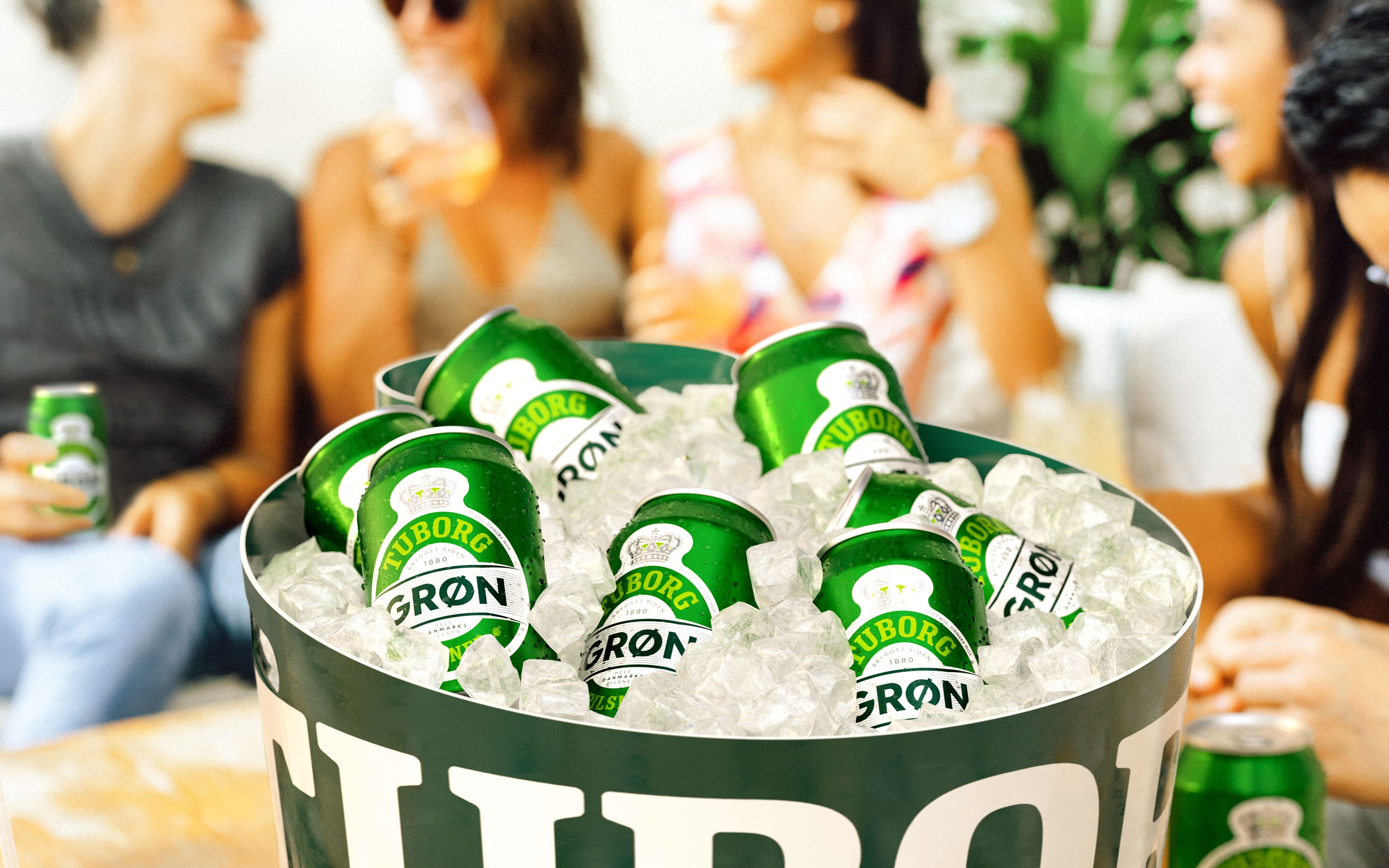
By emphasising Tuborg as a “proud parent brand” – along with harmonising the primary packaging with the well-known ‘clockman’ icon – Robot Food were able to express greater individuality for Tuborg’s extensive range of alcoholic beverages. Concerned by the possibility of losing relevance amongst a younger audience, particular attention was paid to embedding the spirit of community into Tuborg’s brand positioning.
The redrawn wordmark, designed in association with typographer Rob Clarke, makes use of the ‘clockman’ device. Classic Scandinavian design values are utilised to create a more consistent style across individual products, packs, touchpoints, sizes, and variants.
Ben Brears, Robot Food creative director, says, “There’s a sense of classicism in Denmark: if you look at the fundamentals of things like furniture design, the style and aesthetic doesn’t really change much over time. You do it once, do it well, then just polish it a little bit.”
He adds, “For some, these changes might seem minimal, but it was never about throwing the baby out with the bath water. The assets and system we’ve been able to establish helps set Tuborg up for a really progressive future.”
It's Tuborg's first holistic brand refresh for decades. The new design rollout for core brands began in Denmark in early 2022, with the rest currently being rolled out.


