Democratising design: creating for colour vision deficiency (CVD)

Matt Hansen, senior designer at global branding agency Siegel+Gale, discusses how brands can design inclusively including colour vision deficiency (CVD).
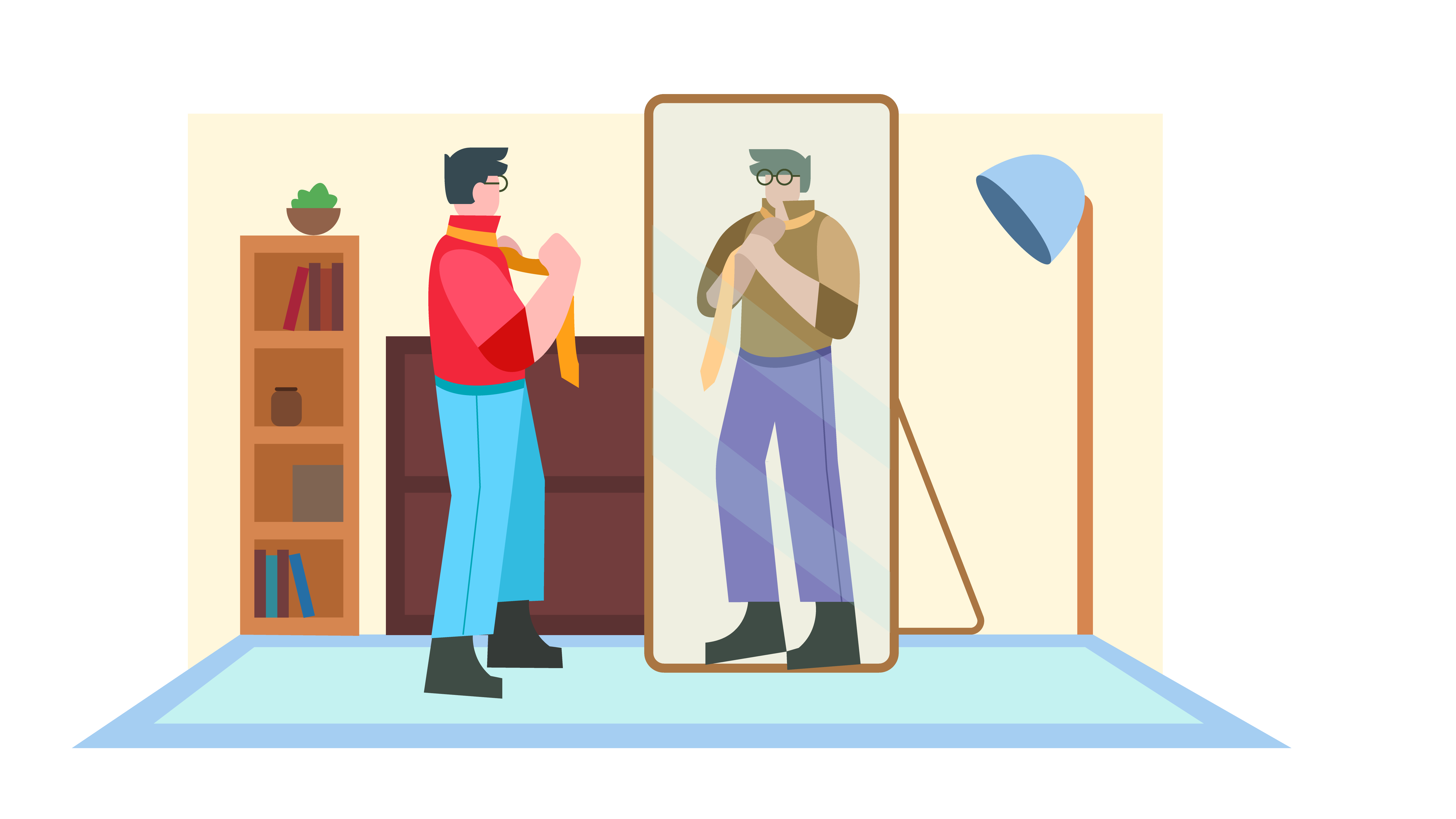
Design is a tool used to help users understand information, which means that we, as designers, should be designing for all people. Whether creating signage for stadiums or icons for websites, designers try to create tools to help users get from point A to point B. Guiding fans from an arena entrance to their seats, or a homepage to the checkout page, design is meant to support easier decision-making.
Our daily experiences and interactions are dramatically impacted by how we physically see, or don’t see, the world. Designers have a huge impact on these interactions as well. If we have blind spots when designing, we exclude large groups of people. Particularly, we can exclude an often-overlooked group of individuals that have a colour vision deficiency.
Colour vision deficiency (CVD) affects a larger group of people than one might initially think. One in every 12 men and one in every 200 women see the world with a different view. To put that in perspective, that's roughly 347 million people — more people than currently living in the United States. CVD has long lived out of the public eye, but it’s time brands and creatives become more aware of it — and better yet, start designing for it.
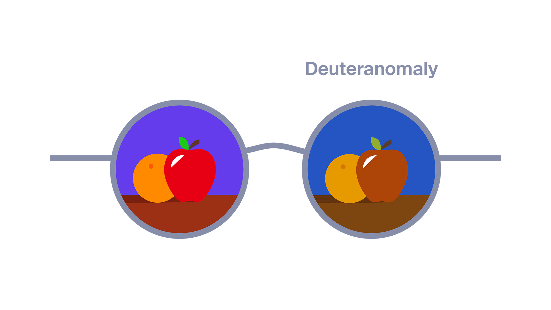
But first, let’s try to understand it better. CVD impacts the perception of various colours and colour combinations. There are many forms, with red-green CVD (deuteranopia) being the most common. This is especially relevant because of the critical role red and green play in all facets of design. Below is an illustration of how different forms of CVD affect the same image.
Now, imagine how different Squid Game might look to someone with deuteranopia.
When creating a brand, or designing a visual system, keep in mind that a brand is only as great as it is accessible. While there have been many advances in brands designing with inclusivity in mind, including standards and guidelines – as well as examples – brands have implemented to design more accessibly, there is always room for improvement. Particularly, there is a huge opportunity for brands to create more inclusive digital experiences for CVD individuals.
One simple thing to incorporate when creating a digital experience for CVD individuals is the use of multiple signifiers. Instead of just using colour to communicate, try using colour and words, or colour and patterns. Another way to design for CVD individuals is by using high contrast and being aware of the colour combinations being used. If colour plays a huge part in your design, then consider adding a CVD mode to your interface.
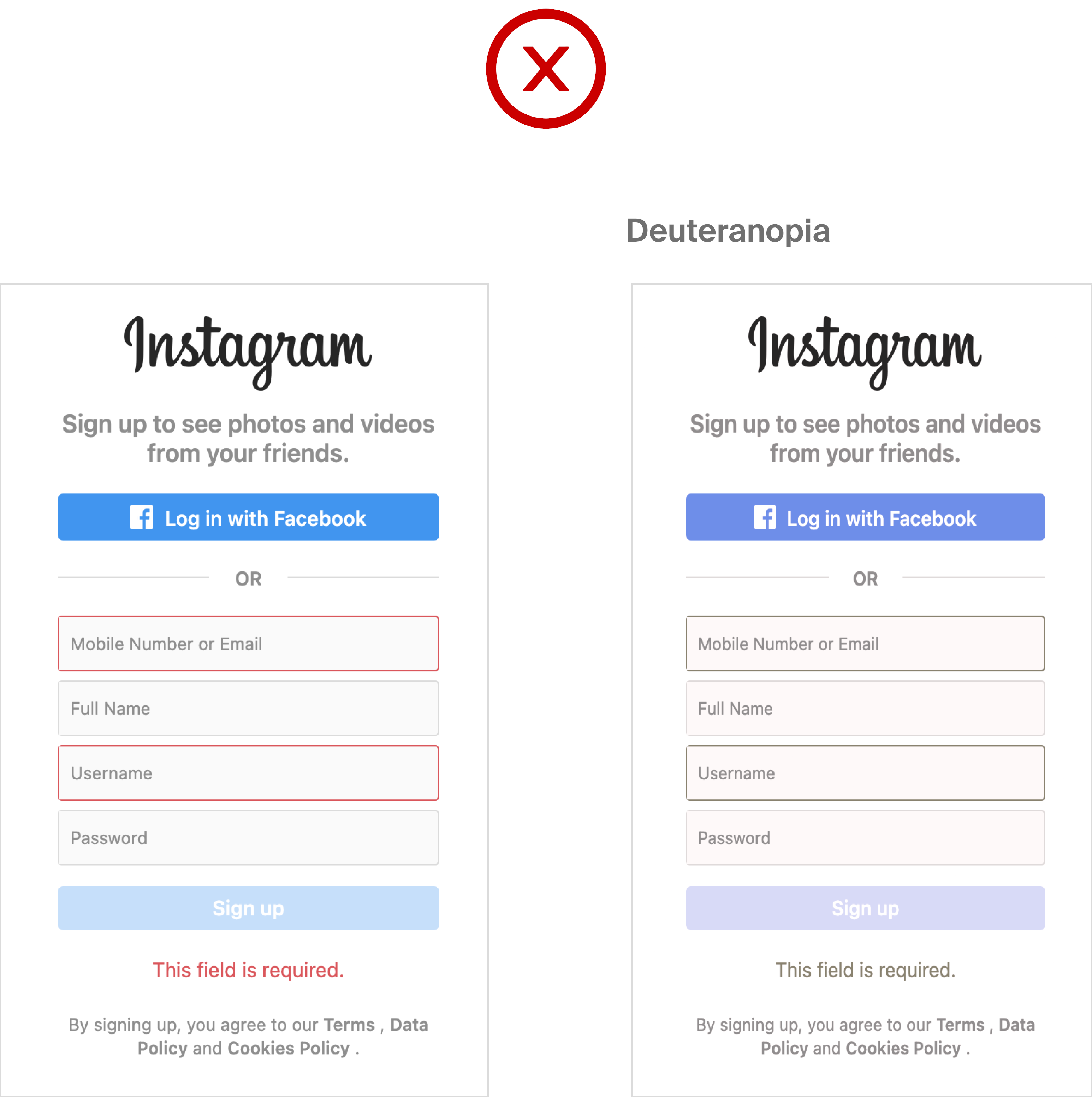
Using just colour to signal something /on the right how someone with deuteranopia sees the UI.
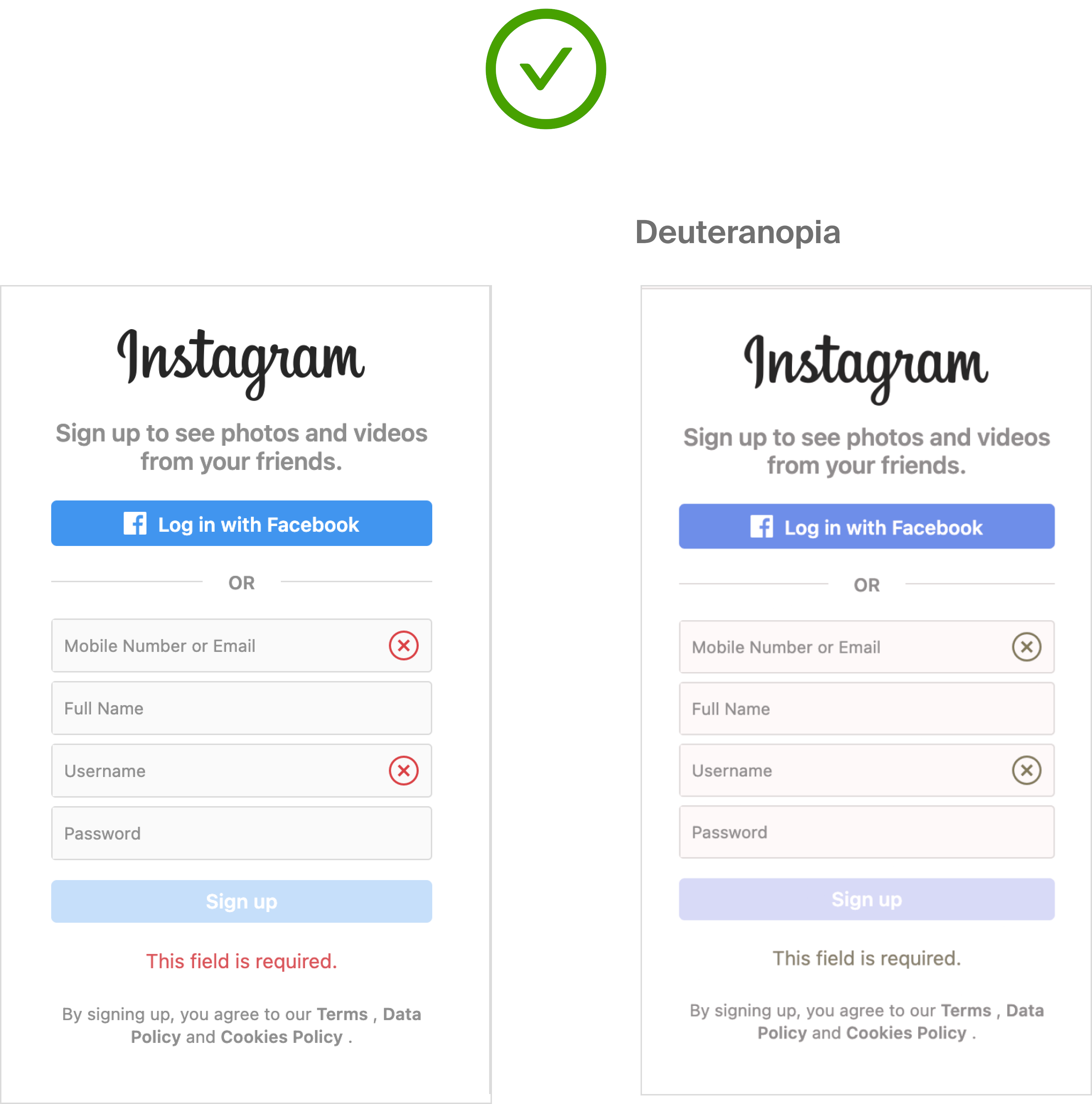
Using colour along with words and/or icons is the best practice /on the right how someone with deuteranopia sees the UI.
Wordle is an excellent example of a digital experience where colours play a huge part in the design, but still designs with inclusivity in mind. The allure of Wordle is its ease of use and minimal interface. Without sacrificing any of that, Wordle added a CVD mode to allow individuals with colour deficiency or blindness to enjoy the daily five-letter word challenge as well.
The Puzzle Bobble 3D: Vacation Odyssey’s new game is inclusively designed as well. The game has three accessibility modes to address Red/Green, Blue/Yellow, and Monochromacy CVD. Particularly, the feature for monochromacy replaces all colours with black and white or patterns. Trello is another brand designing with CVD individuals in mind by embracing the use of multiple signifiers to communicate. The collaboration tool has a CVD mode that adds patterns to help users distinguish between labels.
Considering colour choice. Incorporating contrast and multiple signifiers can create a better experience for CVD users and lend to a more inclusive brand experience. Maintaining awareness of marginalized groups and the consistent design-related barriers these groups encounter can make a brand more inclusive, while also cultivating better designs and design thinking.
Let us not only walk a mile in others’ shoes but let us also see the world through their eyes.
*Colour blindness is more accurately referred to as Colour Vision Deficiency