#TransformTuesday: 14 May
Every week, Transform examines recent rebrands and updated visual identities. This week's picks are below. For more from #TransformTuesday, follow @Transformsays
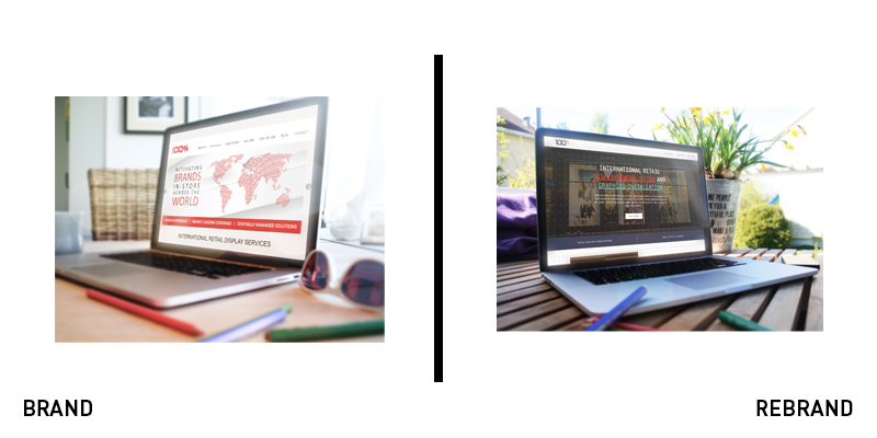
100% Group
With operations across B2B ad sales and in-store marketing campaigns, 100% Group needed a band that could flex to serve both audiences effectively. It turned to Manchester-based Upp B2B for a brand refresh. The agency had to craft a rebrand that would capture the company’s key services while also appealing to its customer base. The result is a modern, simple visual identity that uses a grid lockup system alongside bespoke patterns and interesting typography to tell the brand’s story. The old website had a distinctly vague, tech feel to it, but the new digital platform is clear and narrative-led. The new tone of voice is confident and capable, allowing 100% Group to talk about itself in a more authoritative way while making things clearer for customers, of both the B2B and B2C varieties.

Galvanize
One of Canada’s most successful SaaS firms, ACL Services was founded in Vancouver in 1987. Yesterday, it announced a rebrand to Galvanize as it integrates security and risk management software company Rsam into the business. “Our old looks and names just weren’t telling the new story as well as they could. So, it was time to shake things up and evolve our brand to better align it with our vision,” the company’s rebrand announcement says. Both featured logos typical of the software company, using obsolete acronyms as their services had expanded. The introduction of a punchy, motivating new name will help breathe life into the brands. The Galvanize logo itself – possibly by Georgia-based Focus Lab – is a step forward it uses a recognisable, ownable G icon crafted from purple diagonals alongside a simple wordmark with hints of personality. The new website is easily navigable and friendly, offering explanation and education throughout.
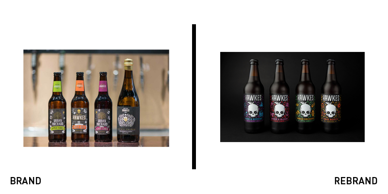
Hawkes
Hawkes has always had a distinct proposition. The skull that serves as its brand icon is nicknamed ‘Eddie.’ It has loads of personality. But, with change in the brewing industry as well as an acquisition of the brand by BrewDog, design agency Robot Food was enlisted to update the visual identity and packaging. The result unites the ‘Urban Orchard’ slogan and cider products with the core Hawkes brand and its hero product: alcoholic ginger beer. The new range has been renamed under the Hawkes banner, allowing for clearer product identification and visual cues to the brand architecture. Using an illustration style heavy on illustration, with nods to counterculture icons, the new approach helps the brand maintain consistency and standout. Chris Shuttleworth, senior designer at Robot Food, says, “We wanted to shape a brand that reflected the mission of the guys behind it. The result is iconic, recognisable and brand proud, a design that carves a new path for craft.”
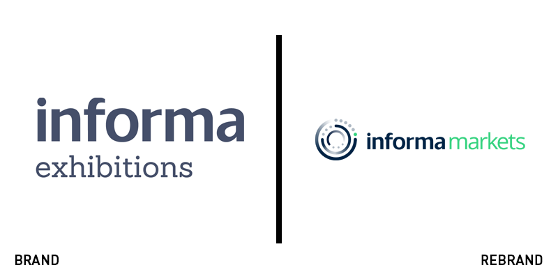
Informa Markets
Informa Exhibitions is one of the biggest global exhibition organisers. The largest division within Informa plc, the organisation recently acquired UBM, allowing it to expand its reach even further. To support the changes, it has unveiled a new brand, Informa Markets, with a new visual identity that links it more firmly to the Informa masterbrand. Using the Informa icon as a base, the new Markets logo deploys a nearly neon green to great effect. The new brand was designed for consistency, both internally and for clients around the world. Informa Markets said in a statement, “More than just a name and logo change, the new Informa Markets brand identity represents our unified, global organisation that provides platforms for specialist markets and communities to engage, experience and do business.”
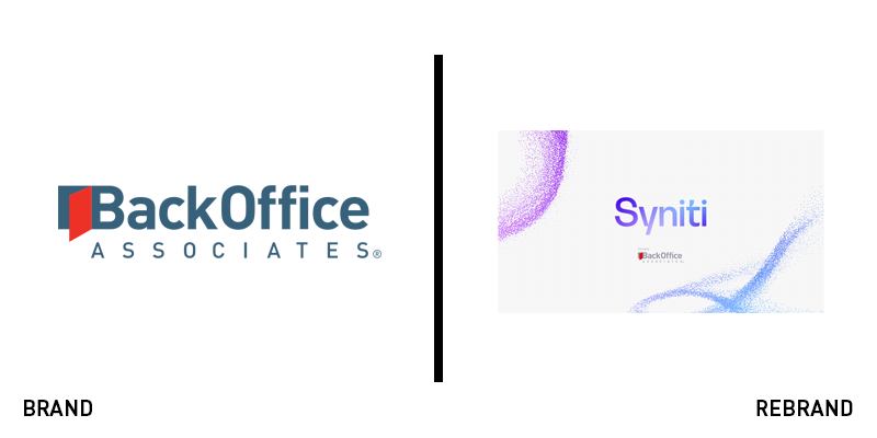
Syniti
“When we set out in the late 90s, our name reflected what we did. Since then, the role of data has evolved. What was once a back-office function is now a strategic growth driver,” says CEO of Syniti Kevin Campbell. The firm, once called BackOffice Associates has unveiled a rebrand to Syniti, to reflect the growing value of data to companies of all sizes. Syniti was acquired by private equity firm Bridge Growth Partners. The rebrand, conducted by Studio Everywhere, focused on the critical role data plays in fuelling modern business. The new branding bears little relation to the BackOffice branding, and rightly so, for a company moving in a new direction. The previous wordmark was serviceable and professional. The new approach uses a more flexible visual identity that can move and adapt depending on the brand touchpoint. The Syniti wordmark itself is a gradient of bright purples and blues, situating it nicely in a the landscape of tech brands, while still allowing for it to differentiate itself.


