#TransformTuesday: 13 February
Every week, Transform examines recent rebrands and updated visual identities. This week’s picks are below. For more from #TransformTuesday, follow @Transformsays.
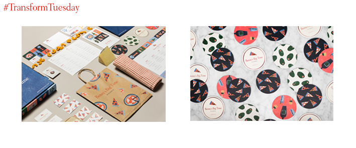
Benny’s Big Time Pizzeria
When it came time for James Beard award-winning chef Vivian Howard and her husband/business partner Benjamin Knight, stars of the PBS documentary series A Chef’s Life, to start their own pizzeria, they kept their brand personal while avoiding the visual stereotypes that come with Italian-American restaurants. Benny’s Big Time Pizzeria was born using a combination of Knight and Howard’s childhood nicknames, ‘Benny’ and ‘Big Time’ and hired the emerging New York-based agency, the Door Design House, to create their branding. Art director Sara Berks and creative director Melinda Welch focused on the high-quality, playful experience of the restaurant using a palette rooted in saturated red and deep blue hues accented with bright and warm colours. The resulting branding is eccentric and contemporary, using the Windsor typeface to create a nostalgic wordmark alongside a complimentary logomark drawing of a slice of pizza designed by Vienna-based illustrator Nanna Prieler.
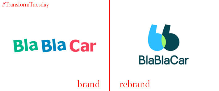
BlaBlaCar
Having grown into the world’s leading carpooling company with over 60m users, BlaBlaCar has updated its logo and visual identity. Its earlier bright and bold identity served to introduce BlaBlaCar’s alternative transportation model to a diverse community, but as the current industry leader its priority is to associate the brand with community building and connectivity across urban and rural areas. London based agency Koto opted to bring the two lowercase ‘Bs’ of BlaBlaCar together to evoke both speech marks, notably have them share a venn like intersection, and have the characters sat beside one another as two people in a car. The result is mature and achieves what James Greenfield, founder of Koto, says “[is] an emotional hook or idea. In this case, human connections are the fulcrum of the whole brand. Talking and connecting is at the heart of BlaBlaCar, making a more social and connected world.”
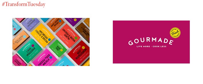
Gourmade
Gourmade, a frozen food brand newly acquired by Jo and Glenn Devenish, has been rebranded by Leeds-based Robot Food. The premium frozen food company approached the rebranding with the goal of conveying exceptional quality, variety and guilt free meals. Battling the stigma of bland, frosty meals, the brand has positioned itself as a positive and warm meal option that tells customers to ‘Live more. Cook less.’ The packaging is bright, featuring signature foodie style photography and the labelling is done in a Robot Food designed handwritten font. Jo Devenish has characterised this branding as having “fantastic shoppability and standout, and an irresistible personality that balances quality with charisma.” Robot Food director, Simon Forster says, these “bold, bright packs ARE the brand”. The newly launched brand is attracting interest from worldwide retailers, including Budgen’s, Simply Fresh and Spar, with more to follow.
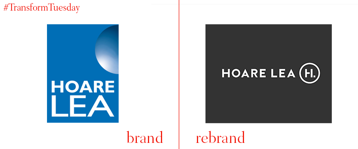
Hoare Lea
Award-winning engineering firm Hoare Lea has been rebranded by Mr B & Friends of Bristol. Maintaining its values and vision, the rebranding affirms the technical expertise of the firm but also the value of human experience. Ian Durbin, partner at Hoare Lea, says this new branding ‘is rooted in our confident, positive, can-do attitude – the one that’s always been at the heart of the firm.’ The redesign is clean and streamlined, using pops of fresh colour against a muted dark grey to showcase project images, news and insights in a user-friendly manner.

JOM Organic Candy
London-based brand agency Mystery recently developed the name and identify for Swedish sisters, Anna and Josefin Nilsson, founders of the sweet shop SugarSin in London’s Covent Garden. Wanting to develop a vegan, ethical new candy that is ‘Pure Indulgence, the Swedish crafted chewy candy was named JOM as the playful acronym of ‘just one more.’ The candies are shaped like fruit segments and smiles, while the logomark was developed incorporating the Scandinavian character “Ø” to highlight the founders background. The overall branding and packaging is simple, tactile and accessible to capture the happiness that comes with pure indulgence.
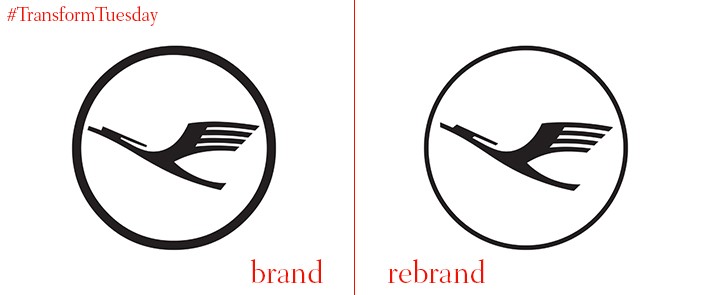
Lufthansa
Leading German airline Lufthansa has had its logo, identity and livery rebranded by Munich-based Martin et Karczinski. Coinciding with the centenary of the design of its iconic crane by Otto Firle, the airline has modernized its identity for a digital age. A slimmer crane now dons Lufthansa’s insignia, allowing for additional negative space in the logo that is light and elegant. The brand’s signature blue and yellow colours have been retained, albeit as slightly deeper and richer hues, resulting in an overall look that aims for reliability, clarity and value. Martin et Karczinski have designed a digitally friendly typeface for the brand’s wordmark across its collateral, completing the updated look to show that the people at Lufthansa are, as Lufthansa’s chairman of the executive board Carsten Spohr says, ‘Proud drivers of globalization and are honored to bring this abstract concept to life! All this drives us forward and makes our work so valuable and fulfilling.’


