Trollbäck+Company rebrands fintech company Betterment

Global design and branding studio, Trollbäck+Company, developed a new brand identity for digital wealth management company Betterment.
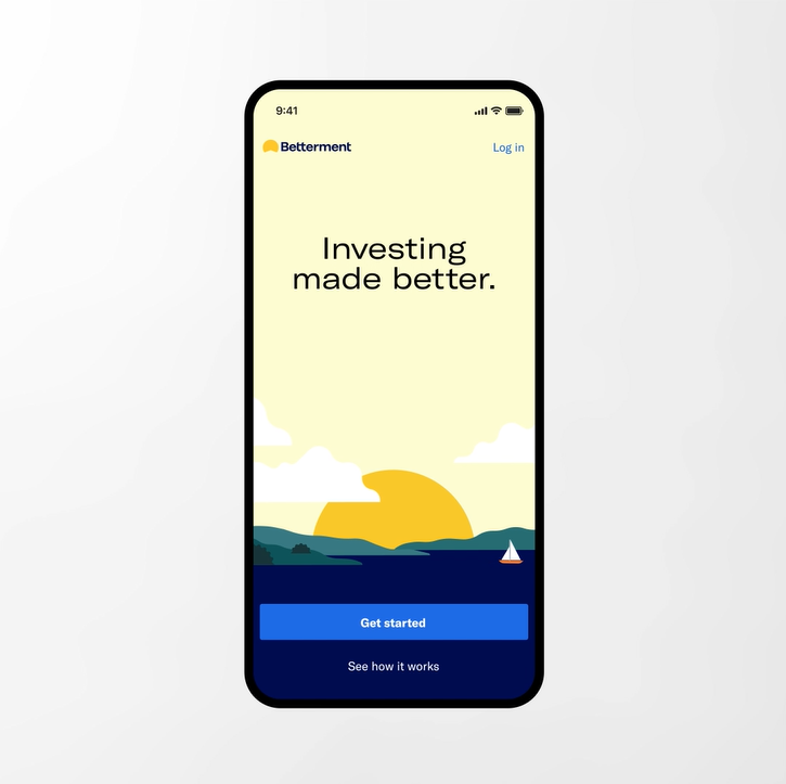
Betterment was established with the aim of bringing investing to the masses and was built on the principles that technology can provide everyone, not just the wealthy, with access to good, fiduciary guidance. The new brand builds on the accessibility and inclusivity at the core of Betterment’s financial services. This is encapsulated in the new brand purpose statement, ‘Making people’s lives better.’
“This new brand identity represents a visual evolution from Betterment’s founding focus on investing to a broader focus of your full financial future, with moments of delight and encouragement along the way,” says Allie Armstrong, director of brand creative at Betterment.
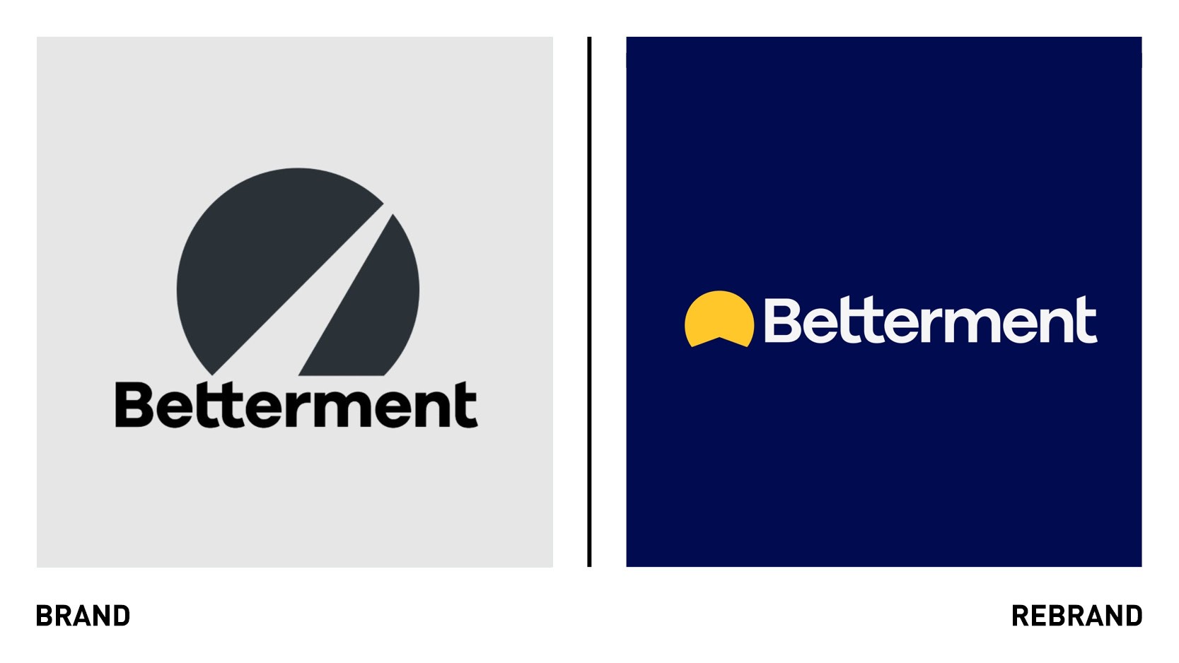
Alongside weaving the purpose through every aspect of Betterment’s brand strategy, Trollbäck+Company worked with Betterment on a new visual identity that captures the brand’s legacy. The new logo aims to represent the illuminating nature of betterment’s offering to users, with the base of the shape inviting a first-person perspective of a path and implying forward motion. The metaphor is further enhanced as an arrow pointing upwards, signifiying growth.
“We created a symbol that evoked a path and progress that feels optimistic and functions as more than just a static logo—it’s the foundation for an entire visual identity system. Its simplicity allows it to be an anchor, and gives so much opportunity for purposeful activation. In marketing it stands out from the landscape; it’s instantly recognizable. And as a product feature, as a button on your phone, it’s a joy to look at, to tap, to engage with,” says Nadia Husain, design director at Trollbäck+Company.
Paired with the logo symbol is a lighter, more legible word and digitally-friendly wordmark. “The word mark stands out without shouting at you. It’s the horizon line to our logo’s sunrise,” adds Husain.
In addition Trollbäck+Company worked with Betterment’s internal design team to also develop a range of illustrations to be used across different touchpoints to emphasise the brand’s approachable but elevated positioning. Whilst the new visual identity retains Betterment’s blue colour and original font, a warmer colour palette is introduced to complement the notion of a journey that feels refreshing.
“We wanted the overall palette to feel like the prospect of a new day—warm, refreshing, vibrant, full of possibility,” says Husain.
“From the outset they’ve been a deeply purpose-driven brand; what we’ve done with this rebrand is give them the tools, through strategy and creative, to own that unique, authentic, purpose-driven approach even more confidently as they continue to grow and serve people at every step of their financial journey,” says Alex Moulton, chief creative officer at Trollbäck+Company.