Kingsley Napley unveils new brand identity
London-based law firm, Kingsley Napley, has unveiled a new brand identity, which coincides with its office move.
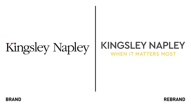
Following interviews and workshops with its partners, the firm identified the need to modernise and refine its brand and messaging. The new brand aims to convey a confident, proactive and dynamic image of the firm. At the heart of the rebrand is new strapline ‘When it matters the most,’ which recognises that many clients rely on the firm to help with challenging issues and situations.
“We have an updated look on-screen and in-print to bring a bolder up-to-date feel to our communications. In whatever way we interact with clients, they can be assured that we will continue to provide the collaborative and dynamic service to which they are accustomed, when it matters most to them. We are committed to adapting to clients’ needs and requirements as COVID restrictions shift,” says Leor Franks, director of business development and marketing.
The logo has been modernised, adopting a Cera Pro font with a yellow underlining. While the colour palette remains the same, there is more emphasis on the core yellow, dark grey and teal blue colours.


