Free The Birds gives European vitamin brand new look
Creative agency, Free The Birds, worked with global sciences company Bayer to revamp its VMS (vitamins, minerals and supplements) brand, Supradyn, for the consumer health market.

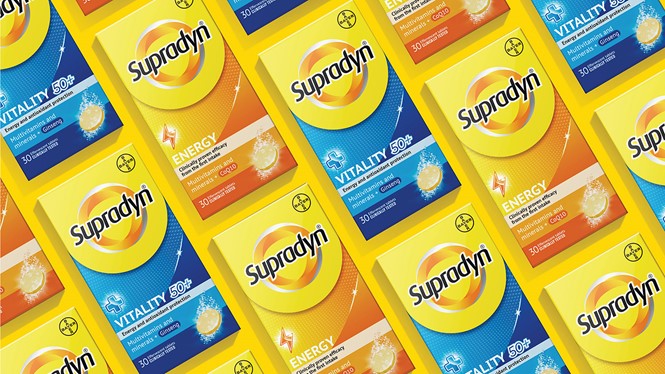
Established in 1959, Supradyn’s previous packaging design had become dated over time and no longer communicated the level of efficacy consumers are looking for today. Free The Birds was tasked with aligning the portfolio across all markets and communicating the new positioning of ‘Recharge your Strength,’ through every brand touchpoint, including packaging design and typography.
A new circular device now heroes the Supradyn name on pack within a shield-like shape, aiming to create a bold brand presence on shelf. Free The Birds also designed a new colour palette to ease navigation: yellow and orange define the master brand identity while darker orange, blue, green, and teal differentiate the product ranges. These colours are featured as gradients on the packaging.
“Whilst we needed a global design approach, we also had to consider the individual regulatory challenges that the vitamin market faces. The new brand identity retains the existing brandmark but introduces a stronger overarching global design framework that is easily recognisable on shelf,” says Nick Vaus, partner and creative director at Free The Birds.
The bespoke icons on pack aim to clearly communicate the benefit of each product whilst aiding navigation across the product portfolio. The children's range also features illustrations of superhero characters, engaging younger consumers in the product and seeking to add a sense of fun and playfulness.
“The new packaging design not only reinvigorates our brand messaging but strengthens our position as Europe’s number one vitamin brand,” says Midori Morgan, global brand director at Supradyn/Berocca.


