JDO rebrands Hennig-Olsen’s Krone-is ice cream brand
Norwegian ice cream Hennig-Olsen worked with global design agency, JDO, to develop a contemporary new design for its classic ice cream, Krone-is.
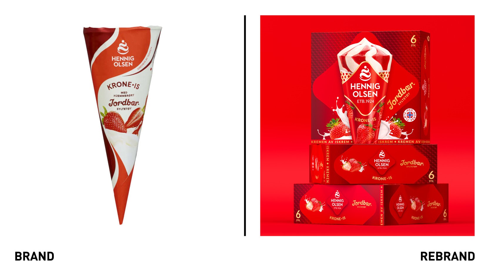
Despite being made by the older ice cream cream producer in Norway, Krone-is faced the challenge of elevating itself above the competition with the frozen-dessert market more crowded than ever.
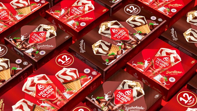
JDO was tasked to revive the brand with a visual strategy that would stand out, strengthen memorability and improve likeability. The new Hennig-Olsen wordmark takes centre stage on the pack to drive recall, whilst a ‘wafer’ pattern that uses the shape of the Hennig-Olsen logo is incorporated into the background.
The design is finished with the ‘Kremen Av Iskrem’ ribbon, a mark that aims to showcase Hennig-Olsen’s unrivalled quality. This was chosen to provide texture, reinforce the product and stir a bit of nostalgia amongst the ice cream aficionados.
“With crafted brand assets like the heart-inspired logo, the ‘wafer’ pattern, the ribbon and indulgent ingredients surrounding the hero cone, the latest design powerfully delivers standout and recognition whilst also awakening nostalgia for the treasured treat,” says Ray Smith, creative director at JDO.
The new colour palette retains the recognisable red, making it a tone richer, but discards the burgundy and white, allowing for the packaging to achieve shelf stand-out with the bright burst of colour.
"Krone-is is one of Hennig-Olsen’s classic products, and its new look by JDO celebrates our heritage, personality and heartfelt passion for quality ice cream,” adds Lillian Susanne Hall, market director at Hennig-Olsen.


