#TransformTuesday: 26 May

Here's this week's selection of rebrands from around the world, from financial firms to recruiting tech. For more from #TransformTuesday, follow @Transformsays on Twitter.
OpenPay
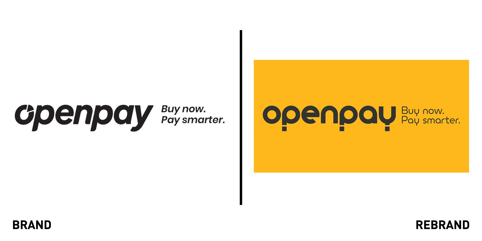
Australian Fintech firm Openpay worked with British design agency We Launch to create a new visual brand identity that reflects the company’s open and transparent approach to consumer spending, and its mission to change the way people pay for the better. The rebrand also supports the company’s increasing growth and ambitions. “Our refreshed brand identity also gives us stand-out; a quality that will help immensely as we continue to raise awareness and recognition of the Openpay brand, as part of our strategy to increase market share,” says Georgina Whalley, CMO of Openpay.
The new identity still includes the tagline ‘Buy now, pay smarter,’ which encapsulates the business’s proposition of encouraging its financially prudent customers to spend sensibly by offering them a way to pay for goods in interest-free instalments. We Launch also created a bespoke illustration style in-house, with ‘modular elements in a grid to form a ‘kit of parts’ to be mixed and matched to a range of scenarios and customer experiences.“Every aspect of the visual brand identity was created bespoke for the brand. A striking visual identity was conceived - taking inspiration from Scandinavian and Swiss design principles. The logotype and typeface were crafted under our direction by a leading lettering artist. And a whole suite of unique illustrations was created in-house - all evoking the brand’s savvy, confident and witty tone of voice,” says Stuart Lang, founder and creative director at We Launch.
The rebrand has been introduced in both consumer and corporate facing platforms, including the website, app, customer and merchant portals and social channels.
Rustlers
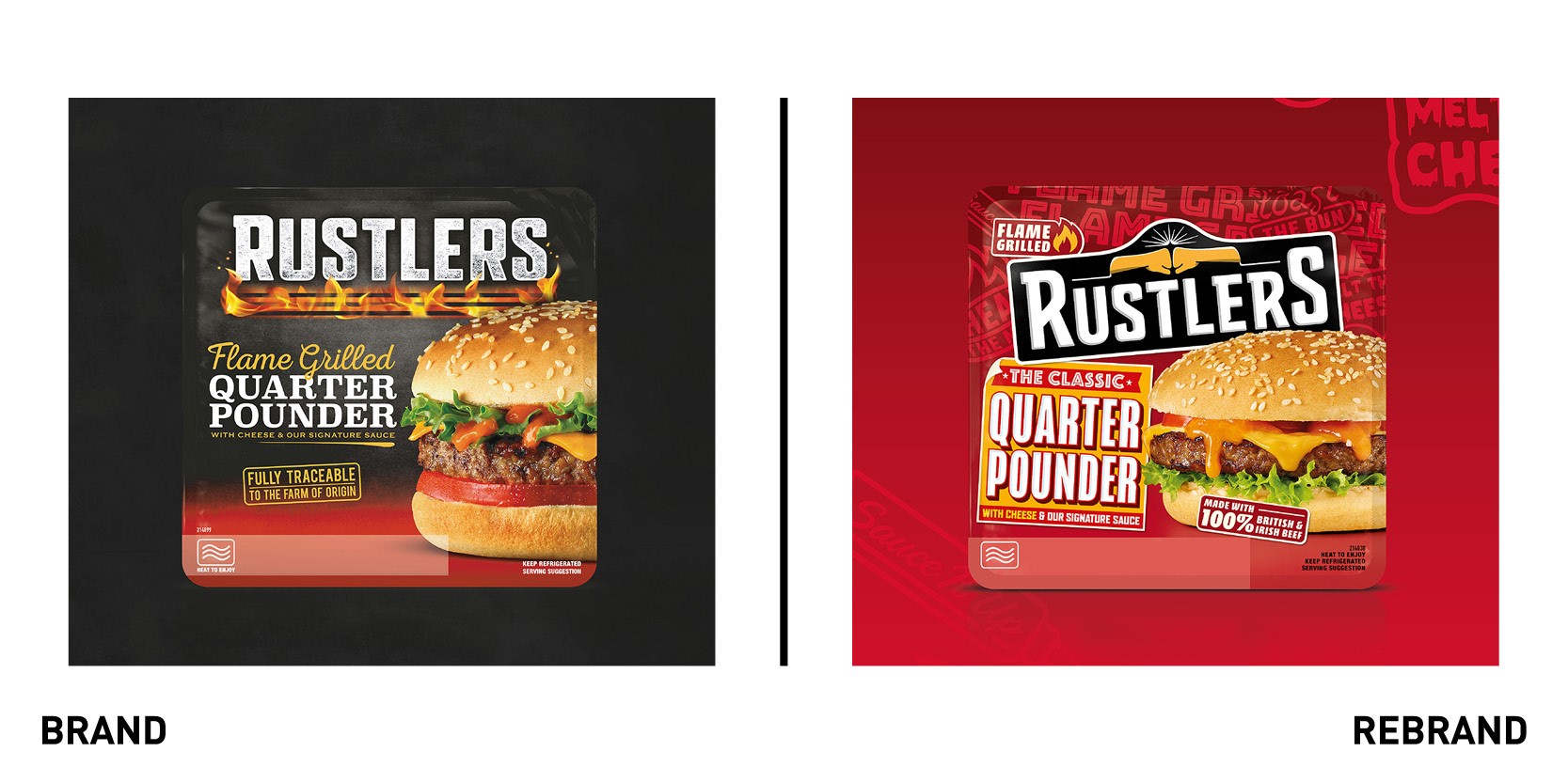
UK’S micro-snacking brand Rustlers partnered with global creative agency BrandOpus to create a new brand strategy and visual identity in response to Rustler’s ambition to grow market share and expand into new categories. The brand’s new fist-pump iconography that sits at the heart of the visual identity moves Rustlers beyond product cues and its literal association to flame grilling to emotive symbolism, representing the satisfaction that the snacks are all about. The rebrand also includes a bold colour palette across each product to enhance differentiation, ensuring standout in shelves and easy consumer navigation. Product photography is more realistic and better reflects the brand’s everyday credentials. “Being able to deliver a quality flame-grilled burger in two minutes is a bit of a life hack, so we sought out create a visual language that evokes a sense of honesty, savviness and resourcefulness but in a relevant & dynamic way,” says Jon Ramskill, creative director at BrandOpus
Refari
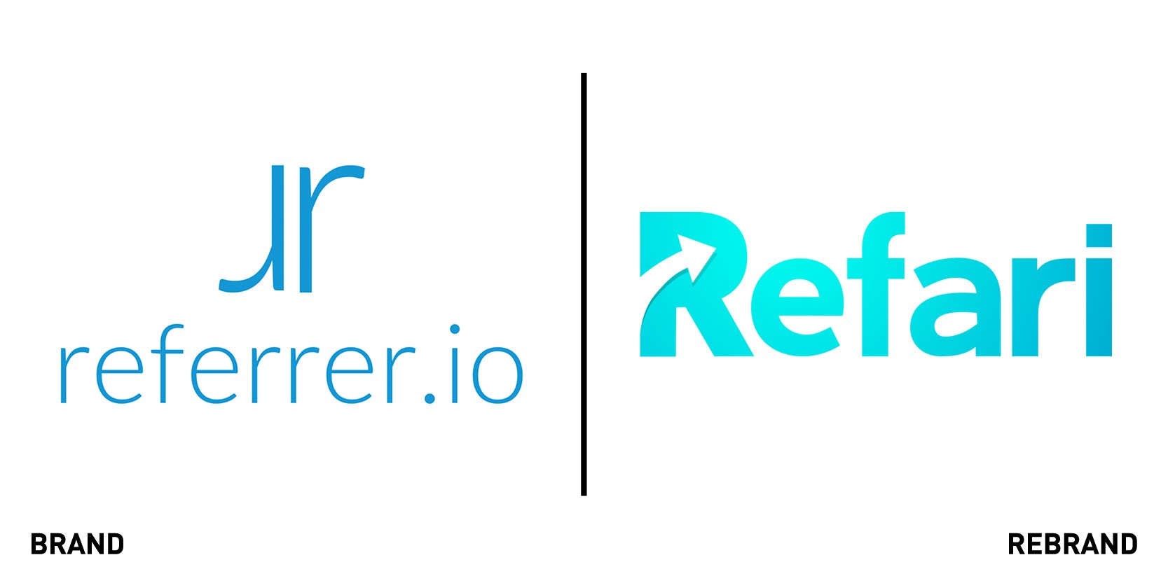
Recruitment technology suite Refari teamed with Sydney-based brand consultancy StartsWithA to launch a rebrand as they outgrew their original one, referrer.io, when referral technology became only one of many different features within the full product offering. Refari also wanted to move towards a brand identity broad enough to work for a multifaceted product but distinct enough so to be instantly recognisable. “The Refari wordmark is deliberately clean, modern and bold, with the subtle inclusion of the ‘Refari Uplift Arrow’ within the R to symbolise the company’s origins in referrals and how the platform elevates clients business performance as a whole. This symbol is something we have used throughout the wider family of Refari brands to indicate that they are built on Refari technologies,” says Alex Marshall, director of creative and strategy at StartsWithA.
Encona
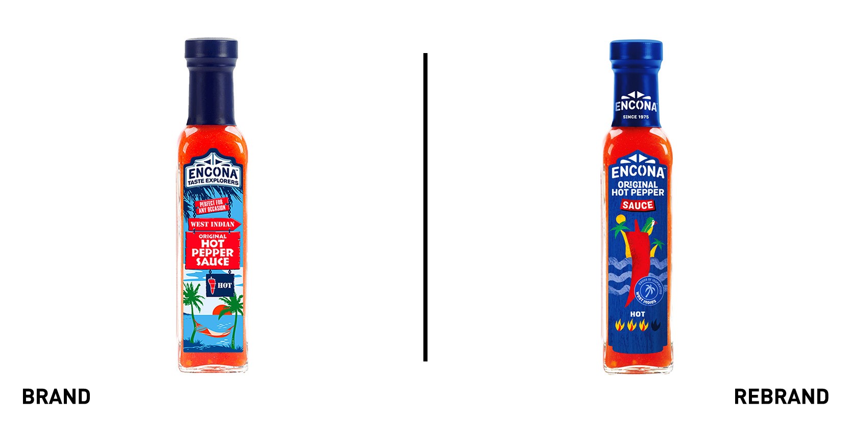
One of UK’s number one hot pepper sauce brands, Encona, worked with English design agency Uniform to create a new brand identity that would enable Encona products to stay ahead in a growing, more competitive market. Despite being part of a food corporation worth more than $1 billion, having a huge market presence and wide availability, Encona wanted to improve its brand recall. The result was the creation of a dynamic new brand identity that celebrates Encona’s dedication to flavour and authentic recipes and that sets it apart on the supermarket shelf.
Richard Pay, creative lead at Uniform, is adamant that even market leaders need to continually develop their products, commenting "Encona needed a brand refresh so that they could tap into new consumer markets, drive brand awareness and ultimately, continually grow."


