#NewBrandMonday: 25 May
Here are this week's selection of newly launched brands from around the world. For more from #NewBrandMonday, follow @Transformsays on Twitter.
Bowl & Basket
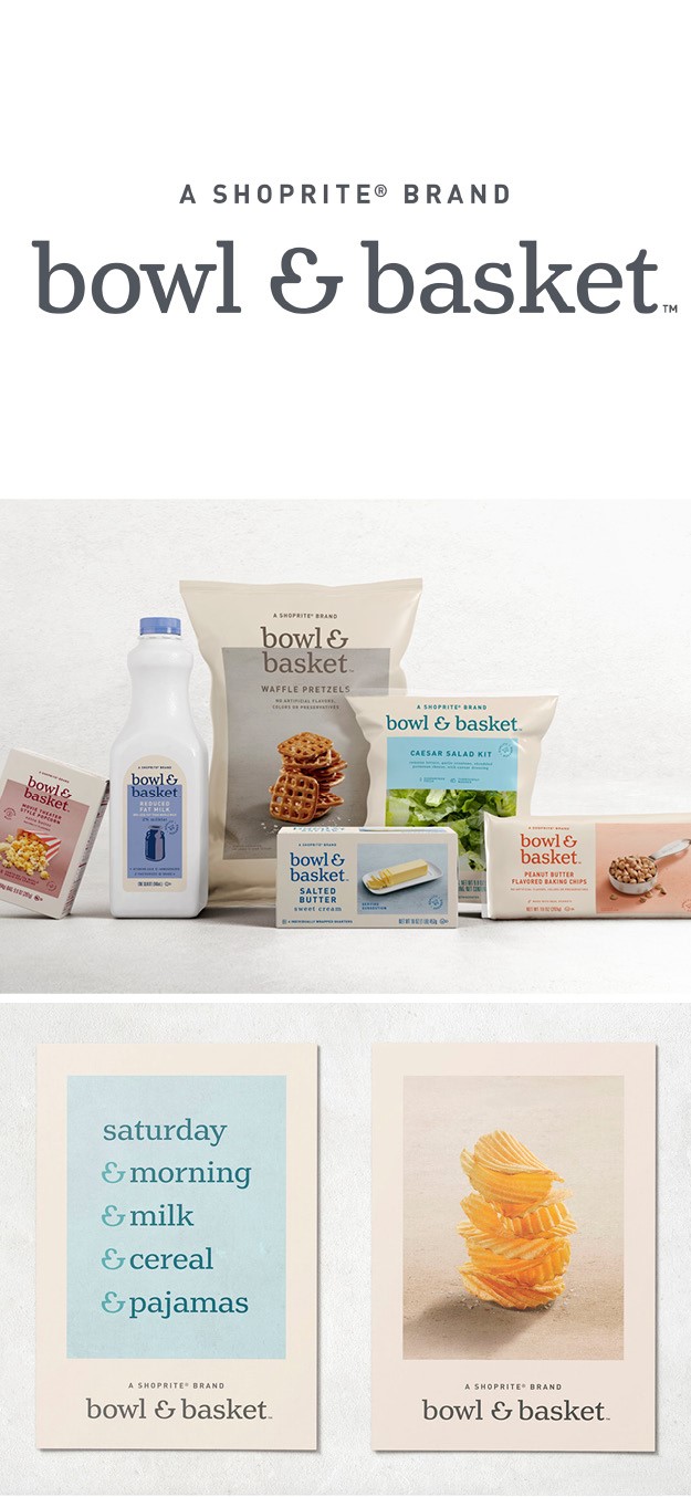
International creative design and branding agency Pearlfisher partnered with American food and beverage retail giant Wakefern to create ShopRite’s new own brand for high quality food, Bowl & Basket. The organic and optimistic nature of the design and what it represents informs the identity and brand expression. This is especially reflected in the logo, which includes the addition of an ampersand that doubles as a visual icon resembling a bowl and a basket. The rectangular placemat that surrounds the logo represents the centre of the table, shareability and community with modern, stylish, and real-food photography. The whole identity is strung together by the ampersand, which is seen in many combinations such as Milk & Cereal, or Saturday & Pyjamas. The packaging features a variety pastel colours, from light pink to green, and includes high quality photographs of the products, which further emphasises the natural and organic nature of their products.
Brigade Court
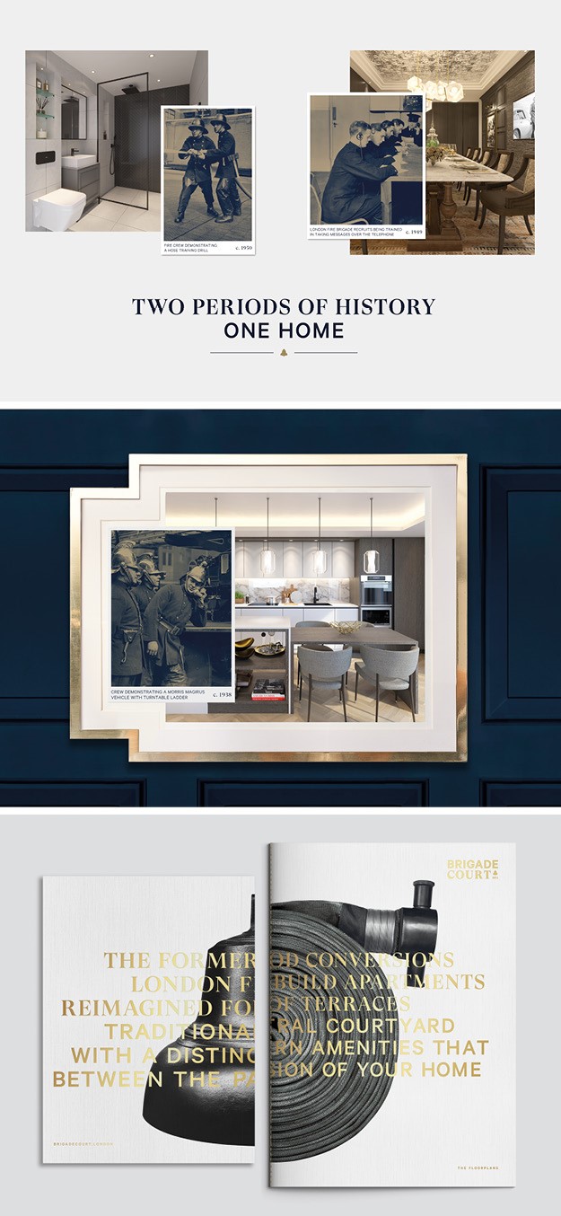
London-based design agency Jack Renwick Studio launched a new brand identity for Brigade Court, a residential development at the former headquarters of the London Fire Brigade. The new development features both period conversions in the original Victoria building and many new-build apartments, a juxtaposition which informed the brand idea: ‘Traditionally Different.’ To do so, Jack Renwick aligned photographs of the original fire station and firefighters with images of the new apartments and local area, creating a series of collages that convey the site’s distinctive marriage of old and new, while still conveying the sense of local neighbourhood. This parallel between modern and traditional is also reflected in the typography, a mix of elegant serif GT Super and a more contemporary Calibre. Other parts of the visual identity pay tribute to the brigades: the colour palette, inspired by the traditional navy uniforms and brass helmets worn by the brigade in early years; the cover of floor-plan brochures, which feature an icon of the original fire station; and the in-house amenities, which borrow their names from areas within the original fire station. In addition, iconic fire brigade equipment is championed on the graphic window displays.
Kapsul
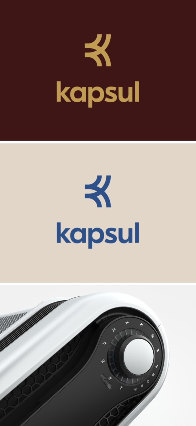
California-based brand agency Envoy created the visual identity, website, and digital product for Kapsul, the first window mounted Wi-Fi AC unit. Both the visual identity and website are sleek and modern, reflecting what Kapsul claims it is: ‘the future of smart air is, a tiny box as powerful as other AC machines. The first words that pop up on the website are ‘cool. calm. connected’ followed by evenly spaced black dots, which further emphasises the key aspects of of Kapsul: good engineering, easy technology and complete control. The brand identity seems to portray the idea that everything is easy and straightforward with Kapsul, even turning on the AC from afar with a click.
Lynx
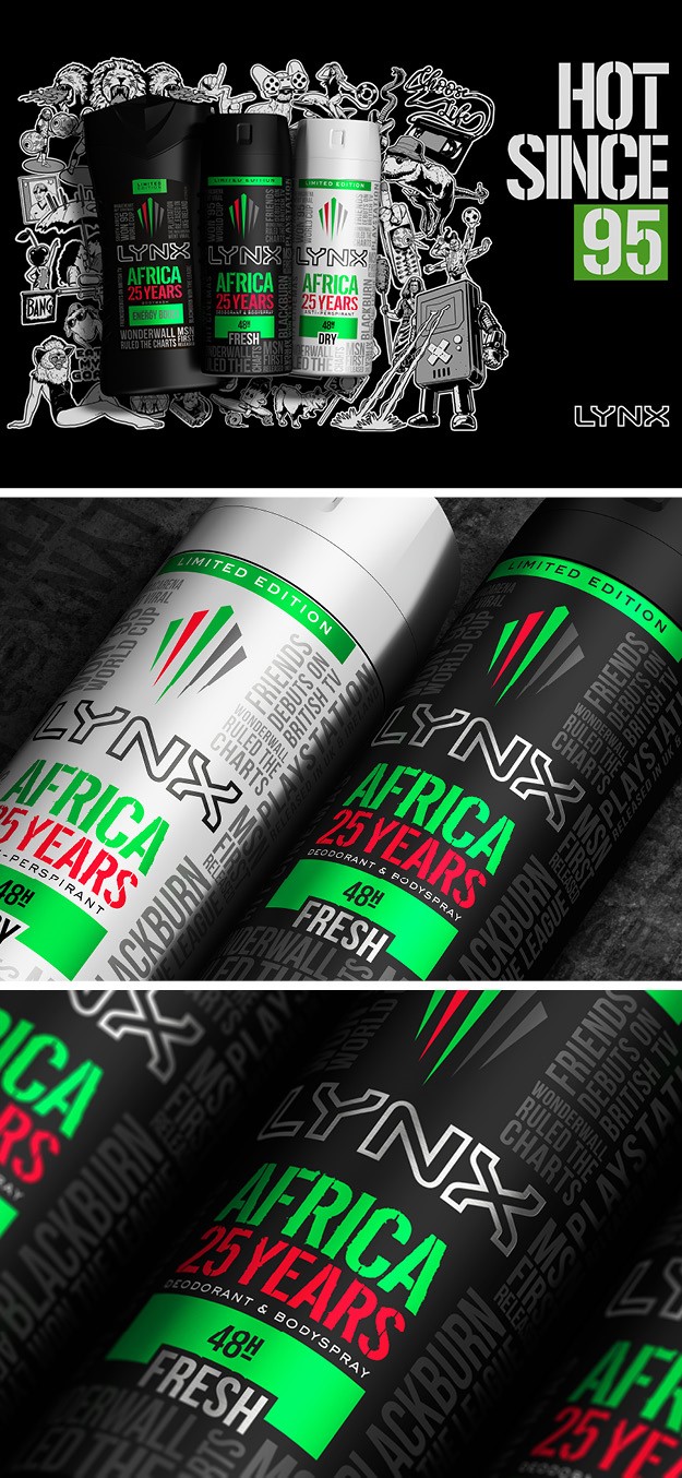
Lynx, the male grooming brand owned by Unilever, worked with London-based design agency PB Creative to launch a new limited-edition range to celebrate its 25th anniversary of its longest running fragrance, Africa. The new limited-edition packaging features key events, figures and cultural moments from 1995 in addition to using Lynx Africa’s iconic colours of red, green and black, both of which serve to remind of the brand’s long history. The celebratory packs also include a snap code which shoppers can scan to enter a virtual reality of the TV advert to immerse themselves within the campaign through virtual reality portals, filters, and lenses. “Our challenge was to create a celebratory limited-edition range design to sit seamlessly within the full Hot Since ’95 25th anniversary communications campaign. We’ve leveraged this iconic fragrance’s past and redefined its future and look forward to collaborating with the Lynx team for the next 25 years,” says Amy Elshenawy, design director at PB Creative.
NesQino
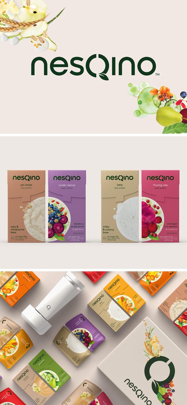
Global brand agency FutureBrand partnered with Nestlé, the world’s largest food and beverage company, to launch nesQino, a solution that enables people to personalise healthy superfood drinks only made of natural ingredients, at home or in the office. FutureBrand used Nestle’s Five Sense framework as a starting point to provide inspiration for an impactful sensorial experience across all touchpoints. An essential part of the visual identity is its intuitively, enabling consumers to understand how nesQino works and showcases the endless tasty possibilities on offer. The logo, featuring the letter Q created by an O shape and a leaf, and the images of the food on the packaging further emphasise the organic nature of nesQino’s product.
“We used a digital-first approach in our designs, ensuring the visual identity system was consistent and cohesive enough to build the entire D2C ecosystem out from it. Coupled with this, the brand has been designed to look and feel like a friendly peer - a welcome addition to your daily routine - rather than a complicated nutrition brand based on heavy scientific claims,” says Marshall Ward, senior vice president of FutureBrand.


