#TransformTuesday: 10 September
Every week, Transform examines recent rebrands and updated visual identities. This week’s picks are below. For more from #TransformTuesday, follow @Transformsays
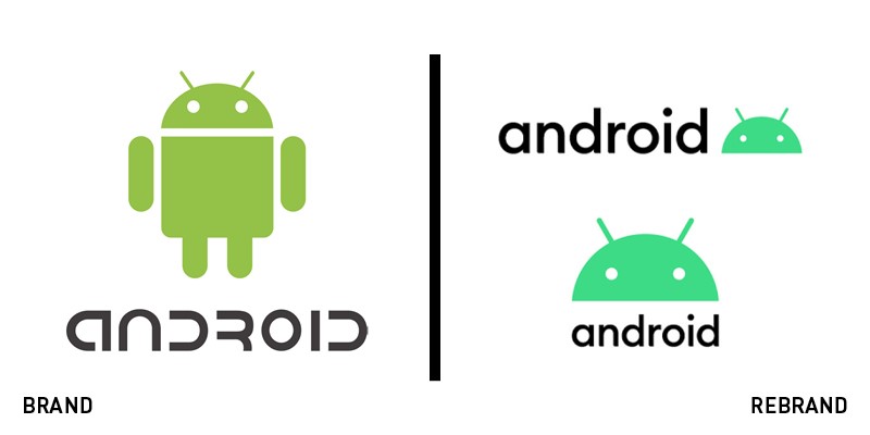
It’s been just five years since Google introduced a new typeface for its mobile operating system, but the advent of Android 10 has called for an additional brand refresh. In partnership with New York-based creative agency Huge, the tech giant has announced a renewed face for the Android brand, drawing inspiration from the iconic green robot to shape the custom font and the new logo. The brand drops its old light green in favour of darker shades and has been designed with readability in mind, to help people with visual impairments benefit from the new identity. It comes with additional colours and vibrant identity elements, all injecting new energy into the Android brand.
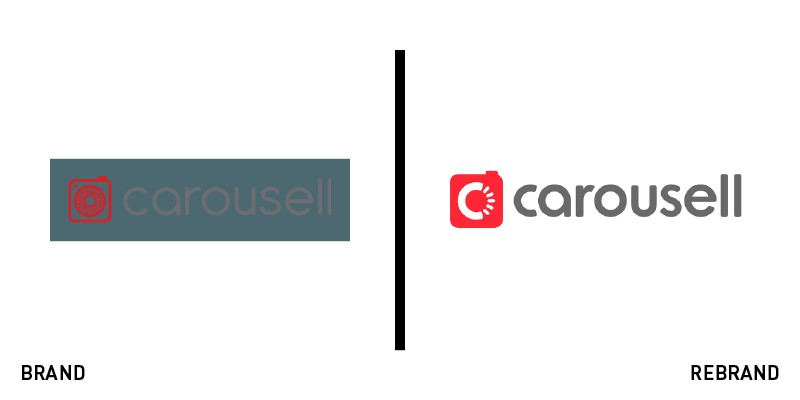
In seven years of activity, Carousell has experienced brand growth and progression as a platform providing positive experiences and exchanges to users. To mark its seventh anniversary, the company has introduced a refreshed, vibrant brand with solid roots in Carousell’s values and history. The new logo, designed by branding agency Superunion, still retains the carousel as a tribute to the history of the brand, to represent the cyclical nature of items going around. However, it also modifies it slightly to feature the letter ‘C’ and five fins, symbolising Carousell’s core values. With a growing community of ‘carousellers,’ the company is off to a new beginning and has already started implementing the brand across all of its touchpoints.
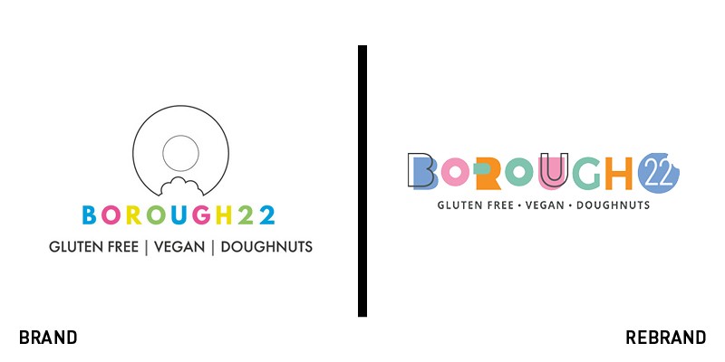
Four years after starting its vegan and gluten-free business, Ryan Panchoo’s London-based bakery Borough 22 has won several free from awards and was in need of a new identity to celebrate the brand’s growth. Inspired by the multicoloured nature of doughnuts and sweets, the new identity was designed by creative agency Jackdaw Design and introduces a wide array of vibrant packaging solutions, to convey the playful nature of Panchoo’s brand and appeal to a wider audience. The logo still retains the colourful approach of the old brand and introduces a bouncy, irregular typeface inspired to the doughnuts themselves.
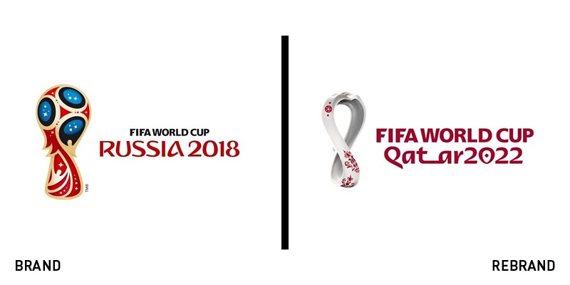
With the 22nd Fifa World Cup set to take place in Qatar in a few years, the international federation has announced a new emblem and brand to support the tournament. With undulations inspired by desert dunes and hosting the shape of an unbroken loop, the new 2022 World Cup emblem is a tribute to Qatar and Asia’s diverse populations by celebrating the continent’s second time as a Fifa World Cup host. The shape, designed to evoke the World Cup trophy, is additionally inspired by a shawl with embroidered detail, a popular garment in the Arab and Gulf region during winter months. The brand comes with a new typeface which reimagines traditional Arabic calligraphy, fusing tradition with modernity.
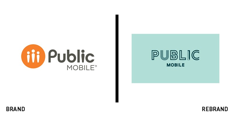
Six months after expanding its physical presence in Canada, Public Mobile has rebranded to put emphasis on the ‘public’ aspect of the brand. To differentiate itself in a competitive market, Public Mobile’s new identity is focused on ‘the power of individuals,’ the same people at the heart of the brand’s values. The logo features an array of different shapes to display diversity and inclusion, a message highlighted in the visual identity of the brand across its several applications. The new face of the company, designed by creative agency Cossette, represents the individuality and the diversity of the community at the core of Public Mobile, through a simplified, mature and strong identity grounded in the company’s care for its customers.
For more from Transform magazine, sign up for the Transform newsletter here and follow us on Twitter @Transformsays.


