Top Gear’s new typeface draws from brand’s well-known icons
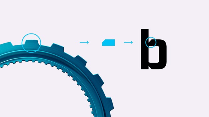
Inspired by the iconic Top Gear cog, the TG Industry typeface marks a new dawn for the brand and carries a strong feeling of identity. Aiming for consistency across all outputs, the new face of Top Gear has already been rolled out in broadcast and print, and will soon head to digital for a general website refresh.
Created by brand design agency DixonBaxi in partnership with the BBC, TG Industry comes in a variety of weights, from thin to ultra, designed to be flexible and adaptable to all mediums. It showcases the brand’s confident identity with solid, block-like shapes and angular cuts to reference the cog’s form, and it features mechanical terminals to emphasise the brand’s message.
TG Industry gives Top Gear a new visual voice to be boldly displayed on all of the brand’s touchpoints, complementing the show’s iconic word marque with a refreshed identity.
Following a few years of decline in ratings and the recent resignation of the show’s presenter, Matt LeBlanc, Top Gear was looking for a way to revamp the brand and start a new chapter, leveraging the success of this year’s summer season. The refreshed typeface is in tune with the brand’s tones and goes to replace a set of non-custom Helvetica and PillGothic fonts on the original website.
For more from Transform magazine, sign up for the Transform newsletter here and follow us on Twitter @Transformsays.


