Kate Spade rebrands in pink spades and green shades
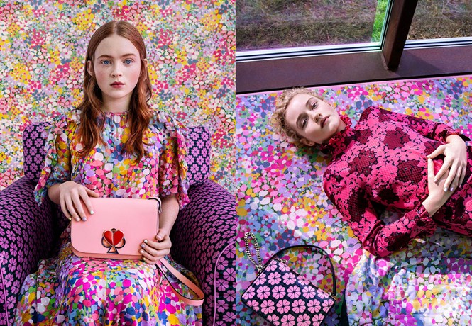
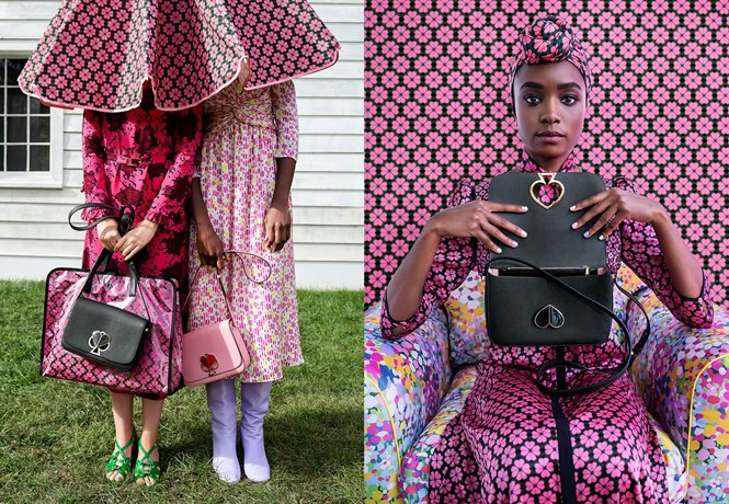
Fashion house and lifestyle brand Kate Spade has announced a new identity with the launch of its spring 2019 collection, blending pink and the brand’s iconic spade.
Kate Spade’s new identity is a ‘pink kiss’ against a bed of green. Building on the brand’s iconic spade, the American fashion house has turned to Instagram to announce its new designs, ahead of the spring 2019 collection release. The new identity includes a logo and a number of applications, in which pink, hearts and spades dominate the scene. It is likely to have been designed in-house, under the guidance of Kate Spade’s new creative director Nicola Glass.
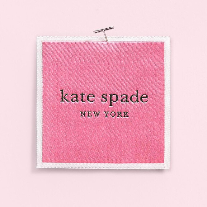
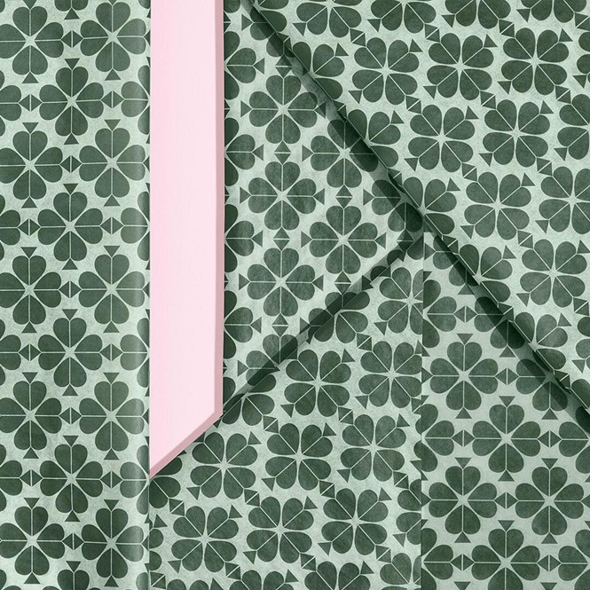
First, the logo, designed in collaboration with typeface design agency Commercial Type: Kate Spade has maintained the iconic typeface, but it has chosen to free it from the spade symbol and encapsulate it, instead, in a pink container against a dark green background. These two colours are then applied throughout the rest of the identity, including labels and shopping bags, campaign posters and apparel, boxes and tissue paper.
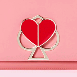
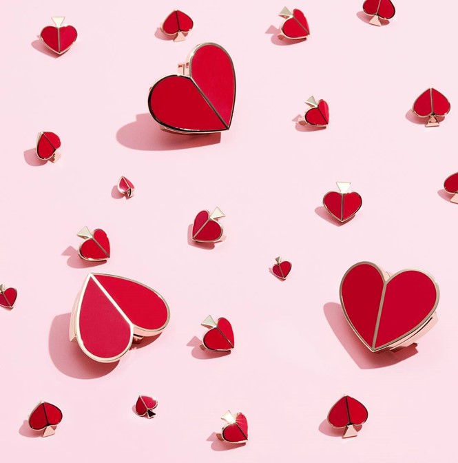
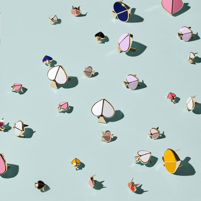
The company’s new pattern on its applications looks like a flower with pink petals, where petals themselves are the top portion of the new spade symbol. It is a clever and playful approach to the brand’s iconic symbol – the spade – which is now employed as a flipped heart depending on the circumstances.
One of the most interesting applications is in the small bag lock mechanisms: the top portion of the spade becomes detachable and rotates on itself, becoming a round heart when the bag is open, and back to spade when it’s locked.
Several recent fashion rebrands – such as Burberry and Rimowa – have shown a tendency to drop serif typefaces in favour of smoother, sans serif logos, a choice that is becoming increasingly popular in the industry. Kate Spade has decided not to drop its serifs instead, choosing to maintain its playful identity and carry it to the new brand.