Burberry launches polarising new logo and monogram
In a clear indication of one brand’s desire to transition into the digital age, British luxury fashion house, Burberry has revealed the new design for its monogram, via Instagram. The rebrand was led by Riccardo Tisci, who was appointed as chief creative officer five months ago.
The redesign of the iconic monogram marks the first time in 20 years that Burberry has rebranded, following Fabien Baron’s design in 1999. The designer behind the new monogram this year is Peter Saville, famous for his edgy work in the music industry, having designed album covers for bands like New Order and Joy Division. His most controversial work was for Joy Division’s last album, where the cover featured a controversial image of Christ’s body in a tomb, shortly after lead singer Ian Curtis’ suicide.
However, this is not the first time the 62 year-old Italian designer has worked for a fashion firm. In 2016, he was responsible for redesigning Calvin Klein’s logo, and he has worked with Paco Rabanne and Givenchy.
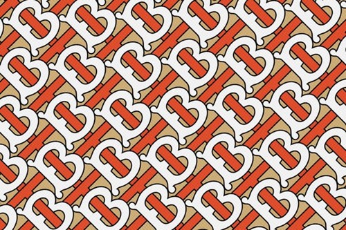
Burberry’s new logo references Burberry’s founder Thomas Burberry, featuring an interlocking ‘TB' print, in vibrant orange and crisp white colours against a muted beige backdrop. Additionally, the new logo is no longer in an all-caps serif font and the illustration of the equestrian knight has been removed. The new logo and monogram are much bolder and more modern than their predecessors.
The brand posted a series of snaps showing the emails between Saville and Tisci, where Tisci asks Saville to produce the designs in just four weeks, in anticipation of London Fashion Week, now less than a month away. The designs that were released are an indication of what the audience can expect from the show.
All the following is coming from a place of love
Russ Powell, head of marketing, Red Hot Penny
When I got my first ever big-boy pay check many moons ago, I rewarded myself with a Burberry mac (rent can always wait, can’t it?). I loved that coat – it’s since perished thanks to an errant umbrella tearing a hole in it on the Circle Line – and I loved Burberry for it. But to now see one of the most quintessentially adored British brands seemingly lose itself with a rebrand like this is really hard to watch.
Far be it from me to critique the work of ‘one of our generations greatest design geniuses’ but it all just feels predictable, generic and a bit…well, blah. We now have Blahburry (that’s a hashtag waiting to happen, right?).
We’ve got an identikit logo-type that looks not at all dissimilar to Balenciaga’s and a monogram print that looks a lot like it came from Gucci. Now, imitation is the sincerest form of flattery but is it purely coincidental that Gucci and Balenciaga are two of the most regularly referenced brands in the genres of music and Instagram posts that send all those fashion-conscious ‘hypebeasts’ scrambling to post fire emojis all over the place? Has Burberry sacrificed its heritage to jump on the ‘fast-luxury’ bandwagon?
Talking specifically about the logo, does it not feel odd to anyone else to include the word ‘England’ in there? Are we to believe there’s another London out there that’s suddenly stolen a march on our capital as an epicenter for fashion? Does Burberry know something we don’t and the Londons of Burgundy, Ontario and Kiribati are going to shortly be churning out their own high-end fashion? If 33% of a logo is redundant from the off, then what are we to expect of the brand that it’s part of.
This isn’t just about a logo and a monogram print though.
A logo is only one element of a what constitutes a brand. This could all be part of a master brand strategy to shift perceptions, tell new stories, engage new audiences and deliver growth for many years to come, but on first blush it just feels like everything that made Burberry great is being forgotten to do so. Yes, brands do need to move with the times or risk fading away, but if your entire brand has been built on heritage up until this point surely doing away with it wholesale and starting again is a risky move.
There are no real nods to any of the brand heritage that we’ve seen so far (other than the use of TB in the monogram check). The fact that this was all launched on Instagram – the social media platform of choice for all those trendy Millennials that definitely exist and aren’t a catch-all term used for lazy targeting – goes some way to letting us know.
No editorial in Vogue. No interview in Drapers. Bam! Straight to the Gram.
But the reaction from the 12m or so followers Burberry have has been less than positive. It seems I’m not the only one. Alongside all the facepalm emojis you’ll see regular use of words like ‘bland,’ ‘boring,’ ‘cheap’ and ‘disappointed.’ That last one’s got to hurt. The people expected more from Burberry.
The whole printed-out email conversation posted alongside the new logo and monogram print feels somewhat contrived and at odds with expectations, too. Are we meant to believe this was an actual email exchange? Is four weeks an unreasonable amount of time to seemingly fire up a word document and type three words in what looks like a stock font (Montserrat Extrabold, apparently)? Do Riccardo and Peter really try to only ever email each other when the time ends with a seven?
It's odd choices like this and the seeming abandonment of the brands heritage that means this just doesn’t feel right.
If this rebrand has done anything though it’s deflected attention from the negative press Burberry has been seeing lately and has generated some awareness ahead of Tisci’s first collection launch. And who knows when the collection drops (to use fast-luxury parlance) and everything is seen as one the new brand may crystalise and everything will make sense.
Based on what we’ve seen so far I’m not sure it will, but I’d dearly love to be wrong.
For more from Tranform magazine, follow us on Twitter @Transformsays.


