Space race aesthetic returns in proposed Space Force logos
The National Aeronautics and Space Administration (Nasa) is one of the US’ most frontier-breaking organisations. For decades, it has reached, quite literally, for the stars. Part of its mission is to act as a transparent, public body providing knowledge and information to the American taxpayers.
Nasa has done all of this with the support of a world-renowned visual identity designed by Nasa employees themselves. Similarly, the United States military branches have strong, iconic brands that help them promote recruitment, build awareness and communicate with taxpayers.
Those brands stand strong because of iconic, simple and powerful imagery like the Air Force’s eagle or Nasa’s orbiting ‘meatball.’ Now, with the introduction of a new ‘Space Force’ – a newly proposed military branch – by US President Donald Trump, this proud brand history is rubbing elbows with a new approach to brand design.
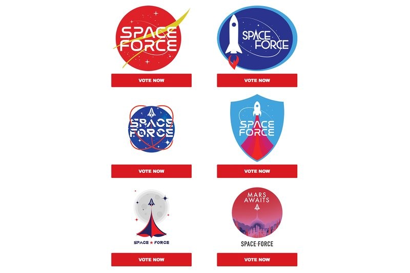
"We need to look past the blatant rip-offs of the NASA logo, the bizarre strapline of 'Mars Awaits,' the ubiquity of stars, rockets and all the other cliché design elements and appreciate that this is all talking directly to the sensibilities of those who will likely strive to have Trump reelected and that it will spur them into action – exactly what good branding should do."
After the announcement of the Space Force proposal, the Trump-Pence 2020 campaign committee emailed supporters asking them to vote on one of six possible logos for the new body. Unlike Nasa’s logo which was crafted by one of its own employees or the US Air Force’s (USAF) logo which was crafted by brand consultancy Siegel+Gale in 2000 after extensive research, the proposed Space Force logos were designed by the Trump-Pence political action committee, likely to encourage merchandise sales among supporters.
Russ Powell, head of marketing, from marketing firm Red Hot Penny says, “In terms of this as an actual exercise in branding, it really is a work of genius. Although this will make anyone with even the remotest idea of branding recoil, it needs to be appreciated that this really isn’t for us marketers or branding experts. Instead this is aimed squarely at those who rock a ‘MAGA’ cap with pride and will no doubt be shelling out for their very own Space Force jump suits, bumper stickers and god-knows-what-other-tat-they-can-bung-a-logo on when the time comes.”
The logos themselves vary in theme. One is essentially the Nasa meatball with a red tint and one simply says ‘Mars Awaits.’ They all, however, have employed elements common to the 1960s Space Age aesthetic. The typefaces used are Nasa-like, all-caps and ‘futuristic.’ The imagery and design elements – bar the meatball copycat – use rocket ships prominently pasted upon star-spattered backdrops. The most Space Age of the bunch, one proposed logo proclaims ‘Mars Awaits’ and evokes the Mars-themed, past sci-fi-inspired visuals of a once-imagined future.
Powell adds, "We need to look past the blatant rip-offs of the NASA logo, the bizarre strapline of 'Mars Awaits,' the ubiquity of stars, rockets and all the other cliché design elements and appreciate that this is all talking directly to the sensibilities of those who will likely strive to have Trump reelected and that it will spur them into action – exactly what good branding should do."
Though Space Force is still only a proposed organisation, the fact that the design of what could be an additional branch of the US military has been done almost haphazardly is concerning.
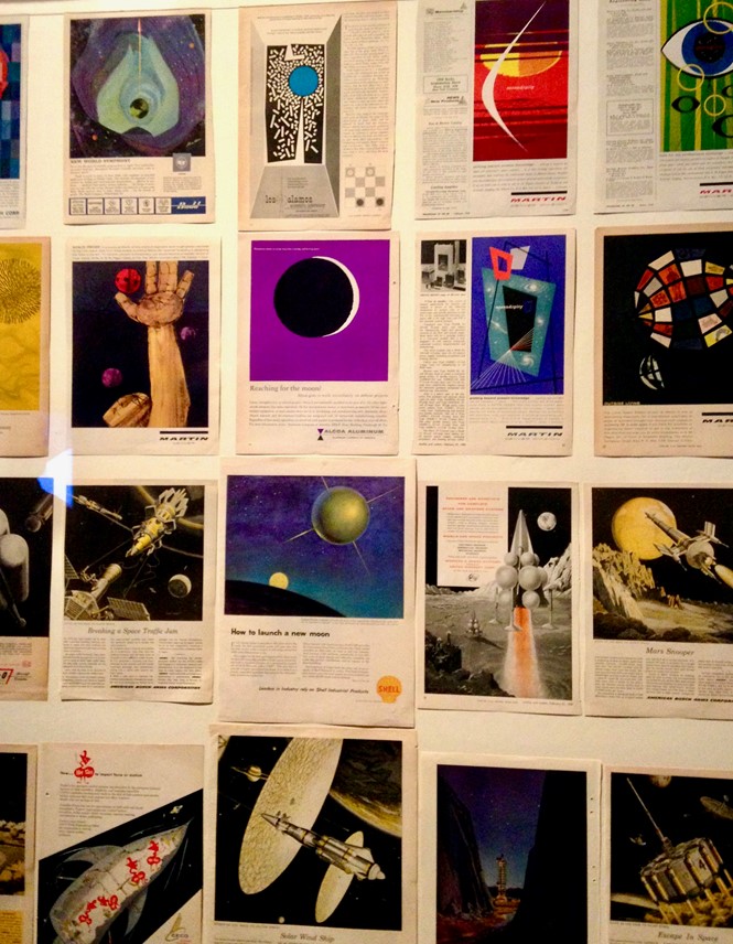
For more on design, communications and branding in space exploration, read ‘21st century space race' in Communicate magazine.
Designing the US Air Force
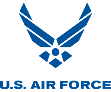
Howard Belk is the CEO and chief creative officer at Siegel+Gale. He discusses the USAF brand identity that was developed by the firm.
What did you have to consider when looking into the Air Force brand project? How did you approach the research?
Immersing ourselves in the United States Air Force identity assignment, we discovered a constellation of strong tribal cultures almost all of which had their own symbols, logos, and uniform patches to which they were passionately loyal. Our mission became clear. We had to articulate and represent one story, one mission, one ideal that the entire institution would fight for.
What do you think was the biggest challenge or biggest success of that project?
We landed on a USAF brand purpose and symbol that united every unit around a single mission. The beauty of the central brand idea No One Comes Close is it acknowledges the elite status of the United States Air Force while summarizing their ultimate mission with powerful simplicity.
The new symbol amplified that simplicity by expressing the heritage, culture, technology and lethal power of that military branch.
What process should anyone developing the brand for a new military branch undertake?
Dig deep into the culture and heritage. Every one of the five branches is unique in that respect. The challenge with the Space Force is there is no existing culture, except perhaps that of Nasa. The challenge there, is Nasa is not a military branch.
What do you think about the way the potential ‘Space Force’ logos were unveiled? What about the design process that went into creating them?
The administration made a mistake unveiling these logos to the public via email rather than doing so from a more official source. That was compounded by turning the selection into a popular vote, and a lead message from the agency that the first visible action of the new endeavor will be the sale of merchandise. It needlessly commercializes something that purports to be much more serious.


