Rebrand for Czech Ice Hockey reflects national identity
Ice hockey, the Czech Republic’s national sport, has been embedded in Czech culture for over 100 years. In preparation for the upcoming season, the governing body of ice hockey in the Czech Republic and one of the founding members of the International Ice Hockey Federation, Czech Ice Hockey, has partnered with Prague-based design agency Go4Gold to unveil a new name as well as introduce a dynamic visual identity.
As a hallmark of Czech modern national identity, Czech Ice Hockey, formerly known as the Czech Ice Hockey Association, represents and regulates both the men’s and women’s national ice hockey teams. After 110 years of representing the Czech Republic in international competitions, the redesign has been long overdue.
The former logo employed the flag of the Czech Republic as the focal point of its design, but the new logo, designed by Czech logo designer Tomas Vachuda, uses the country’s official symbol – the lion – for inspiration. Based on the colours of the Czech national flag, the logo sports red, white and blue and features grey shading to resemble the colour of ice. Mirroring the Czech coat of arms, the lion wears a crown, and the six tips in the lion’s mane embody the six hockey players on the ice. The lion’s mouth hides a tiny hockey puck, while the shape of its eye pays tribute to the Štvanice Island in Prague, where Czechoslovakia won its first world title in 1947.
In contrast to the former logo, an image of a hockey stick reflecting a Czech flag on the ice, the redesign is a more distinct and straightforward visual as well as conceptual expression of the Czech Republic’s relationship with ice hockey. As the Americanisation of European sports logos grows more popular, European organisations are following suit and testing what works and what doesn’t. By redesigning its brand, Czech Ice Hockey triumphs in maintaining a sense of national heritage while adopting a bright and modern visual identity.
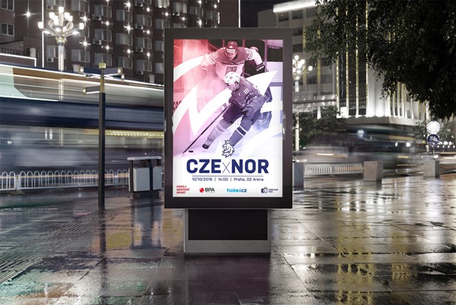
As a self-contained unit, the lion head functions as an adaptable icon that can be featured across a variety of mediums. The new logo has already been unveiled through marketing tools such as merchandise that hockey fans can wear in support of the team and eye-catching advertisements that feature duotone gradient action photos.
For more from Transform magazine, follow us on Twitter @Transformsays


