Dead Sea beauty products reinvigorated by updated positioning
Skincare products from the Dead Sea are some of the most sought after in the world. The industry is a major one for Israel and Jordan – which both border one of the saltiest seas in the world. One of the industry leaders, Israeli brand Ahava, is working to change the perception of the Israeli beauty industry as a whole.
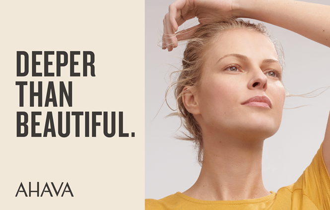
It worked with beauty specialist and New York agency School House to go deeper. The new strapline, ‘Deeper than beautiful’ represent’s the brand’s new positioning. The new brand includes updated visuals as well, but the key for Ahava was a shift in tone of voice that helps the brand regain relevancy in a more competitive sector.
The challenge Ahava faced in terms of its positioning was that, despite its decades-long heritage, it wasn’t perceived as a prestige brand. However, natural beauty products have never been more popular. Using that angle in the brand messaging has reinvigorated Ahava’s brand, allowing for a more luxurious visual identity and a more modern tone of voice.
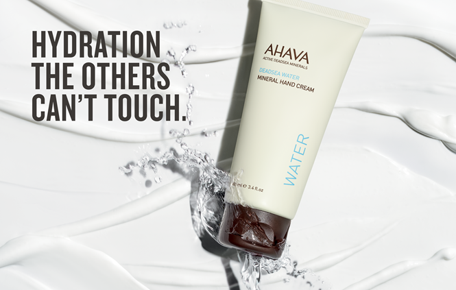
School House used Ahava’s Israeli origins to its benefit by focusing on all that is beautiful within the nation. The resulting copy style isn’t quite humorous, but uses a subtle play on words and a clarity of tone to communicate with modern consumers.
“Ahava presented us with the opportunity to take a brand with strong roots in its heritage and transform it into a successful and culturally meaningful player in the beauty space. Our goal was to have Ahava disrupt the industry by being itself,” says Christopher Skinner, founder and principal of School House. “Through the implementation of refreshed messaging, branding, packaging and social content, we’ve positioned Ahava to become a bridge between where consumers are and where they want to go, allowing them to connect with consumers on an elevated common ground. In our partnership with the Ahava brand, we will tell these strong narratives through advocates in the media and the digital space.”
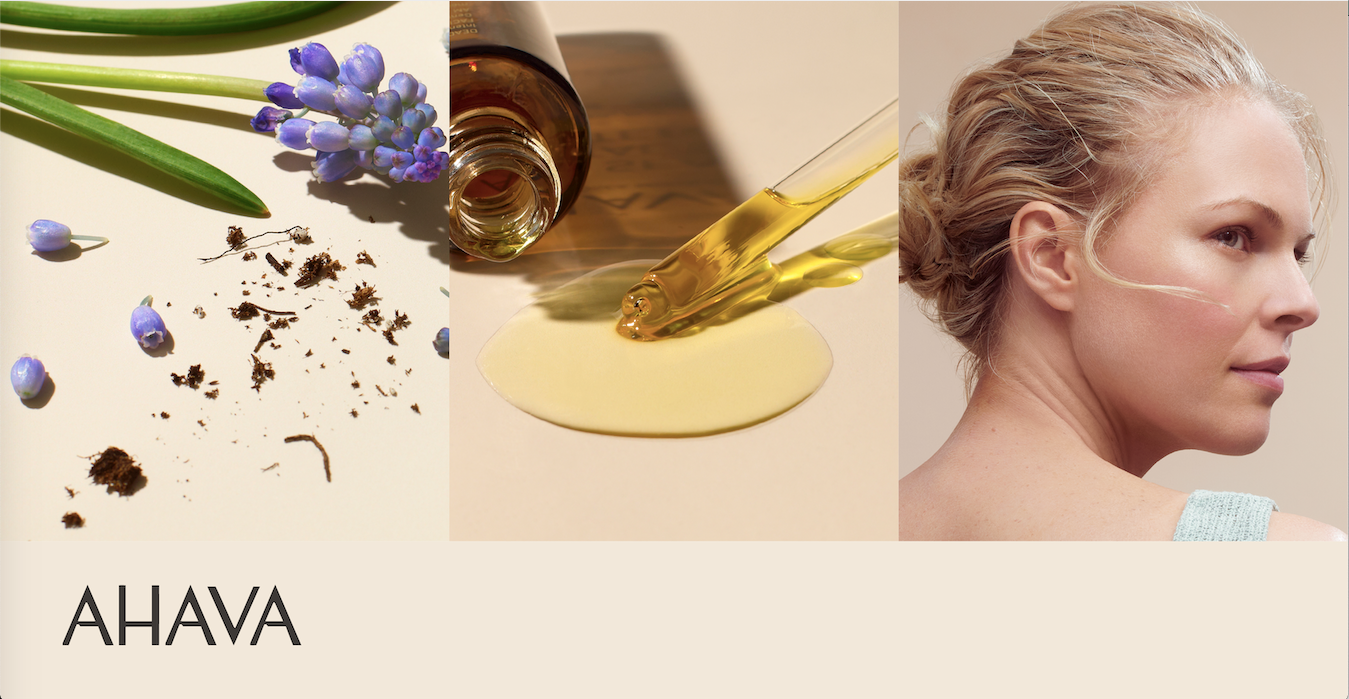
The visual identity reflects that brand positioning by focusing on the ingredients. Photography uses a mostly taupe palette, complemented by the colours of the natural ingredients themselves. The taupe helps highlight the Dead Sea’s location in the Levantine desert while the vibrant colours offered by each ingredient allow for a luxury-like tone to be set visually.
The resulting packaging is simple and stylish, with the feel of a high-end department store beauty counter’s products. It’s a welcome update from the previous packaging system that relied more on gradients and colour patterns and featured more copy on the pack.


