#TransformTuesday: 6 November

Every week, Transform examines recent rebrands and updated visual identities. This week's picks are below. For more from #TransformTuesday, follow @Transformsays.
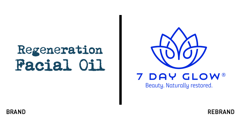
7 day glow
Beauty is one of the most competitive sectors, with thousands of products produced every day. To differentiate itself from the mass, Regeneration Facial Oil, a product developed by Wisconsin-based firm Brown Barn Botanicals has rebranded, changing its name to 7 Day Glow. The brand makeover has been designed from DBD International and the new name is in the context of the brand’s overall repositioning, which states that it no longer ‘sells a product or service,’ but instead, sells ‘the transformation the brand makes possible.’ With a new strapline reading ‘Beauty. Naturally restored,’ the new brand focuses on the natural ingredients in each of the products. The new logo features a different, more vibrant shade of blue. Brand design agency DBD International removed the vintage pharmacy-like packaging, replacing it with a clean and simple logo that consists of an abstract illustration of a lotus flower, accompanied by a wordmark that is written in a simpler typeface that offers a better on screen translation than the previous one.
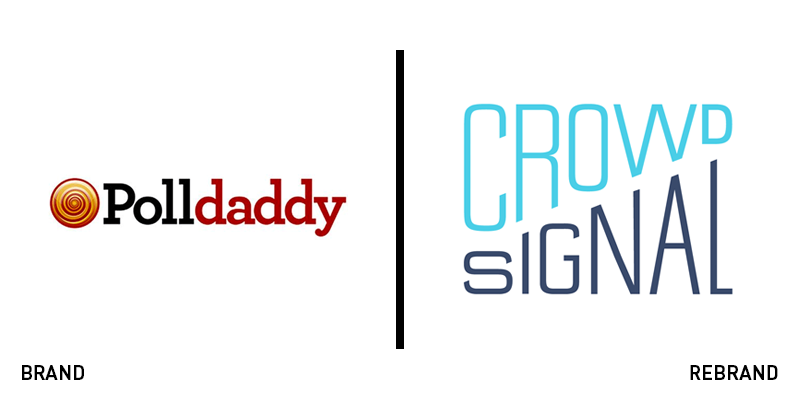
Crowdsignal
Polldaddy, the portal that allows for the creation and management of polls and ratings from within the WordPress dashboard, has adopted a more mature name, Crowdsignal. The new website that was developed sports an updated design with few drastic changes in an effort to avoid confusing its loyal following. Ensuring a smooth transition into the new era, the website has essentially kept all the same features and functions, with the dashboard remaining the same, along with the editing tools for polls, surveys, quizzes and ratings. Instead, the changes have been focused on the brand’s visual identity such as the colour palette, which has shifted from red and black to a light shade of blue with black, and the logo, which now has a contemporary, geometric look, straying away from the previous, outdated wordmark.
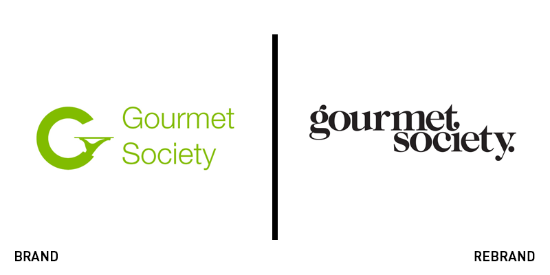
gourmet society
The Dining Club Group’s premium discount dining brand, gourmet society, has rebranded.. The new brand was designed by London-based independent creative and communications agency Leagas Delaney, with the aim of creating a brand that is modern and sophisticated. The new brand remains minimalist both in its visuals and its expression, while reflecting gourmet society’s determination to deliver on its promise of offering the ultimate dinning experience at an affordable price. The new logo is cleaner and simpler than its predecessor, with a wider kerning between the letters, a black colour palette and an all lowercase typeface.
Anwar Sultan, CMO of the Dining Club Group, says, “We are confident that our new gourmet society brand identity will resonate with both our potential and existing gourmet society members who will notice a more sophisticated look and feel through all communications, especially the gourmet society website and mobile app, making it easier for our members to make fantastic savings.”

Newgate Communications
Communication agency Redleaf Communications, Porta Communications’ subsidiary, has been integrated into its global strategic communications agency, Newgate Communications, now continuing to work under that brand. The self-explanatory logo illustrating an abstract image of a red leaf has been left behind, with the company adopting Newgate Communications logo, which consists of a black and purple colour palette and an smoke-like illustration above the wordmark, which is written in a simple, sans-serif font.
Newgate’s CEO, Emma Kane, says, “Under one brand we are able to reflect the unity and consistency of services whether we are operating locally, nationally or internationally; whatever we are doing for our client, it is one organisation, committed to excellence. I am incredibly proud of everything that the team has achieved to date and very motivated by the immense opportunity we have going forwards.”
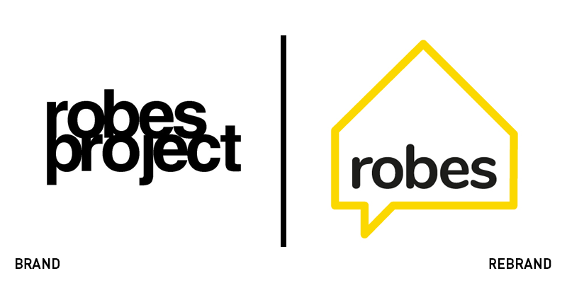
Robes
South London-based homeless charity Robes has been rebranded by creative studio me&dave, with the goal of driving investments, in order to continue its work of helping homeless people on the streets of London. The rebrand coincides with the charity’s 10th birthday. Me&dave created a brand identity that is playful and friendly, using a bright shade of yellow, to communicate Robes’ message and purpose to potential volunteers and corporate sponsors. The name ‘Robes Project’ was shortened to ‘Robes,’ as the word ‘Project’ implied it was a temporary enterprise. A new logo – a yellow, line drawn house that doubles as a speech bubble – expresses the concept that while Robes provides shelter, it also believes that lifting someone out of homelessness starts with a conversation. The soft font and warm palette express the ‘human’ nature of the charity and bring a sense of compassion and unity to the brand. Me&dave’s creative director, Mark Davis, says, “Robes lacks a big backer and to get one on board it needed to evolve the brand and get noticed. We wanted to communicate what an important charity it is, as well as create a design that would have longevity and be easy to apply across all communications in the future.”


