#TransformTuesday: 21 February
Every week, Transform examines recent rebrands and updated visual identities. This week's selections are below. For more from #TransformTuesday, follow @Transformsays

Bidfood
The ubiquitous UK-based national food wholesaler, previously known as Bidvest Foodservice is, from April 2017, to be known as Bidfood. Although the company only updated its Bidvest 3663 name in mid-2015, its chief executive Andrew Selley says the change further reflects the company’s ongoing vision. Selley says, “When we made the move from Bidvest 3663 to Bidvest Foodservice, we also launched a new mission, vision and employee values, all centring on service excellence and offering the best customer experience in the market. Although our name is changing, these principles and our wider business priorities remain firmly in our focus, and I believe this is a stronger brand for us and for our Bidfood businesses globally.”
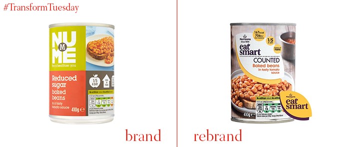
EatSmart
UK-based supermarket chain, Morrisons, has updated the visual identity of its healthy eating range to clarify the brand offering. London-based creative agency, R Design, led the update, most significantly changing the in-store brand name from ‘NuMe’ to ‘EatSmart.’ Reflecting the overall Morrisons brand, of which a new version was released last year, a leaf shape encases the ‘EatSmart’ type. A focus on nature also emphasises the health benefits of Morrisons’ new range. Bright yellow, white and aubergine purple distinguish ‘eat smart’ from other ranges offered by the supermarket and, say founder of R Design, Dave Richmond, lend ‘an earthy tone.’
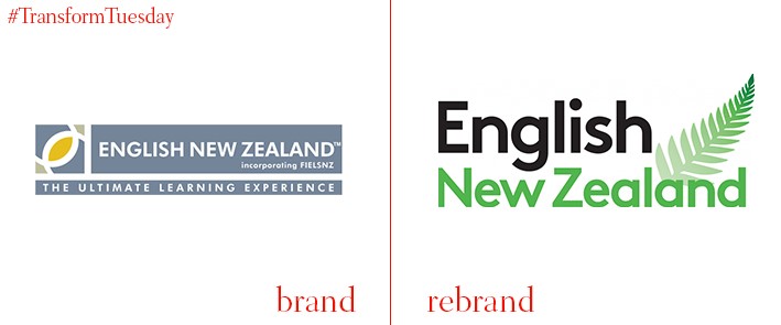
English New Zealand
English New Zealand is an organisation representing 27 high-quality English language schools across New Zealand, all of which offer travel and study to international students. The beginning of 2017 sees English New Zealand simplify its visual identity and align its brand identity across digital and printed materials. Inclusion of a classic fern leaf design on the new logo reflects the organisation’s origins and, says Ewen Mackenzie-Bowie, chairman of English New Zealand, “[The] green reflects the fine environmental experience students can enjoy while learning English in our wonderful country.”
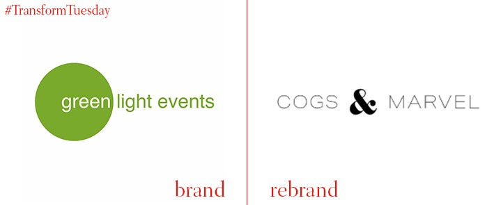
Cogs & Marvel
Ireland-based events company, previously known as Green Light Events, has rebranded, including a name change to Cogs & Marvel. The company will also open a new office in San Francisco, in-keeping with the growth – from 16 to 40 employees – Cogs & Marvel has experienced over the past year. Expansion is part of the events company’s growth plan, which involves establishing a more international presence to reflect its international client base. Co-founder Róisín Callaghan says, “Stronger strategic thinking and creativity is at the heart of our growth ambitions and the rebrand to Cogs & Marvel, which is reflective of our commitment to deliver the ‘how’ and ‘wow’ factor for our client events, is an accelerator that we feel will help us to achieve traction quicker."
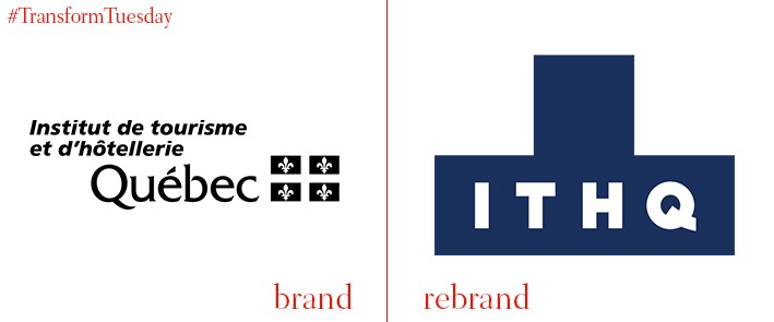
ITHQ
Montreal, the largest municipality in Canada’s Québec province, is home to the Institut de tourisme et d'hôtellerie du Québec (ITHQ). This educational institution, which offers training for the hospitality and tourism sectors, has updated its visual identity and marketing materials. The rebrand, carried out by international advertising agency, lg2boutique, is inspired by the distinctive main building which forms the ITHQ entrance. The architectural symbolism reflects the practical nature of what ITHQ offers; in application, the design resembles puzzle pieces of a jigsaw.
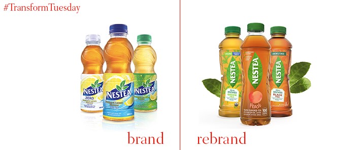
Nestea
To remain relevant in the US’ $4.5bn ready-to-drink tea market, Nestle’s Nestea brand has updated its visual identity and recipe. To quell fears about sugar content and less healthy additional ingredients, the revamped Nestea only has four ingredients and sources its tea from Nilgiri, in the south of India. The new Nestea will also be available in a variety of flavours with an updated packaging, with wider bottle mouths and its ‘clean’ ingredients list citing the biggest update in the brand’s history. Cassin Chaisson, tea marketing director, Nestlé Waters North America, says, "The consumer is at the heart of the new NESTEA. "The thousands we surveyed helped draw the reinvention blueprint for our new look, new bottles, the reformulation of our fruit-flavoured line and the introduction of our real-brewed range."


