Brushing up big data
Celebrated as one of the most influential figures in modern science, Alan Turing once wrote of himself, “I’m afraid that the following syllogism may be used by some in the future. Turing believes machines think. Turing lies with men. Therefore machines do not think.” Over half a century later, both his beliefs and his crimes absolved, the opening of the Alan Turing Institute solidified a nationwide push to cultivate data sciences in the UK. Its recent rebrand aims to showcase the fruits of forward-thinking.
Founded in 2015, six years after Turing’s public pardon, the institute receives primary funding from the Engineering and Physical Sciences Research Council (EPSRC), as well as the collective involvement of the UK’s top universities, namely Cambridge, Oxford, Edinburgh, UCL and Warwick. Headquartered in the British Library, direct engagement with the Department of Business, Innovation and Skills, as well as the Government Office for Science have centred research as a cornerstone of the institute’s public outlook.
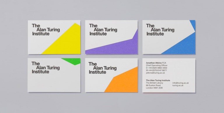
London-based design studio, Red&White, undertook the rebrand with a high degree of consideration for the cultural outreach of the institute, removing masculine connotations of previous imagery and creating an alluring, thought-provoking new visual. The new design incorporates the workings of renowned mathematician Leonardo Bonacci, better known as Fibonacci, and his well-known integer sequence, used in Red&White’s case to underscore the institute’s visuals with a creative and colourful backdrop.
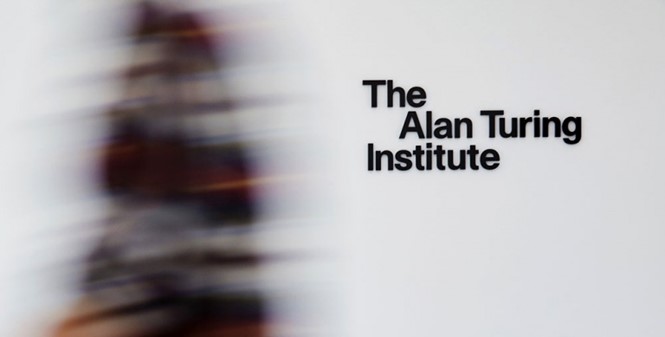
Accompanied by a layered artwork, the rebrand integrates a new, sans-serif Haas Unica typeface into the design, with a varied range of 13 different colours illustrating the rebrand. The formation of the signage shows Turing’s name protruding, an indentation that, for Red&White’s design director, Nima Falatoori, highlights the “pioneering, eccentric” nature of the institution. Falatoori continues, “Alan Turing is a significant figurehead, so we physically moved his name forward to represent the idea of being forward-thinking, making it a bit off-centre represents the way he challenged things around him and looked at things in different ways.”
The new design is set to roll out across the range of online platforms, with marketing materials and wider interior implementation to follow.