#TransformTuesday: 11 July

Every week, Transform examines recent rebrands and updated visual identities. This week's picks are below. For more from #TransformTuesday, follow @Transformsays
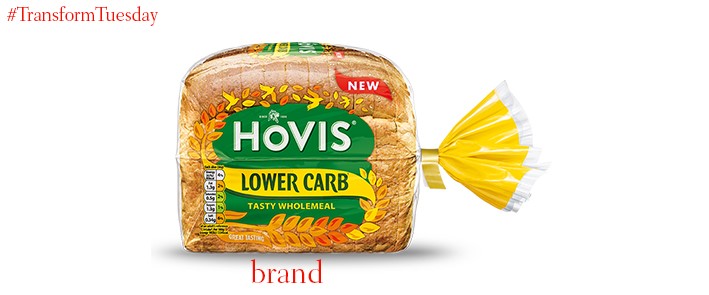
Hovis
A low-carb version of Hovis, one of the UK’s most well-loved bread brands, has been developed by global brand consultancy, Elmwood. Breaking away from the usual tropes of baked goods packaging, Hovis Lower Carb uses a colour palette dominated by yellows and greens to emphasise its updated brand positioning. Elmwood also hopes to standout in a shelf category challenged by increasing numbers of innovative brand developments. Stephanie Oglesby, senior designer at Elmwood, says, “We chose contemporary, vibrant hues to reflect a sense of energy and vitality. Our design embodies the heritage of the Hovis brand, while feeling accessible and appealing to the modern health-conscious consumer within the wider health food world.”
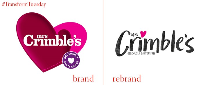
Mrs Crimble’s
Market-leading gluten-free brand, Mrs Crimble’s – owned by Wessanen UK – has released an updated brand identity. Developed by Big Fish, a London-based brand studio specialising in artisan food and drink packaging, its logotype is hand-drawn – lending it a homely, rustic aesthetic. The company hopes to appeal to an even wider audience than it currently enjoys, with a customer-centric brand strategy to highlight its increasing availability as a convenience food brand. Rebecca Vercoe, brand controller at Mrs Crimbles, says, “The new face of Mrs Crimble’s will bring greater interest and visibility to the free-from aisle with much more fixture standout, and will show the world that gluten-free doesn’t have to mean taste-free.”
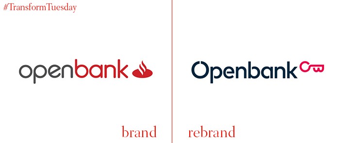
Openbank
Openbank, an online bank launched back in 1995 and based in Spain, has launched a new corporate identity which emphasises its digital credentials. Developed by international design agency Saffron Brand Consultants, the bank – which operated as sub-brand of Santander – has rejected any hint of its parent company’s famous red identity. In fact, its latest visual update includes a personal logo, unique to Openbank. The Openbank project page on Saffron’s website says, “Using the brand initials, we designed a key symbolising openness and opportunity. Combined with its contemporary design, the key has a classic touch, which perfectly supports the concept of distinction Openbank wanted to champion.”
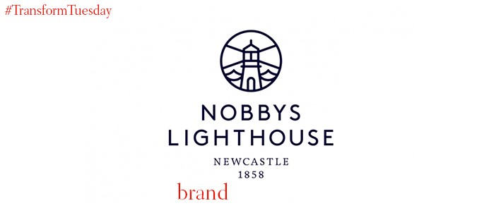
Nobbys Lighthouse
Located on the south side of the entrance to Newcastle Harbour in New South Wales, Australia, Nobbys Lighthouse is a popular spot where families, walkers and travellers alike enjoy its unique views. The destination has recently been gifted a new identity by Newcastle-based brand design agency Shorthand Studio. The agency worked with local business improvement association Newcastle Now to reinvigorate the site and create a visual identity based on the area’s history and unique position. The photography which informs the place brand design was captured by Novocastrian photographer Hannah Rose Robinson.
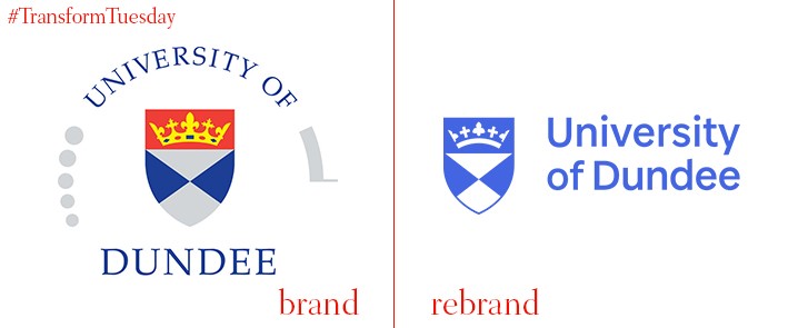
University of Dundee
Scotland-based University of Dundee has released an updated, simplified version of its logo and shield, as well as an updated font for its wordmark. Retaining the minimalistic colour palette, the University of Dundee uses a classic Scottish blue as its leading shade. Says the university, “All colour is emotive, and our colour palette is bright, optimistic and warm – it has been designed to reflect the values, energy and vitality of the University of Dundee.” The update also retains the cross and crown used in its previous iteration, while aligning its motif to the shield’s righthand side. According to the university guideline page, “The wordmark is based on a modified cut of Baxter Sans, the university’s signature brand typeface.”
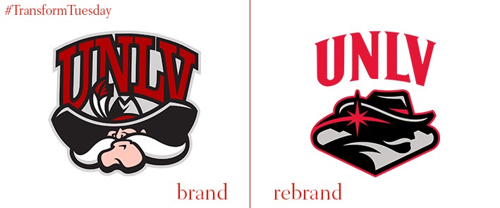
UNLV Rebels
Denver, Colorado-based brand design and communications agency, Adrenalin, has updated the logo and visual identity for the UNLV Rebels, the athletics teams which represents the University of Nevada, Las Vegas. Adrenalin has updated the logo’s iconic ‘Hey Reb!’ moustachioed figure, retaining the scarlet and grey colour scheme with which the athletics teams are synonymous. The agency also includes a nod to the famous ‘Welcome to fabulous Las Vegas!’ sign which greets visitors to the city. Dan Price, president of Adrenalin, says, “The primary driver was modernisation. Our research showed that students and alumni liked the old logo but felt it was a bit dated. We wanted to better tell the story of the university and make the mark unique to UNLV and Las Vegas, with the incorporation of the star and Vegas sign outline a big part of the process.”
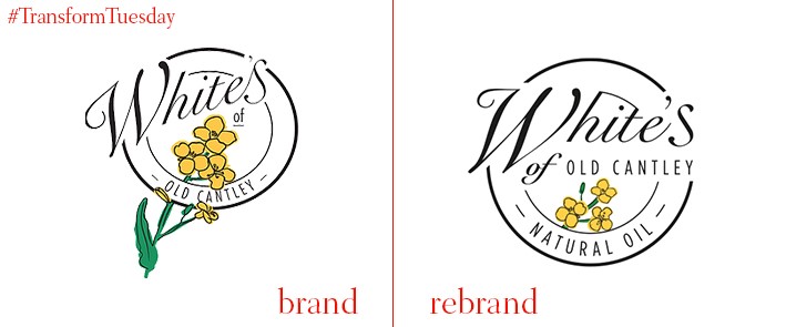
White's of Old Cantley
Doncaster-based farmers, White's of Old Cantley, has been producing rapeseed oil since 2016 – and farming in the UK for five generations. After further diversifying its rapeseed product into oils and lip balms, the White family approached Transform Awards Europe 2017-winning Doncaster-based studio Moirae Creative Agency to develop an identity for its rapeseed products. The result is a packaging design and visual update which reflects the farm’s new, colourful direction. Yet, it also retains the reputation and heritage on which White’s prides itself. Daniel Jones, creative director at Moirae, says, “For the brand mark, we simplified the rapeseed flowers which made the logo considerably less cluttered and much more visually balanced. In terms of packaging design, we [used] a different Pantone reference for each flavour, working closely alongside White’s to select the perfect combination of hues.”


