Danone rebrand communicates sustainability goals
The Danone Manifesto states, “We carry forward our mission to bring health through food to as many people as possible and our dual project for business success and social progress, while reflecting our values of humanism, openness, proximity and enthusiasm.”
Within this manifesto, there are specific convictions, commitments and beliefs the brand had created for itself and for its consumers to follow. The beliefs are put in place to encourage a healthier lifestyle to its consumers and advocate a sustainable future for the planet.
The first step that Danone has taken when tackling this task is to shift the public’s perception of the representation of the brand identity, by redesigning the logo completely. London-based Conran Design Group created the new brand identity for the company.
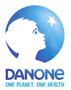
The new brand identity was introduced on 7 July 2017 and will be advocated and enforced from 2018. The redesign had taken place in order to incorporate the brand’s new commitment, “One Planet. One Health”, which is a new sustainable approach of Danone. The approach is designed to encourage its consumers to uptake a more nutritious and “sustainable eating and drinking habits.”
Danone had chosen to pursue this crucial strategy to ensure its consumer’s health is aligned with the company’s own values and legacy. Conran Design Group had been faced with the challenge of redesigning the brand identity into one with a more powerful and significant visual representation, as it encourages the stakeholder and consumer to interconnect with the new sustainable aims of the brand. Conran chose to create the new identity through watercolour and is hand drawn, in order to represent “embracing the earth, water and the planet as a whole and communicating a strong sense of humanity.” The drawn child in the logo has a compelling relationship to the star, which represents the sustainable ambitions the company has for the future. The child in the logo is human like, and is looking upwards, symbolising the ambitions and sustainability goals for the brand.
Since 1972, Danone had maintained a similar logo and brand identity. The classic company name written in white with the blue background in the middle of a rectangular-like shape. This drastic change in design presents how serious and determined Danone is in completing their given goal and their serious concern for sustainability and a healthy lifestyle for their consumers and stakeholders.


