#TransformTuesday: 05 September
Every week, Transform examines recent rebrands and updated visual identities. This week's picks are below. For more from #TransformTuesday, follow @Transformsays
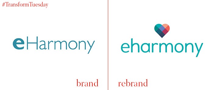
eHarmony
Launched in California in 2000, eHarmony was part of the early twentieth century online dating boom which is now an enduring feature of many modern relationships. Yet, in the face of increasing competition from mobile apps such as Tinder and Bumble, the more traditional set-up of eHarmony required an overhaul which includes a new visual identity and logo. With a focus on long-term relationships, the eHarmony brand overhaul sees the adoption of a more classic colour palette and heart imagery – a departure from the bright, flirtatious aesthetics of its competitors. Carried out by the company’s in-house team, the rebrand is based on the concept of its users ‘[making] better dating choices.’
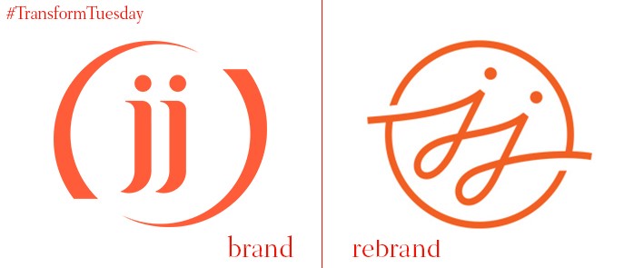
JJ Media Group
Following on from a rebrand in 2012, London-based location agency JJ Media Group has recently announced the consolidation of its product service divisions under the parent company brand. The restructure, which includes JJ Media Group’s location, events, studios and equipment services, reflects the more integrated nature of UK media offerings and poises the group for expansion into international markets. Josh Jones, CEO at JJ Media Group, says, “It takes a new type of production service company to cater to a new type of media landscape. The best way for brands to emotionally connect with audiences is through meaningful content. But for the new content economy to thrive, each element of the production process must be carefully aligned and happen at scale.”
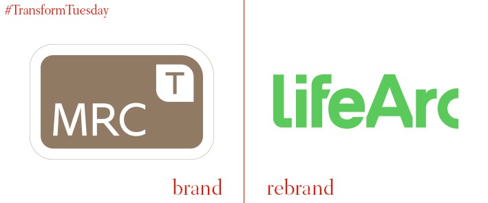
LifeArc
Strategic brand consultancy BrandPie has revealed a total rebrand for lifeArc, a London-based patient-centred charity with a global outlook. Previously known as MRC Technology, the organisation began life as the technology transfer and commercialisation division of the UK’s Medical Research Council. It was established as an independent charity in 2000. The new name and identity for lifeArc aims to reflect its future-focused proposition and dedication to delivering better patient outcomes at all stages of the medical process. Jonathan McGee, head of marketing and communications at lifeArc, says, “To move from a brand aligned for over 25 years with as well-known a heritage as the UK’s Medical Research Council, to one that had independence and kudos, had to be manged very carefully. BrandPie helped us get multiple stakeholders, on board with the new invigorated purpose, name and identity resulting in a highly impactful launch of the new brand.”
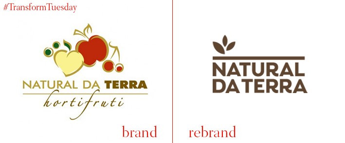
Natural da Terra
In a bid to realise its plans for expansion, São Paulo, Brazil-based premium grocery chain store Natural da Terra has updated its visual identity. In a project led by global brand studio Futurebrand, the store has dropped its busy logo, which included a mixture of images and fonts, as well as the name of its parent company ‘Hortifruiti.’ Instead, Futurebrand has developed a logotype with a more corporate aesthetic with a focus on the store’s brand name; its accompanying image is informed by the brand slogan ‘Life can be natural.’ Natural da Terra’s new identity focuses on the fresh produce and meal options Natural da Terra offers. Futurebrand says, “With the chosen brand in hands, it was necessary to evolve its positioning, integrating the values of both operations. The new positioning inspired a new identity as well as a new shopping experience — from products offer to the store’s environment, from different services to a new visual communication.”
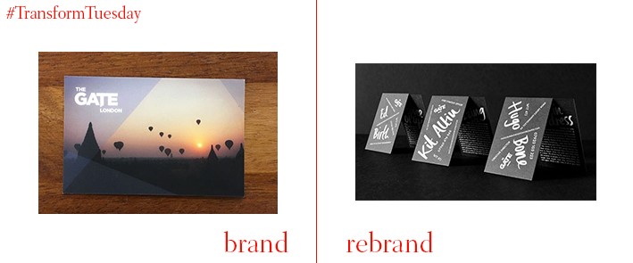
The Gate
London-based advertising agency the Gate has unveiled a new design for its employee business cards following a brief, given by executive creative director Beri Cheetham, to the agency’s in-house creative team. The illustrations, created by designer Ricky Richards, reflect and celebrate the individual personalities which see the Gate driven by the enthusiasm of its employees. Richards says, “People say that business cards are defunct. The previous branding was jaded, ubiquitous and didn’t have a point of view or reflect the company’s energy, spirit and culture. It was far from offensive, just unremarkable and instantly forgettable. I wanted to handcraft every card in a way that represented every individual’s personality, making each one unique and remarkable.”
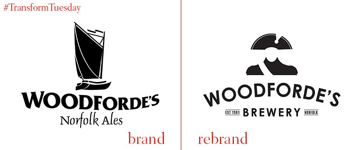
Woodforde’s
Norwich, UK-based brewery Woodforde’s has launched a new visual identity in which Britain’s most revered naval officer, Admiral Lord Nelson, has a starring role. With Nelson hailing from the Norfolk area, sometimes referred to as Nelson’s Country, the ties between the naval officer and the brewery’s location is strong. The rebrand follows the brewery’s takeover by James Hughes and Nick Dolan in early 2016, who are also in the process of widening Woodforde’s distribution and image. Chief executive of Woodforde’s, James Hughes, says, “We wanted to develop a strong identity for the vibrant beer market. We have built a loyal following across the region and this new contemporary look which includes the Nelson silhouette has its roots in Norfolk. The rebrand is integral to our strategy to build an even stronger national profile and replaces the Norfolk Wherry boat.”
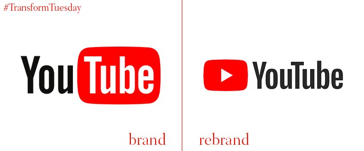
YouTube
Back in May, global video sharing platform YouTube released its latest brand typeface, YouTube Sans. Now the site has announced the next stage in its brand evolution. Its visual identity update is the first logo change in 12 years, dropping the television shape – which for so long encased the ‘Tube’ part of the brand name – in favour of a more flexible ‘play’ button. At the centre of YouTube’s brand update is its user experience which, with output on an ever-growing number of platforms and increasing competition from the likes of Snapchat and Instagram, needs to ensure it remains ahead of the curve. YouTube’s official blog says, “Designed for our multi-screen world, the updated logo combines a cleaned-up version of the YouTube wordmark and icon, creating a more flexible design that works better across a variety of devices, even on the tiniest screens… you can use the brightened-up icon as an abbreviated logo, which will be seen more easily and read more clearly.”


