Quenching the thirst
Following a September rebrand, Lucozade has pursued a new strategy in terms of its packaging design. We look back at Ash Sandys' reporting on the Lucozade rebrand, and speak with James Harmer about the new packaging outlook for the sports drink
By Ash Sandys
Since its launch in 1990, Lucozade Sport has dominated the market for sports drinks in the UK. Now, in the face of stiff competition and a more health conscious market, it has undergone the biggest rebrand of its 25-year history.
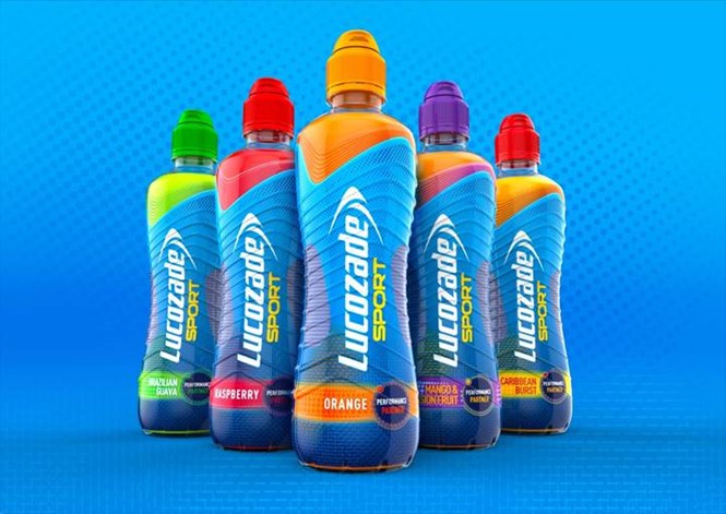
Independent London-based design agency, Bloom, has designed the new identity and packaging for the fruit-flavoured isotonic drink. New features include a modern, colour-centric design and a new bottle shape.
In a reaction to the growth of a more calorie-conscious consumer market, Lucozade Sport Lite has also renamed to Lucozade Sport Low-cal.
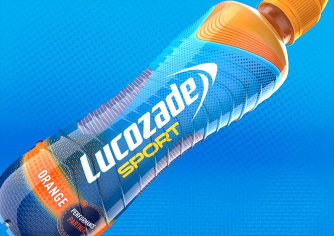
The new products feature a range of brightly coloured lids to make the drink’s flavour easily distinguishable. This is in contrast to its previous iteration, where it was claimed by some that neither the colour or flavour of the drink was immediately apparent.
Lucozade worked with Touch Packaging Innovation to redesign the packaging for Lucozade Sport. The new bottle is inteded to blend into the existing line of products while still ensuring it will meet consumers' needs.
By James Harmer, strategic planning director, Touch Packaging Innovation
A rebranding brief is often met with a sense of anticipation and excitement. Taking a brand icon and enhancing it, with a flourish of creativity is a regular occurrence.
However, it is more infrequent for an agency to leave their finger print indelibly on the physical pack for all to see. Yet this is what we did when re-designing Lucozade Sport’s physical bottle structure. Our aim was to create a 3D embodiment of a refreshed modern dynamic sporting icon and a breakthrough bottle innovation for Lucozade Ribena Suntory.
Joining up the dots between the brand teams and the technical teams is a balancing act, particularly when it comes to brand identity development that crosses over into technical innovation. Typically, a design agency will work directly with the marketing team, who own the brief for a brand identity redesign. However, we always request input from client representatives across the total supply chain, to better understand the opportunities and barriers when physical changes to the pack are involved, as part of a total brand refresh.
Good practice for 3D Brand identity is also deeply rooted in understanding people’s interaction with a brand. Physical ‘touch’ is one of the most underleveraged yet important senses in helping to tell a brand story. In the case of Lucozade Sport a major aspect of the brief was making sure the new bottle would stand out from the crowd with a new physical presence on shelf. In order to do this, we conducted ethnographic research to see how the previous design ‘performed’ both consciously and unconsciously in the hands of sporting consumers. By digging into usage behaviour and HOW the bottle performed, we were able to marry the needs of a visually distinctive redesign to generate an emotional consumer response to the brand, with the functional needs of the target consumer and the ‘relationship’ they wanted to have with the physical bottle.
As a result, the bottle identity symbiotically integrates the new textural grip with the brand pattern that plays across the bottle’s surface. This created an iconic visual identity for the brand that simultaneously functions as a ‘slip-free’ grip texture. The appealing interplay between the graphics and structure helped Lucozade standout from the crowd as a visually and physically holistic rebrand to great effect.
The result is a rebranded bottle that is both stronger and lighter, and has driven purchase intent up by 10%.


