F1 introduces first new visual identity since 1993
When Formula One introduced its ‘flying one’ logo, designed in 1987 by London-based agency, Carter Wong, as its official trademark at the start of the 1993 season, the sport was beginning to revolutionise. The widespread use of technology, perhaps best seen in the rapid development of its cars, was starting to further implement itself across global circuits. Its most decorated driver, Alain Prost, was preparing to hand over his throne to the already seasoned Ayrton Senna, and as brand sponsorship liveries took on more zest and detail, the ‘90s were set to become a defining decade for the Formula One brand.
In recent years, Formula One’s revenue streams have ballooned. Its 2017 turnover is estimated at over £1.3bn, with underlying revenues at approximately £1bn. Last year’s £3.3bn acquisition by the Liberty Media Corporation signified a new era for Formula One racing, and as blue-chip companies continue to renew partnerships, brand exposure is at the forefront of the sport.
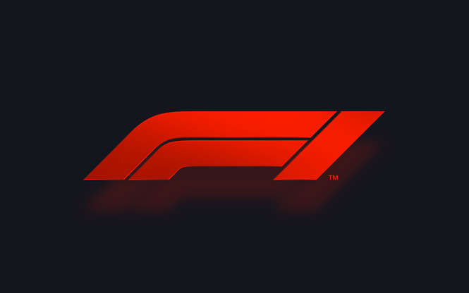
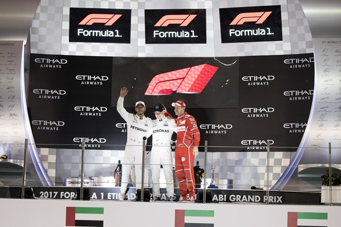
This month, as the close of the Etihad Abu Dhabi Grand Prix marks the end of the 2017 season, Formula One revealed its new visual identity, the first for 23 years, designed by creative advertising agency, Wielden+Kennedy. The new identity comes as fanbase feedback expressed that the sport was ‘impenetrable’, with many followers commenting that the previous identity didn’t reflect the exhilarating nature of the sport.
Ellie Norman, director of marketing at Formula One, says, “It was clear we were going to need to address some fundamentals of our brand, if we were to realise our ambition to make Formula 1 a major entertainment player and claim our rights to be the global media brand we should be. What we say and do now is so important for our future, but it must always be driven by our fans. They come first.”
The new logo aims to capture the frenetic and unpredictable features of the sport, symbolically portrayed in its widened aspects and ‘modern-retro’ aesthetic. A neon-orange colour palette compliments the reworked wordmark, introducing a new typeface with several variations.
Richard Turley, executive creative director at Wielden+Kennedy, says, “The new mark aims to embody the core forces of Formula 1 racing: speed, attack, and control; while its sleek, sharp interlocking components celebrate the technical prowess of Formula One engineering teams.”
With the 2018 season set to begin on 25 March in Australia, fans can look forward to widespread rollout across 20 other circuits throughout the year.
Carter Wong designed the previous F1 brand, 23 years ago, and will be sad to say goodbye. But the time is right for a change, says Sarah Turner

After 23 years in place, the logo we designed for Formula 1 has been changed for a new generation. While we’ll be sad to see it go, F1 has been a brilliant project to be associated with and will always remain a part of our history.
Without embracing the new, there would have been no renaissance, no modern art movement, no great modern architecture in the world, no new branding – so we are proud of the past, but look forward to an equally successful future.
We’ve been amazed by the outpouring of passion and support from the design community and F1 fans following the announcement this weekend. It’s brilliant to see that after over two decades in pole position, the brand mark still inspires such a strong response.
We’re in the business of rebranding and, while we’re sorry to say goodbye to the logo, 23 years on the podium is something we’re so pleased to have achieved. Without the willingness to embrace change, we’d all be out of work.
Carter Wong wish the rebrand well and look forward to seeing how it rolls out across the different F1 platforms.
Sarah Turner is managing director at Carter Wong


