Classic British tea and coffee brand unveils art-focused rebrand

Homes and offices across the UK probably have a box of Yorkshire Tea stashed in their cupboards. With a market share of 21.7%, it is a challenger brand making headway against industry stalwarts, PG Tips and Twinings. But Yorkshire Tea is just one of many brands owned by Taylors of Harrogate. The tea and coffee purveyor, part of Bettys and Taylors, has been a family business since 1919.
The business’ many brands had evolved distinct identities over the years, with few linkages between them or to the overall Taylors of Harrogate brand. “We make a lot of different products for lots of different people and they might not connect the dots and know that it’s all Taylors of Harrogate,” says marketing director Dom Dwight. Without a strong central brand, Yorkshire Tea drinkers did not, for example, recognise that Taylors Rich Italian coffee or Taylors extensive range of herbal teas were produced by the same company. To address this, Taylor’s worked with packaging design firm Pearlfisher to refocus the brand.
In research, Dwight and Pearlfisher found that Taylors was communicating about and for its tea and coffee lines separately; there was no unifying communications strategy. “We needed to find a coherent central idea that Taylors could be centred around,” Dwight says. That idea became ‘extraordinary flavour’ and the notion of craftsmanship.
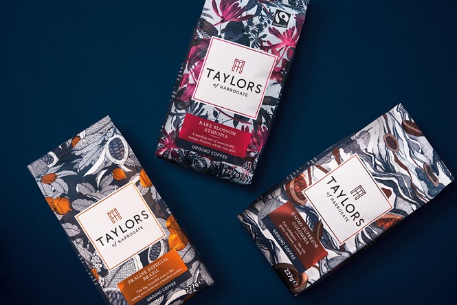
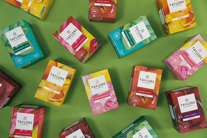
“Packaging is our major touchpoint, so getting that to express who we are is important,” Dwight adds. For that reason, packaging became the primary communicator for the new brand. Redesigning the Taylors logo was the first step. By adding in an icon shaped like a Georgian window and enclosing the whole thing in a large white square on every pack, Pearlfisher put the Taylors brand at the heart of everything. The coffee and tea packs were then reimagined.
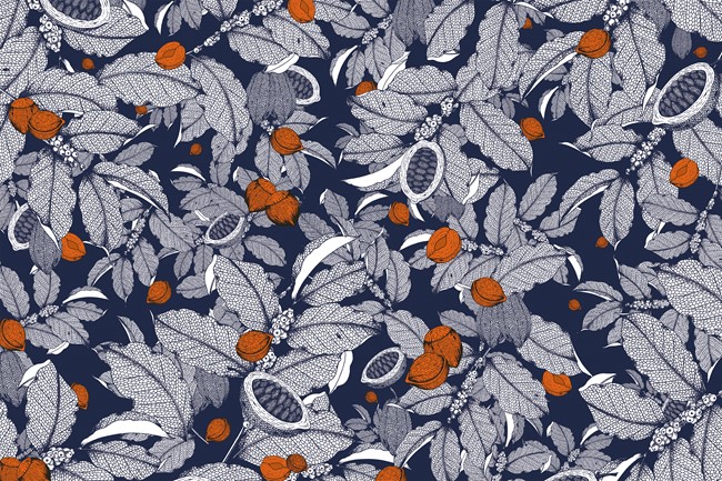
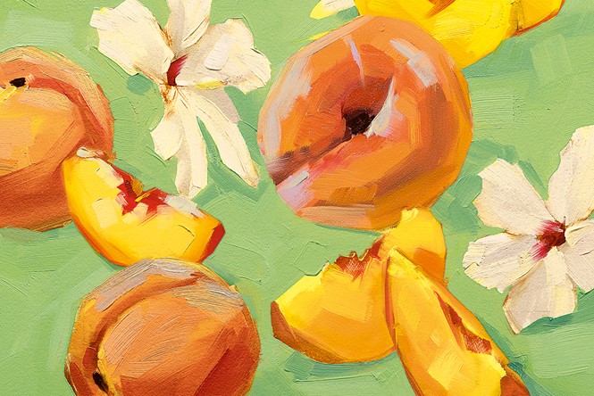
A brief was sent out for each of the four main product categories – coffee, premium coffee, fruit & herbal tea and green tea – to artists around the world. They were tasked with creating artwork that would become the new packaging. For the coffee brands, a Japanese artist took notions from travel imagery and created colourful, lively scenes reflecting the coffees’ places of origin – including a Brazilian street carnival, a winding Italian lane and a fiery, frothing volcano. Another used highly detailed pencil drawings to reflect the intricate level of craftsmanship present in Taylors premium coffees origins.
But with a century of heritage behind it, Taylors could not completely reinvent itself. Instead, the brand has blended history with modernity. Coffee, says Dwight, is still a difficult to understand category for many consumers, so the Lazy Sunday brand, for one, is still approachable and easily understandable. The logo too, blends old and new as it blends a touch of art deco with an elegant, modern approach.
The next steps will be to roll the new packaging out, update the websites and then embark on a refreshed communications strategy as a single Taylors of Harrogate. “We have to make our primary contact with the world live up to what we say to the world,” Dwight says. From there, Taylors can further expand its repertoire of brand communications to enhance its reach toward new audiences.
Jonathan Ford, founding partner and CEO of Pearlfisher, adds, “We’ve worked in partnership with Taylors of Harrogate for almost a decade and we’re genuinely excited to have helped define the future direction for such an iconic British brand. By revising the brand’s focus from ‘craft’ – which has become a jaded concept in almost every category – to ‘craftsmanship’, we’ve brought the Taylors story of artistry, ‘makery’ and innovation to the fore with clarity and confidence. We commissioned artists from far-flung corners of the world to create the beautiful illustrations upon which the new aesthetics for each range are based, and couldn’t be happier with the final designs - considered yet contemporary, traditional yet progressive, just like Taylors of Harrogate itself."