Kan to reposition public broadcasting

Public broadcasting companies can become the flag bearers for the sharing of culture and the development of excellent entertainment. From the BBC in the UK to PBS in the US or Qatar’s recently-controversial Al Jazeera, public broadcasters set the tone for the national news agenda.
In Israel, a new broadcast service brought into being on 15 May signalled a new era not only for broadcasting, but for the brand. The new Israeli Public Broadcasting Corporation (IPBC) was founded to promote Israeli culture, education and Hebrew language programming, among other ambitions. Alongside the new mission is a new brand. It is to be a reformation of the previous Israel Broadcasting Authority and is named Kan.
Tel Aviv-based branding agency Firma crafted an organisation-wide brand that is applied to Kan’s suite of channels and genres. The agency writes, “We began the branding process hand in hand with the forming of the new organisation, mutually shaping its vision, actions and character.” This allowed Firma to develop the brand around the content itself. Kan, Firma says, was designed to be free from governmental or economic pressure and free from the conventions in public broadcasting, "It's all about quality and accessibility: great entertaining, educating and informing content, for everyone in every way they wish to have it"
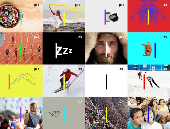
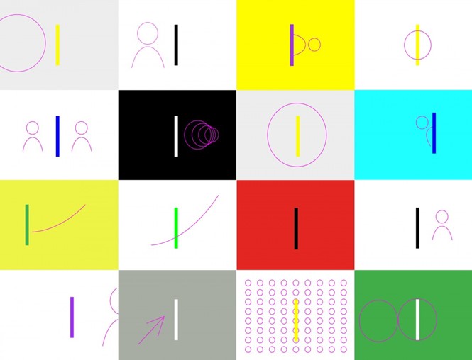
The new brand is flexible and colourful, able to be applied across any of the relevant communications channels. But, it is based around a core wordmark made up of a line representing the Hebrew letter nun, followed by – left to right, though it is read in the opposite direction in Hebrew – the letters alef and kaf. Sub-brands have their own versions of the logo in lockup with the main wordmark.
Visually, the brand is complex and interesting as it deploys imagery from the range of programming and uses nearly neon blue, green and pink to accent the primarily monochrome logo. Unlike many broadcasters’ trend toward on-air idents that adapt to the pictures on screen (a la ITV) or are semi-transparent, the Kan branding uses the stark line of the nun to bring the identity to life and unify all its assets.
“The logo and the base for the whole language is simple: a line, where everything begins. In the loud, pompous media brand environment, this line stands out as self-assured, fresh, free and unique,” says Firma. “This very complex work resulted in a very simple, accessible and attractive language, representing the true revolution for the benefit of the public itself.”
Firma also developed the name for the new venture, deciding upon Kan – meaning ‘here’ – as a way to unify the sub-brands, activities and language used by the broadcaster.