#TransformTuesday: 31 May

Every week, Transform examines recent rebrands and updated visual identities. This week's picks are below. For more from #TransformTuesday, follow @Transformsays
A competition open to any Romania-based football clubs, regardless of league position, the visual identity accompanying the Romanian Football Cup, or Cupa României, has been updated by international brand strategy and design agency, Brandient. Following new leadership of the Romanian Football Federation, the decision was taken to make the Cupa României brand design reflect its community-oriented credentials. Given the role it plays in encouraging and supporting grassroots talent, a brand positioning was needed which eschewed an entirely corporate identity. Incorporating the national colours of bright red, yellow and blue, two eagles - also a national symbol - adorne either side of the logo, emulating the power of football. An iteration of the iconic cup itself is incorporated into a heart which symbolises ‘The heart of Romanian football’.
Global brand consultancy Industry has undertaken an extensive brand refresh of the body previously known as the Institute of Advanced Motorists. Now termed IAM RoadSmart, the rebrand was carried out to extend the appeal of the IAM and its advanced driving courses to a broader demographic, including women and younger drivers. Its new visual identity is based on a winding road image, to symbolise progression. The bright, blue and grey colour palette, unique to the motoring space, is implemented to simulate the joy and appeal associated with safe driving – its previous red scheme was, while eye-catching, perhaps slightly alarming to inexperienced drivers.
Online travel agency Skypicker has rebranded to be known as Kiwi.com, in a relaunch simultaneous with the company’s redesigned website. By developing a unique algorithm, the Czech Republic-based start-up is able to compare and identify the cheapest flights for its customers. A refined visual identity symbolises the company’s growing maturity and sophistication, reflecting the aim of Kiwi.com to be regarded as a ‘beacon of light’. Making the rounded, bold font consistently spaced across the entire brand name ensures a more assertive presence for the brand, in a market where competition is fierce.
BrewDog, the craft brewery which revolutionised the alcohol market through its crowdfunding approach to investment, had unveiled a new arm to its business. In a move away from its usual beers and ales, BrewDog Lone Wolf concentrates on spirits, specifically gin, whisky and vodka; a new distillery at its Scotland headquarters has been designed to ensure all products are made entirely from scratch. A visual identity has been created to accompany the Lone Wolf brand arm, with transparency and innovation at its heart. Designed by London-based studio B&B, its raw and energetic components, developed to convey the BrewDog brand message, will form the basis for branded product designs. These are set to be launched towards the end of 2016.

Based in White City, London, Queens Park Rangers – known as QPR – is a British football club with a long history. Since 1953, the club has undergone five changes to its visual identity, with the most recent, spanning 2008 – 2016, styled in the vein of a traditional football club emblem. Encompassing visual cues, football allusions, and the club’s heritage among others, QPR fans Dan Bowyer and Daniel Norris have refreshed the club’s look for the contemporary league. Its new iteration is simplified, retaining the same white and blue colour scheme in a more clean-cut format. Gone is the intricate silver detailing around the text exterior, replaced with a roundel bearing the QPR name. Designed with interlinked letters, the unity between the football club and its fans is a theme very much prominent in this redesign.
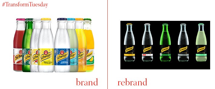
Iconic beverage brand Schweppes has been selling carbonated water since 1783. To highlight its brand heritage and affirm the drinks manufacturer as a strong contender in an ever-more diverse market, Bristol-based creative design agency Epoch Design has rebranded its packaging. With a black colour palette in place to reinforce it sophisticated credentials, the design differentiates Schweppes from its own-brand competitors. Epoch Design has retained Schweppes’ iconic yellow accent, upon which the brand name is mounted. It is hope customer uptake will remain high through a widespread marketing and advertising campaign, designed to complement the new brand rollout.
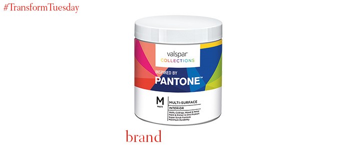
The London office of strategic brand design and innovation firm Webb deVlam, has worked in partnership with paint brand Valspar to launch its new ‘Collections’ range. The five themed colour collections have been designed to provide the customer with a wider choice than what the paint market currently offers. Inspiration for the Valspar colour palettes is derived from everything from heritage publishing design in The Bookcase collection, to Cosmetic Colour, a collection based on the world of beauty. Webb DeVlam forecasted visual trends to ensure all colour choices remain relevant and contemporary, an important consideration as interior design is a market so prone to style transitions.


