Spotlight on Time Out
![TimeOutBrand[1][6].jpg](/remote.axd?http://transformmag.blob.core.windows.net/media/3488/timeoutbrand-1-6.jpg?anchor=center&mode=crop&width=665&rnd=131075244880000000&bgcolor=ffffff)
Time Out’s longstanding presence in London and 107 other cities stems from its original mission and adherence to the values its audiences hold dear. Amy Sandys delves into the archives, and modern rebrand, of the global magazine
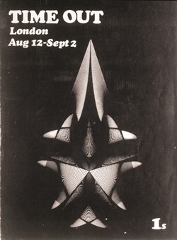
In the 21st century, the ability of print media to attract and retain substantial audience numbers is being called into question. Increasingly eschewed in favour of free digital content, many media channels have adopted a mixed approach to publication distribution. Some have even ceased physical publication altogether, as did the Independent newspaper as of February 2016. Time Out London, the free weekly magazine available across the capital, belongs to an increasingly narrow selection of titles still producing printed copy and it is on course to celebrate its 50th birthday in a little over two years. Yet, despite its longevity, it still retains the same refreshing brand feel as it did in 1968.
Caroline McGinn, editor-in-chief of Time Out London says, “When Tony (Elliott, founder and owner of Time Out) founded it 1968, Time Out was dedicated to discovering the very best things in the city and helping everybody who was interested in finding them, find them. So right from the get-go, it had a very curious, active, cultured metropolitan audience.”
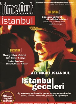
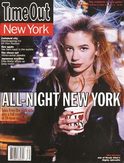
Yet the brand’s success may have been compromised had it not expanded to further metropolitan climes. In 1995, the first edition of Time Out New York was published, after 27 years of being confined to the boundaries of London. This first foray into a global operation led to what now amounts to editorial teams in over 107 cities worldwide – from London to Buenos Aires to Dubrovnik, Time Out has become the go-to source of city information for locals and visitors alike.
Jemima Monies, head of business and PR at adam&eveDDB, the communications agency involved in Time Out’s resdesign, says, “In early 2015, the brand faced two big challenges. First, despite having a wide ranging commerce offering, the brand was still seen as a magazine and a content provider. Second, the brand identity that had hardly changed since its inception in 1968 was struggling to work effectively and consistently.” This transition from London-based cultural listing magazine to a ‘content and commerce platform’ with multinational operations thus paved the way for Time Out to unveil a new visual identity.
On 1 March 2016, the company unveiled its first major brand refresh in its history, designed to marry the most appealing aspects of the Time Out brand across multiple platforms. Brand creative director for Time Out, Anthony Huggins, describes the process as, “Part of a bigger project – a local brand on a global stage. We took this opportunity to have a look at all our products and how they all fit, to consider where our brand is currently used and its consumer touchpoints, and develop it to see what we can do with it.”
While changing the imagery and content to match local offerings and requirements, Time Out also ensured a unified theme to its global logo and branding across print and digital. Its latest incarnation, however, is a slight exception to this rule, by actively seeking to align the Time Out London and Time Out New York editions, a first for the brand. London and New York hold economic and social links unique to the world, and the historic connections created between these two cultural hubs can be traced back through arts, theatre, music, fashion, food, and other cultural touchpoints.
From the beginning, Time Out wanted to get involved in the city’s cultural life – by reaching out to the community, it became a community in itself

It seems fitting, therefore, that the brand should align its two largest markets with the same look and feel, colour palette and layout, and an appetite for longer, worthwhile stories as well as shorter, punchier articles. Tammy Einav, MD at adam&eveDDB, says, “This project was a rare opportunity to refresh a nearly 50 year-old, iconic global brand. The new visual identity gives Time Out global consistency and flexibility across its increasingly diverse channels.”
When a once-local brand such as Time Out is redesigned on a global platform, particularly in a competitive market such as publishing, there could have been a temptation to ignore the brand’s origin. However, for Time Out, past and heritage are as, or perhaps more, important to the brand as its continuing global development journey. Authenticity in its editorial content has been a theme since the magazine was first developed, and what its audience continues to look for today. Huggins says, “We’ve got a lot of brand heritage with Time Out, and we were really conscious that we didn’t really want to get rid of that. So when we were updating the logo, we did that really sensitively and just updated it ever so slightly. We made it much more responsive and much more modern, but it’s still keeping the quality of the original design.”
The logo, on first inspection, looks scarcely different. Online, the traditional black, red and white colour palette associated with Time Out remains intact; the print magazine is the same size and shape, with the characteristic colourful image adorning its front cover. The logo has also retained its clear, readable, rounded font, as well as its white colouring transposed atop of the original black background.
A slight change has occurred on both the London and New York sites, however. The red colour block underneath the Time Out wordmark has been forgone in favour of a simple red line – underneath this, a new strapline reads ‘Discover. Book. Share.’
Similarly, the print edition has simplified layouts, slimmed down the pages for fashion, music and film and created a magazine of worthwhile stories – the corresponding design, McGinn says, is “It’s really treating colour as if it’s a poster, as if it’s the background and framework for pulling out the great quote you really want to read, or the great picture you really want to look at.”
Such an unobtrusive approach to the redesign was what Time Out and its agency partner, adam&eveDBB strove towards from the beginning. Time Out is a brand firmly cemented in the London psyche; both McGinn and Huggins are aware that any slight misstep could have cost the brand’s carefully built reputation.
Indeed, so integral is Time Out’s history in providing a base from which the most recent redesign could be worked, that despite the forward-thinking direction of the brand, heritage continues to play an important role. Elaborating on the importance of using the history behind Time Out’s brand, Huggins explains, “To be honest, [trust] was the fact we kept on going back to. We’ve planned out and built a lot of trust and heritage in that brand, and that’s really important to us.” With countless studies highlighting the importance of trust in measuring brand awareness and value, trust unsurprisingly became an important touchpoint for Time Out to build on, and a value embedded in its rebrand strategy. As McGinn notes, “Even now [Time Out] is a global brand and it’s in so many cities worldwide, that sense of mission is still exactly the same. Certainly when we look at our audience as a brand, and as a media brand, we know that in the city they’re in, they’re hugely active, they want to go out and discover things – and they come to us because they want us to surprise and delight them.”


This ability to surprise and delight has been woven into the fabric of Time Out from the beginning. Although the brand established itself as an alternative political voice early on, its inclusion of popular cultural events listings in its editorial differentiated it from more vocal competitors. Perhaps Elliott’s determination to ensure London’s cultural voice was not lost amid the political fracas of late 20th century, Britain lent Time Out the edge in seeking out London’s cultural heartlands – unearthing interesting developments and cultural stories ensured Time Out’s contents were never predetermined. For McGinn, the ability to ‘surprise and delight’ is perhaps more resonant of a digital age, when nothing stays secret for too long. This is perhaps why a large proportion of the rebrand has been given over to a focus on the brand’s online and digital presence, where Time Out’s main traffic exists.
In cementing the brand as a digital-first platform, the Time Out app has been redesigned in a more functional, streamlined manner. On the wording of the new strapline, ‘Discover. Book, Share,’ McGinn says, “For Time Out it was really pinning down what the essential mission was for content and for the brand, and finding better ways to express that visually.”
Monies adds, “[We] worked closely with Time Out to develop ‘Discover. Book. Share’, a direct call to users to think about Time Out as a source of inspiration and the people who can help them book a table, tickets or a reservation at the bar. Following on from this, the agency then took on the task of evolving the brand identity to become more responsive and modern while ensuring the equity of the original design that so many users know and love remains.”
By encouraging visitors to peruse the website and use its online booking system to make purchases or reservations, Time Out is able to be involved in the process from start to finish. Although this marks the clearest departure from its original incarnation as simply a listings magazine, it is not surprising. From the beginning, Time Out wanted to get involved in the city’s cultural life – by reaching out to the community, it became a community in itself.
Yet, with a Guardian report in December 2015 suggesting the changes in structure to the Time Out offices in New York and London were part of a wider move to develop the brand into a ‘global multimedia business,’ it would seem Time Out’s beginning as a humble listings publication is truly behind it. This most recent redesign has given the historic magazine an opportunity to become well-equipped for a digital age, without losing sight of the heritage values its audience places so highly on the magazine’s editorial content.
As noted by those involved in its rebrand, from consumer to designer, for Time Out trust is essential to successfully capture and retain an audience, regardless of location. Updates to the existing brand will allow Time Out to plan for future growth, yet it will still remember what drew its audience from the beginning, its place at the heart of the cultural landscape.
Peer review
Lawrence Bogle, art director, Cravenhill publishing
When I was new to London and wide-eyed, I looked to Time Out to show me around, it wasn’t just a listings mag but a thing with insight, a pointer to what definitely shouldn’t be missed, events big and small could be found in its pages. The design was simple, utilitarian and easy to follow, the covers graphic and attractive. This magazine, provider of interesting information, includer of gay listings (few others mainstream titles did) captured my attention. Then the internet was invented and things slowly began to change, printed matter became less weighty, magazines fewer and all eyes were on the computer screen. Time Out, it’s fair to say, didn’t have an easy crossover to digital, boxes jumped up here, flashing there and I was frustrated. I really wanted Time Out to work because I felt a connection to it. Skip ahead to this month and Time Out is back: clearer, focused and easy to navigate. I can easily see what’s happening on Saturday or next month, furthermore I know where to go and at what time. The changing sized boxes have gone and it’s now a simple journey from A to B or Z for that matter.
Design is forever changed by the varying applications that must use it and what might once have been a masthead is now a logo, a button and has several functions. This is a good thing because one must think laterally and not be smug, and the new is always interesting, right? As a designer of magazines myself, I’m at pains to point out that all editorial design must bear the reader in mind as importantly as producing smart and clean designs pleasing to the eye. Design using words and boxes is a simple discipline with few rules yet at the hands of some can still raise an eyebrow but that’s not an issue here, as the now-free magazine is well considered as it once was. However some pages look not so much like editorial designs as an online screen with grabby pics
and one-minute reads.
Is this alright? Of course – it is read standing on the tube, waiting for a sandwich and, for that, the new design is perfect. Time Out has always presented strong design and the redesign is a further strengthening of this well established brand.
David Beard, executive creative director, LPK
In the past, Time Out was a pretty extraordinary publication. It was the font of all knowledge, it was the go-to brand if you wanted insider knowledge, to find a great gig or the best new restaurant.
I think what we have now is something that becomes quite homogeneous, and it feels like any other magazine. It has lost its specialist in-depth touch for me.
With regards to the identity and the layout, it feels very lightweight, and I don’t find it easy to follow. There are a lot of articles that are not at all in-depth, there’s a lot of top tens and a lot of throw-away elements. But as a brand that owned London, or owned cities, from New York to wherever, and was a real guide, I think its lost its way. I don’t think that the brand lives up to its heritage at all.
I think the design is a little bit superfluous and it’s lost a lot of its trust, a lot of what made it extraordinary in its own right, and it feels very pedestrian. London is amazing, cities are amazing, and actually having that insider knowledge is what makes it special. It doesn’t need to be over-designed, it needs to actually give across that information to people. I think its lost that communication with the publication, the online presence is much better, but you still have to hunt quite hard to find exactly what you want, whereas it used to be very specific. If you wanted to find the best bar in Brixton you could get there quickly, but it’s a bit more mainstream and seems a bit more generic these days. I used to love it, it was the bible, but I think it’s been overtaken and I think it has lost that.


