Tennis Australia serves up rebrand
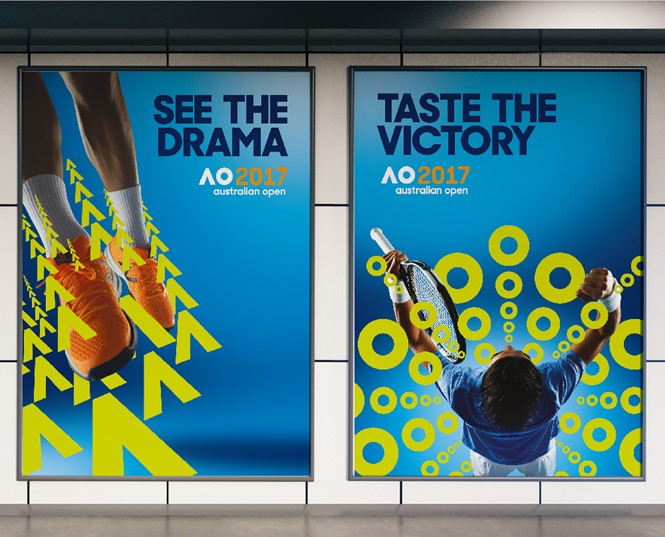
The Australian Open, Asia-Pacific's premier tennis competition, has unveiled a new identity. The reimagined look seeks to make the Open, "More relevant globally and more adaptable in an increasingly digital world," according to Tennis Australia's CEO, Craig Tiley.
As the ATP World Tour moves through China, upcoming events will see the European Open, the VTB Kremlin Cup and the BNP Paribas Masters highlight the tour, before ending in November with the Davis Cup Final. The Australian Open looks to begin the 2017 tour with a fresh face as the rebrand introduces a new visual to the campaign.
American brand consulting firm, Landor, undertook the rebrand in line with the Australian Open's aims to engage with fans and players, as Tiley continues, "It's fresh, fun, and playful - just like the Australian Open itself."
Speaking on behalf of Landor, Mike Staniford, executive creative director of Landor Southeast Asia, Pacific and Japan, says, "We wanted to create a living system which could animate and move in accordance with the dynamic of the game itself. It’s a bold, energetic, and active identity that reflects this leading sporting experience that embodies Australia."
With a new typeface, colourway and logo, the rebrand seeks to solidify the Australian Open as a key brand identity in the tour along with counterpart tournaments Wimbledon, the French Open at Roland Garros, and the US Open