Every last child
International children’s charity Save the Children has launched a new global visual identity and brand guidelines that will help unify the charity’s 29 organisations working to help inspire breakthroughs in children’s potential across the world.
The rebrand, developed by independent brand agency Design Bridge, reflects the charity’s recent shift to a global strategy and focuses on the charity’s brand characteristics: compassionate, courageous, pioneering and outspoken.
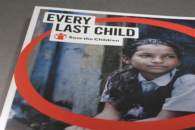
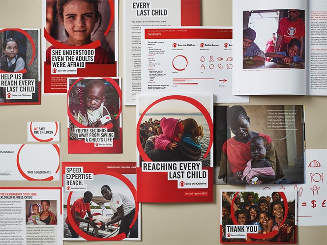
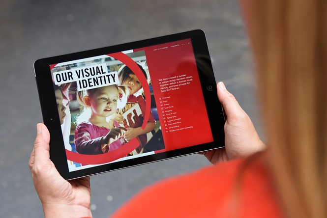
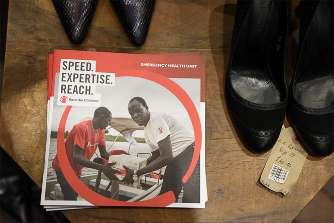
To stand out from over one million charities around the world, Save the Children adopted a colour palette with a deep, red gradient – differentiating itself from the many organisations that use flat, bright reds. The rebrand also includes a new tone of voice, typography and campaign templates. The circle, one of the brand’s most recognisable assets, acts as a protective symbol by encircling the children in photographs, and is used to exemplify the emotional intensity in a visually consistent manner.
John Wigham, design director at Design Bridge says,“Our task was to create a global brand for Save the Children that would unify its different international members and strengthen its communications, both internally and externally. We started by establishing a clear brand personality by looking into the history of the charity and its founder, the pioneering social-reformer Eglantyne Jebb, who wrote the Declaration of the Rights of the Child, which underpins today's UN Convention on the Rights of the Child.”
The new photographic style breaks away from the distressing imagery often associated with cause charities and instead focuses on telling stories of saving, protecting and educating children across the globe. According to Design Bridge’s website, this is meant to inspire a sense of hope and proactivity rather than devastation and loss, which is also reflected in the new tone of voice for written communications.
Wigham says, “We felt that photography should always tell a story, provide a real context and show the positive effects of Save the Children’s work wherever possible. If a disaster zone is pictured, it provides the context to what Save the Children is doing on the ground and the children they are helping.”
Holly Kielty, creative director of brand language at Design Bridge, adds,“We developed a tone of voice that focuses on telling true, human stories in a heartfelt and compelling way. The tone is always proactive, future-focused, and fiercely protective, communicating a sense of hope. Messages are conveyed simply and confidently, bolstered by new typography and a system we have created for highlighting headline text as a bold call to action.”
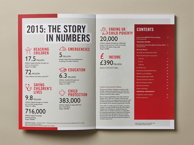
Founded in 1919, Save the Children was founded in the UK as a response to the famine resulting from Britain’s blockade after World War I. Over the next few decades, the organisation expanded to champion children’s rights and welfare across the globe. In 2015, the charity helped 17.5m children directly through work on the ground and reached 6.3m children through its education programmes. Today, the charity spans 120 countries and has general consultative status with the United Nations Economic and Social Council.


