Iconic splat at heart of Nickelodeon rebrand
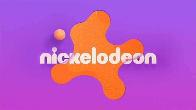
In partnering with creative agency Roger, the US children’s television channel underwent its first identity redesign in 14 years. In a bid to unify the Nickelodeon brand across on-air, digital and social, the brand’s recognisable ‘Splat’ logo features at the centre of the redesign.
Working alongside Nickelodeon’s internal teams on design strategies for products, resorts and attribution on various digital and SVOD platforms, Roger’s work aims to honour the brand’s legacy of celebrating everyone’s inner child. Additionally, the new identity had to be able to grow alongside Nickelodeon’s expansive creative output.
Braden Wheeler, creative director at Roger, says, “The design language needed consistency across every touchpoint of the Nickelodeon brand, from on-air to digital and social media to the product packaging and resort experiences, so we knew we needed a very accessible core to the visual identity.”
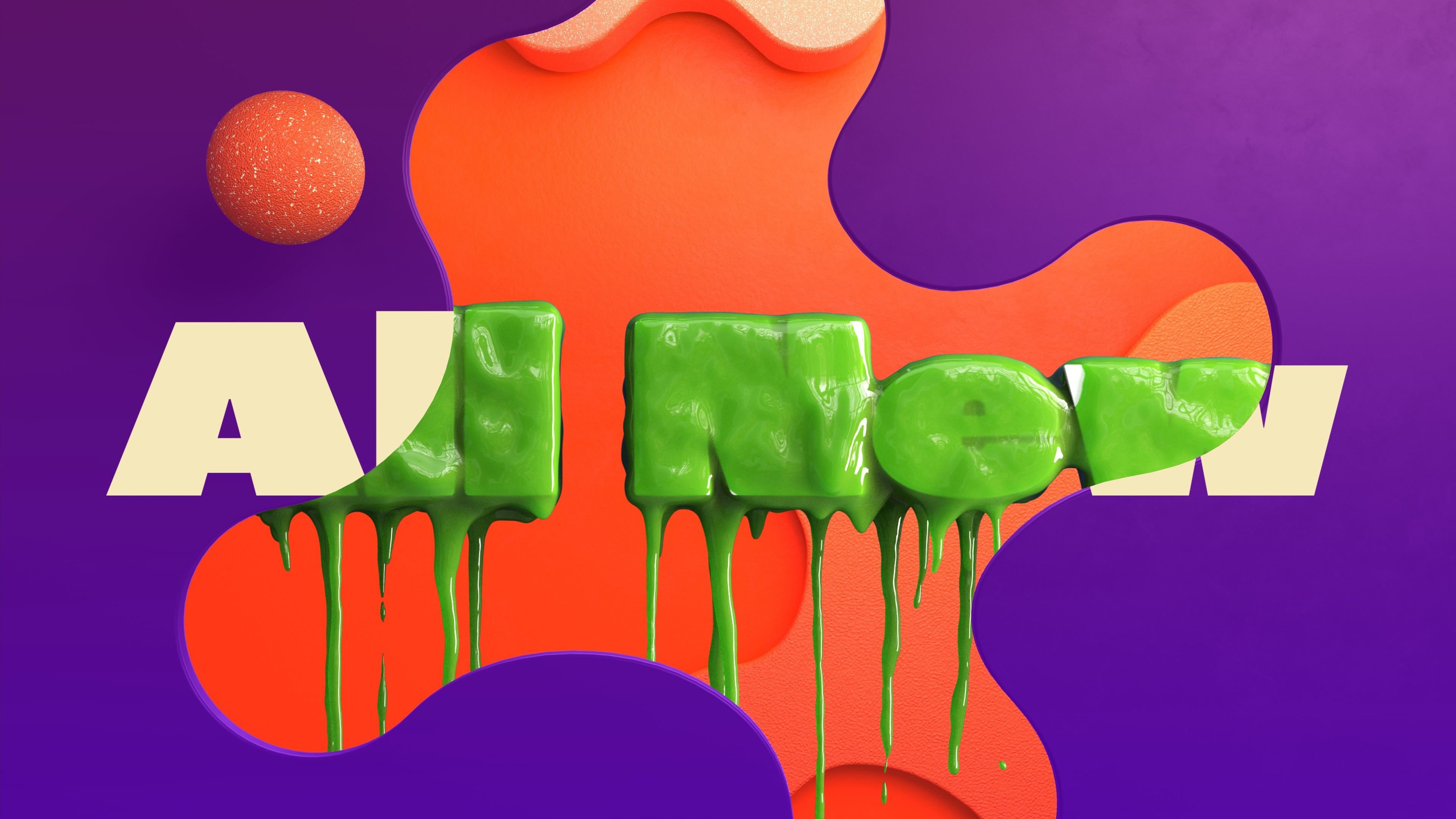
Designed using a circular grid system, the new Splat allows for a secondary set of splash shapes built onto the same grid which complements the hero mark. Elsewhere, further updates to the brand identity include a revised colour palette of purples, yellows and pinks. Designed to offer a wide range of options for further evolution in time, the updated identity also includes typographic changes: ROC Grotesk is now used alongside Neue Plak.
Wheeler adds, “We aimed to infuse a sense of imagination and exploration into every deliverable and design choice in a quite literal sense, with elements reinventing themselves in real-time,” explains Wheeler. “It was a tightrope balance between eclectic and cohesive, but the modularity built into the system gives Nickelodeon the flexibility to play in their sandbox and build upon the brand for years to come as new IPs and initiatives are introduced. Flexibility was always at the forefront of our thinking.”
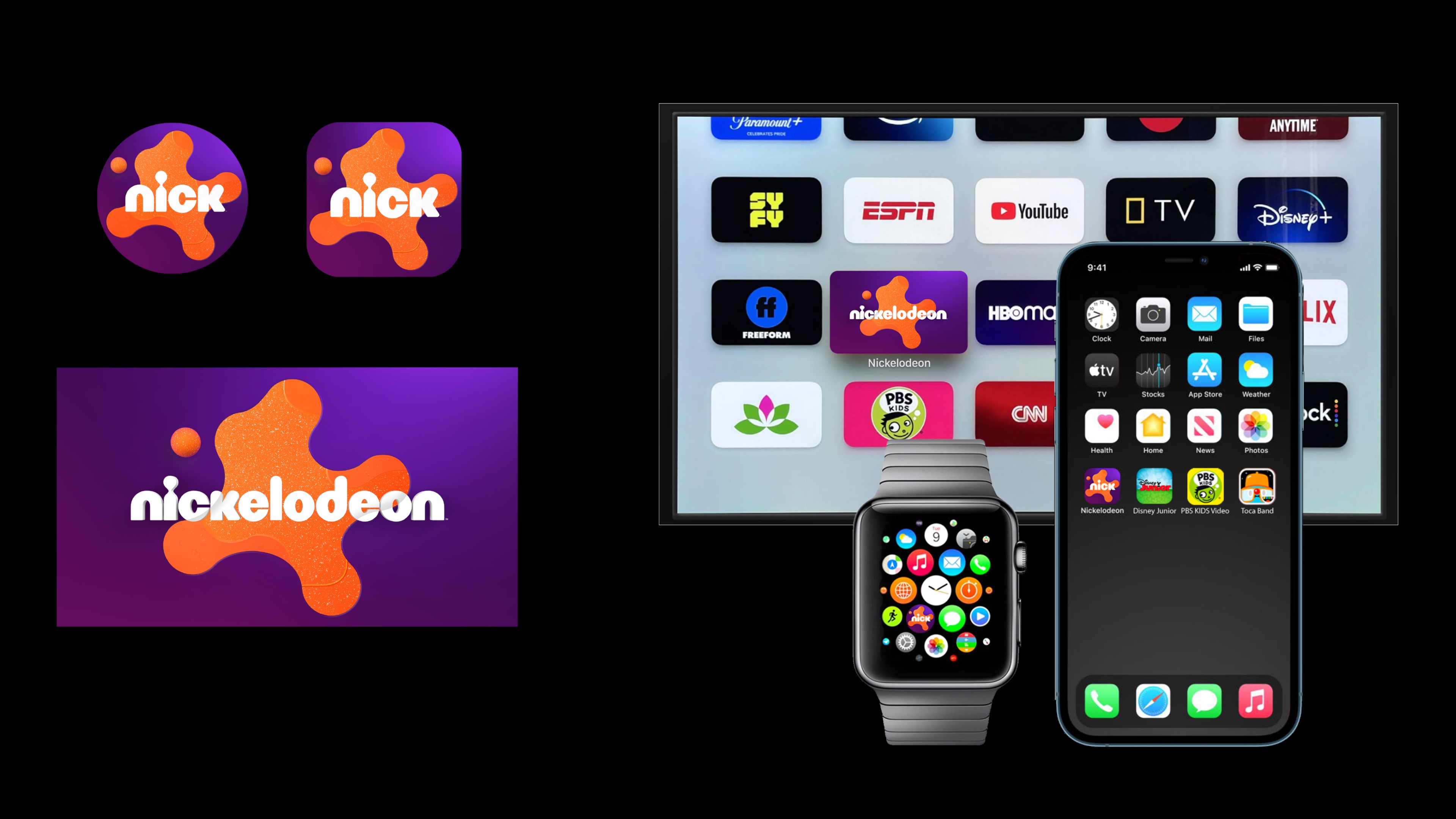
Roger was also responsible for redesigning the Nick Jr. channel’s logo lockup, graphics and animated idents, which will launch in September. Aimed at a preschool audience, the creative agency’s work features a bold new colour palette, and the orange splat is included at the centre of its identity.
Vincent Aricco, Nickelodeon’s senior vice president and global executive creative director, says, “[Roger] embraced the elements that make Nickelodeon a brand that continues to resonate with kids and families 40-plus years into the game – irreverent humour, a love of all things messy and a penchant for creating larger-than-life moments that magnify the best of what it means to be a kid – and produced a modernised visual identity that is the perfect marriage of innovative design and just the right amount of weird.”


