#TransformTuesday: 2 February

Here is this week's selection of rebrands from around the world. For more from #TransformTuesday, follow @Transformsays on Twitter.
Derby County Community Trust
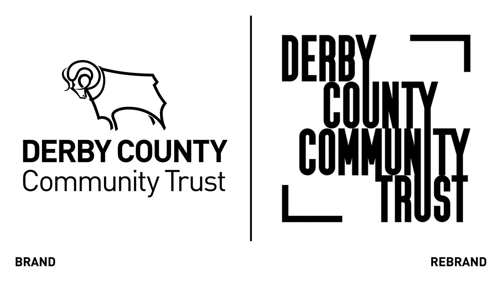
Derby County Community Trust, the charitable arm of the Derby County Football Club which uses the power of the club to improve communities through sport, health and education, has rebranded. The rebrand reflects the trust’s ever growing audience; since becoming an official charity in 2008, its reach has continued to grow, encompassing a huge range of projects. The new logo looses the ram to focus exclusively on the name which, encircled in a square-like box, prevails amongst everything else. Its typeface is bolder and bigger, yet simpler and cleaner. The rebrand also includes a new website for supporters and the local community to find out more about what the trust offers.
“Our biggest selling point is our association with the football club, but as we’ve grown as an organisation and our delivery programming has got so much more diverse, there have been times where we haven’t used the Ram front and centre. The new brand is our identity, it’s about the people and how we articulate the relationship with the football club,” says head of community at Derby Country Community Trust, Simon Carnall.
Fed Sq.

Fed Square, one of Melbourne’s most important public squares, home to art galleries and installations, has worked with branding agency Interbrand to develop a new logo that reflects its position as the beating heart of Melbourne. Under the new vision, supported by a recent government review, the new branding positions Fed Square as ‘anything but square’ while promoting a ‘kaleidoscope of experiences.’ The logo has significantly changed, with the new one purposefully sticking out and grabbing viewer’s attention through its vibrant purple colour and geometric design. The new logo is much brighter and more abstract in design, reflecting the different art installations at Fed Square. The rebrand will also celebrate the square’s history, with a number of documentaries created to show its heritage, architecture, design and sustainability intiatives. The new identity is reflected in Fed Square’s events and offerings. The new media branded collage work , centred around bright colours, was done by Australian artists and illustrator Tanya Cooper
“Fed Square is a globally iconic destination and Melbourne’s gathering place, where visitors are immersed in unique cultural experiences and architecture that celebrate Victoria’s rich heritage and identity. As a result, our brand needs to inspire, engage and celebrate our community,” says Suzana Bishop, acting CEO of Fed Square.
Inditango
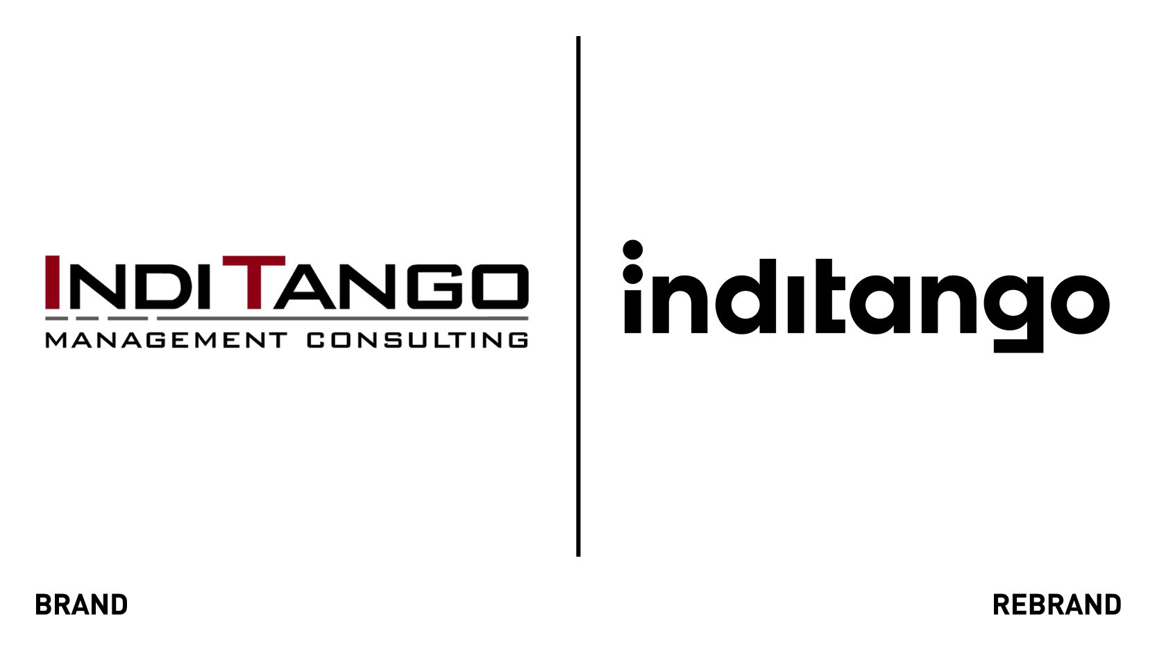
German IT Management consulting Inditango worked with design agency EIGA to develop a new brand identity that would help them express the uniqueness of their authentic yet progressive approach through brand strategy, visual identity and digital communication. Inditango’s unique brand name derives from the NATO phonetic alphabet in which the abbreviation for IT would be rendered as India and Tango. The logo, but also all other visual elements from the layout. Grids to the icons, includes the visual system of the Mrose code, two two dots for the ‘i’ and a single dash for the ’t.’ The overall rebrand reflects Inditango’s brand character, of authenticity, competency and self-confidence and its company values of loyalty, expertise and independence.
Mug Shot
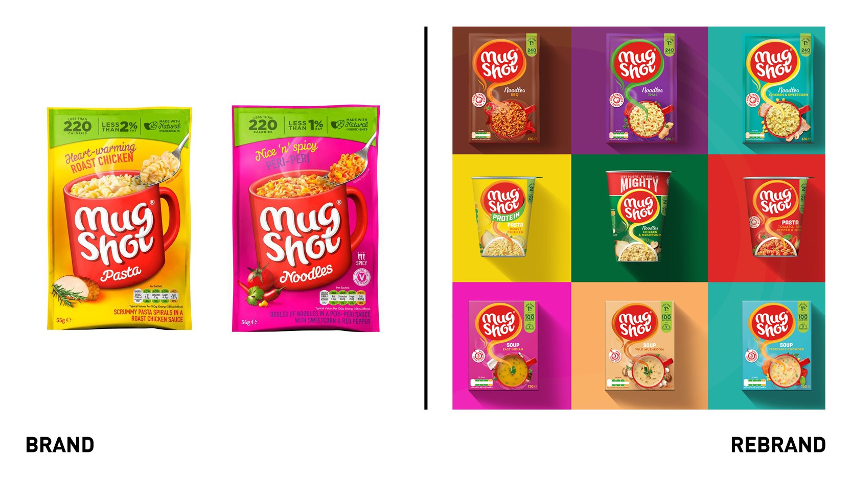
Healthy and convenient hot snacks and soups brands owned by Symington’s, Mug Shot, has worked with branding consultancy Brandon to reposition the brand from a ‘better for you’ low calorie snack to a satisfying mug full of every day snackers. The push behind this decision came from the need to re-engage existing and potential consumers with its own taste credentials, after new players entered the market with Asian inspired flavours. The brand positioning ‘comforting moments’ was inspired by consumer research that showed that people related to the moment of eating a hot snack out of the mug, finding it comforting and good for the soul. To create a brand that would really resonate with non-users while not loosing existing buyers Brandon made the product feel heartier and full of flavour but maintained key elements of the original brand, like the recognisable logo. The photography was switched to a top-down shot to highlight the food and flavour credentials that consumers are looking for, while the toned-down colour palette was used to help remove any connotations that the food is for kids.
“Initial feedback from consumers shows that the new navigation system has made it easier to identify different flavours and ingredients and Mug Shot’s new bold and iconic look now has the broader appeal and all-important shelf-standout that we were looking for,” says head of brand at Symington, Christine Everett.
Palomar Incorporated
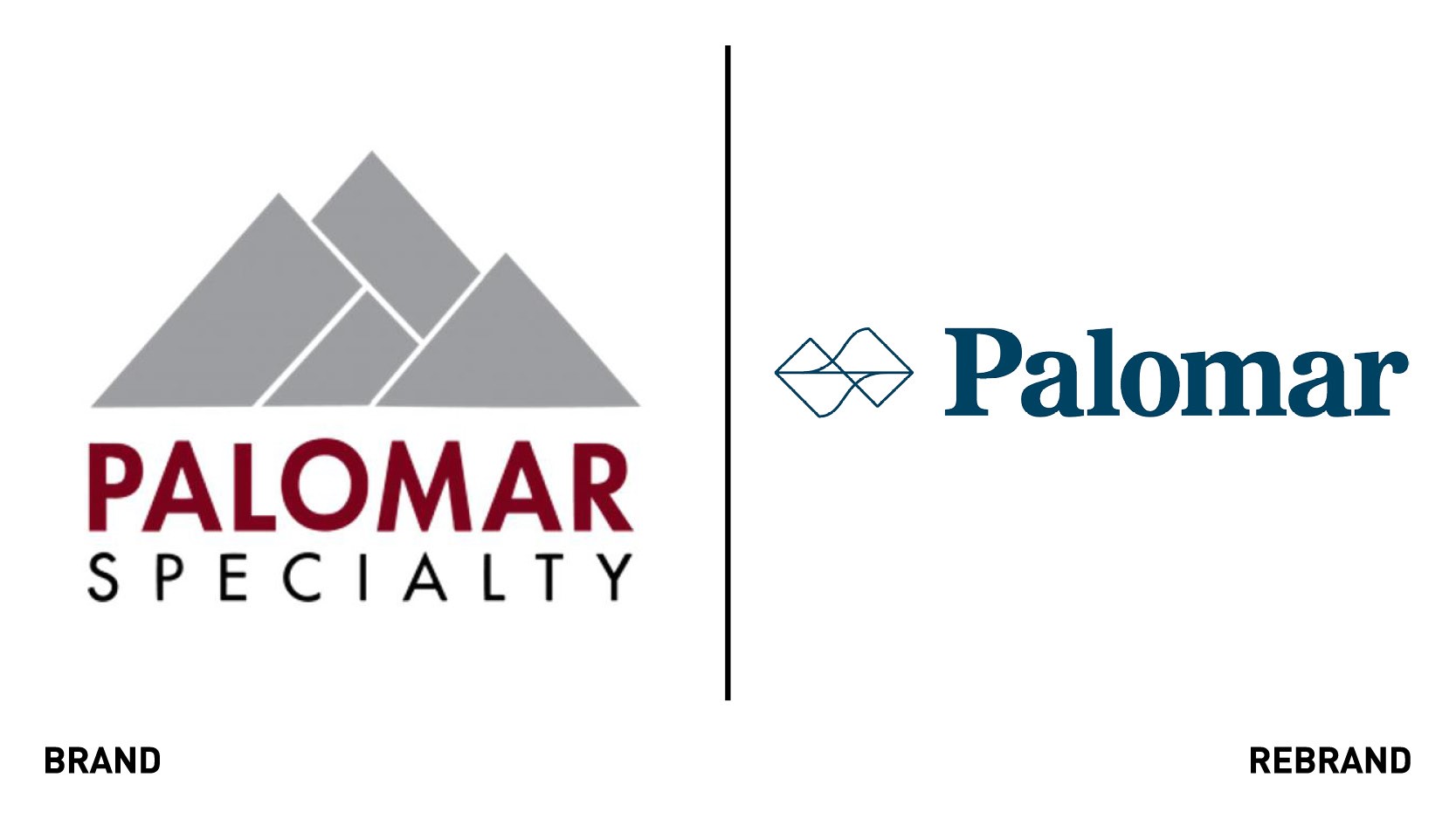
Insurance services provider Palomar holdings, Inc. launched a new branding aesthetic, corporate website and logo, all of which help reinforce the company’s mission, vision and values. The rebrand also solidifies Palomar’s commitment to agility, innovation and problem solving for its partners, counting to build solutions that protect people and businesses. The new website is optimised for user experience and customer service highlight the company’s unique offerings in both commercial and residential specialty property insurance for agents, brokers and policyholders. It also aims at showing the company’s fresh approach to covering homes and businesses, while the upgraded navigation and functionality and simple layout allow visitors to e easily locate information and services they need. the new PLMR.com will be a place to showcase the Company’s thought leadership and dedication to corporate social responsibility.
“Palomar’s nuanced approach to underwriting risks with analytics and data attests to our acknowledgement and commitment to the continuously evolving world. As our business evolves, we continue to make our branding efforts part of this journey. Our new brand identity, corporate website, and logo are a much better representation of who we are and where we are headed,” says Mac Armstrong, chairman and CEO of Palomar.
Planetmark
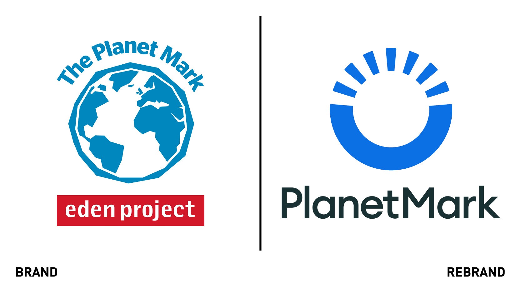
Sustainability certification Planet Mark has launched a new digital transformation programme and a new modern identity. Working with strategic branding agency Design By Structure, Planet Mark created a revised brand system that draws inspiration from the planet and champions the idea of change throughout. The new logo retains the iconic blue colour but has moved to a cleaner and modern abstract form, with the solid base line representing a new horizon and a fresh start. Different playful text and illustrations were commissioned to reinforce Planet Mark’s approachable personality, which is a major attraction in businesses wishing to become Planet Mark members. The move will enable to company to amplify its international reputation and growth, and make the sustainability certification more globally appealing. The digital transformation includes a new domain incorporate a new member page to allow for members to engage with their employees and communicate their sustainability journeys transparently.
“Our new strategy and modern identity is designed to communicate in simpler terms the critical message that the climate crisis requires urgent action and we share a common goal and vision of working together for a brighter future. We need to do more and collectively we can. We want Planet Mark to appeal to a wider market and empower businesses with a common goal,” says CEO and founder of Planet Mark, Steve Malkin.


