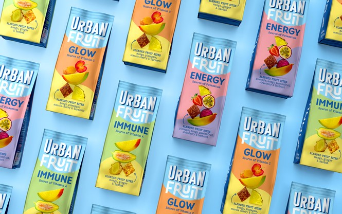
Robot Food designs wellness range for Urban Fruit

Dried fruit brand Urban Fruit developed the first ever ‘wellbeing’ range in the dried fruit category, working with branding and packaging design agency Robot Food to design the new range's visual identity.
Robot Food knew the range had to be confident, colourful, and not only stand out from the competition, but from Urban Fruit’s existing product portfolio too, while making the product look natural and tasty.
Using Urban Fruit’s expressive master brand as a starting point, Robot Food chose to soften the colour palette to create a calmer, gentler feel. The packaging also includes bold types to highlight the benefit-led naming, from ‘immune’ to ‘glow’ to ‘energy,’ and the clear wellbeing claims. The clear information on pack not only achieves shelf standout but also aims to be informative for first time buyers that are not familiar with the new range.
“We built on everything that makes Urban Fruit great whilst clearly denoting an elevated health range.The photography was carefully considered to hero the fruit, amplify taste cues and create a calming, balanced aesthetic. The clearly labelled benefits and the use of symbols added an efficacious feel that will help consumers shop easily to achieve their wellness goals,” says Stephanie Oglesby, design director at Robot Food.


