Real estate data provider launches new brand identity that unites people and property
Estate Gazette, a provider of data-driven intelligence for the UK real estate sector, worked with brand agency Designhouse to develop a refreshed brand identity that unites people and property through data.

The brief centred on delivering a flexible, strong brand identity that would work equally well on an award trophy, signage or in digital format. The rebrand was commissioned to help rationalise and clarify the portfolio, unifying employees across a single organisation while refining the existing brand architecture with a new simplified product hierarchy that would be easier for customers to access.
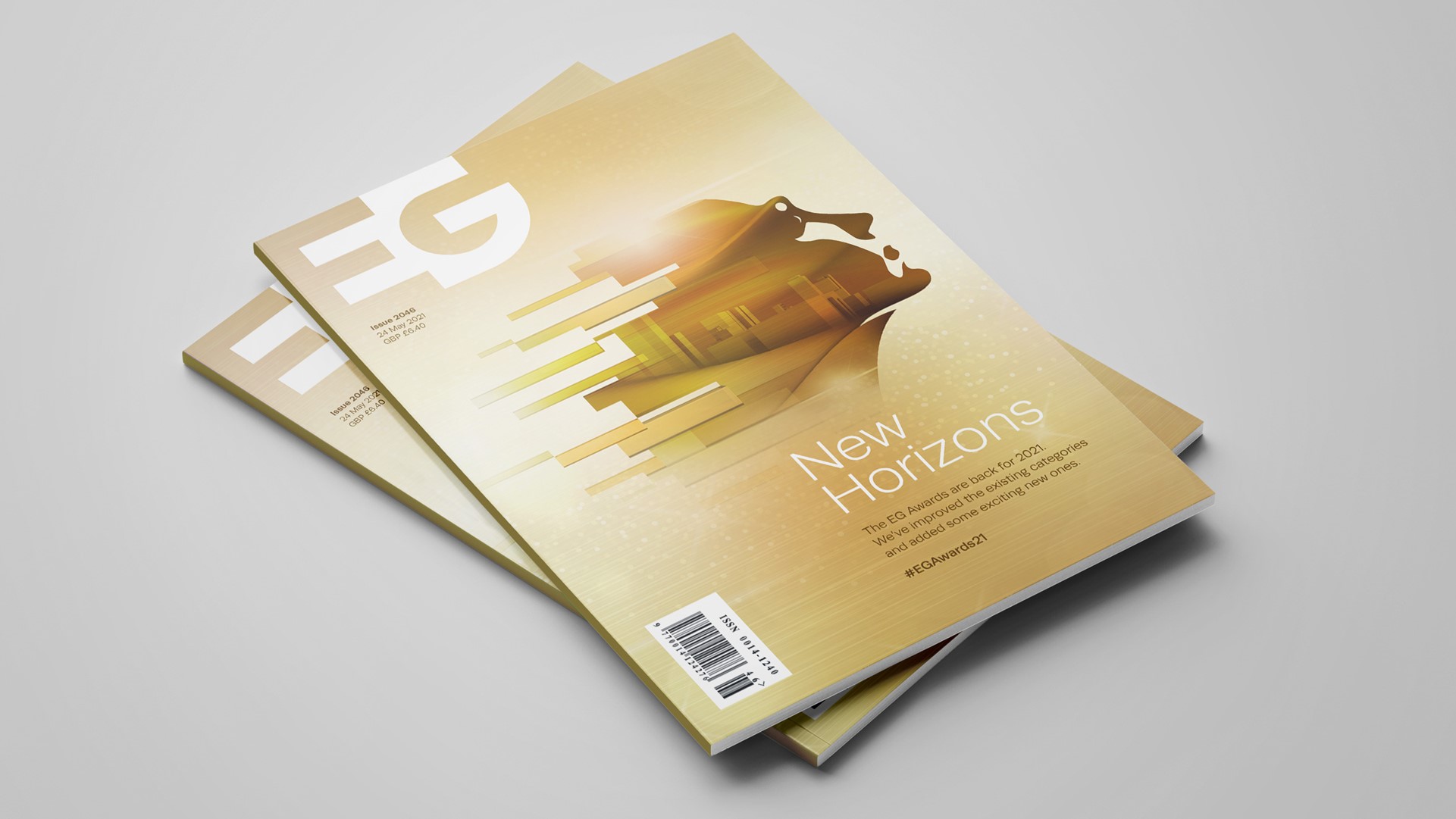
The redesign of the master logo employs the theory of negative space, combining the two letterforms into a single mark and making it more assertive and recognisable. The use of negative space reflects the importance of internal floor space in the commercial property world and mirrors the building and its internal space.
“Simplicity of construction is at the heart of the new logo, a singular mark that represents the unison of people and property. The data and intelligence behind EG’s technology is reflected throughout the visual language, acting as a thread, running through the entire brand,” says Richard Debenham, design director at Designhouse.
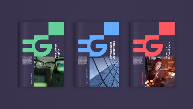
Designhouse updated the imagery, moving away from abstract stock photography representing data to focus on the people using the technology, both within EG and the clients who use it to inform their decision-making.
The old primary palette of dark grey and tomato red has been replaced with a single new master colour, a professional deep purple, which works in harmony with a secondary palette of colours inspired by indoor and outdoor space.