Princes Ltd. works with BrandOpus to create its first fully plant-based brand
Food and drink company Princes Ltd. has launched a new plant-based brand, Plot 9. Global branding agency, BrandOpus, developed the positioning, name, identity, packaging and brand guidelines for the brand, which offers zero-compromise plant-based meal pots.
To stand apart in the rapidly evolving and competitive sector, Princes was on a mission to create an unconventional disruptive brand presence that matched its zero-compromise product offering. BrandOpus was tasked to create a brand from scratch that connected with a younger flexitarian audience.
“Plant-based food is often perceived as a compromise when it comes to flavour and texture. Plot 9 is about squashing this misconception and showing consumers the true power of plants,” says Alan Eriksen, marketing director at Princes.
A deep dive into the category uncovered that plant-based had traditionally been defined by literal interpretations of goodness and nature - often denoted through green plant codes, natural colourways and leafy textures. The BrandOpus team saw this as an opportunity to drive more of a positive and emotive narrative for both the brand and category, by heroing the product’s ingredients and quality.
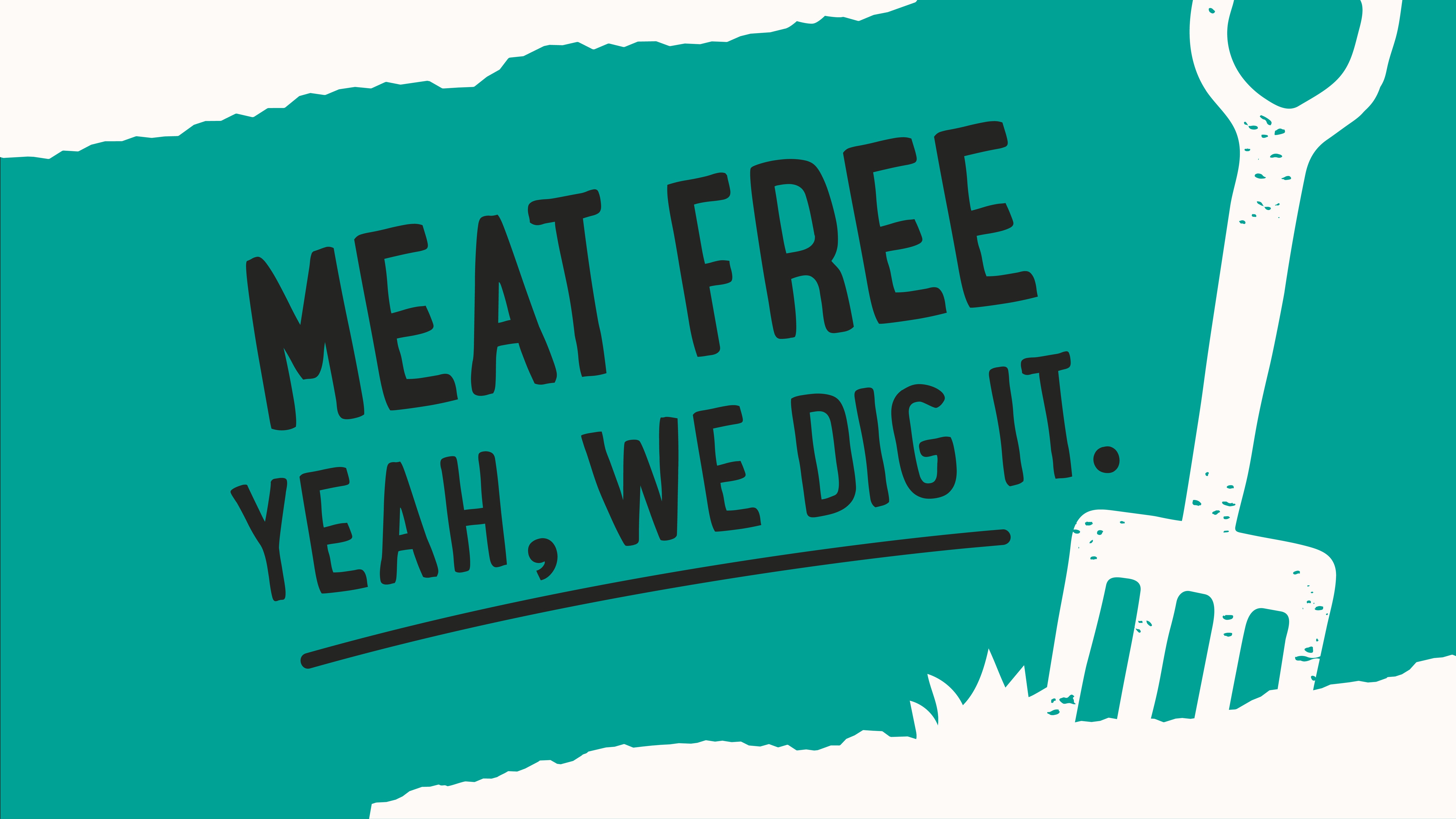
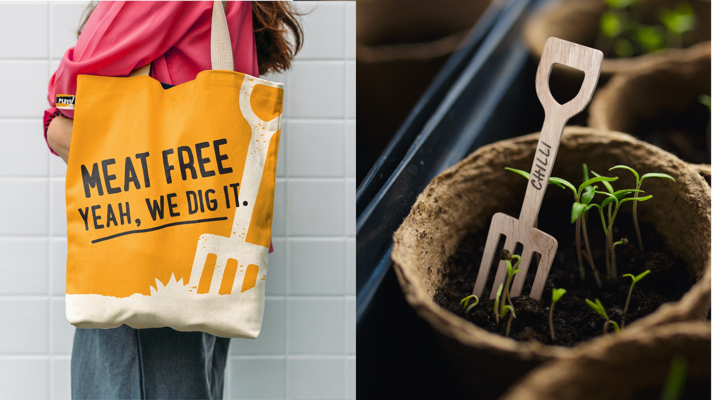
“To achieve standout on shelf and deliver against the brand’s ambitions, we needed to create a brand with a bold plant-based attitude. Plot 9 digs in to the power of plants with a name that evokes the spirit of the allotment, a garden fork symbol that heroes how we harness the land and a naturally raw visual expression to meaningfully connect and engage consumers,” says Paul Taylor, chief creative officer and founding partner, BrandOpus.
The new work aims to give power to plants by metaphorically capturing their potency and strength through a rustic and supersized pitchfork icon. Connecting good quality ingredients with the land, it echoes the brand’s confident attitude of digging in. This inspired the name, Plot 9, which aims to transport consumers to a specific type of land where vegetables are grown.
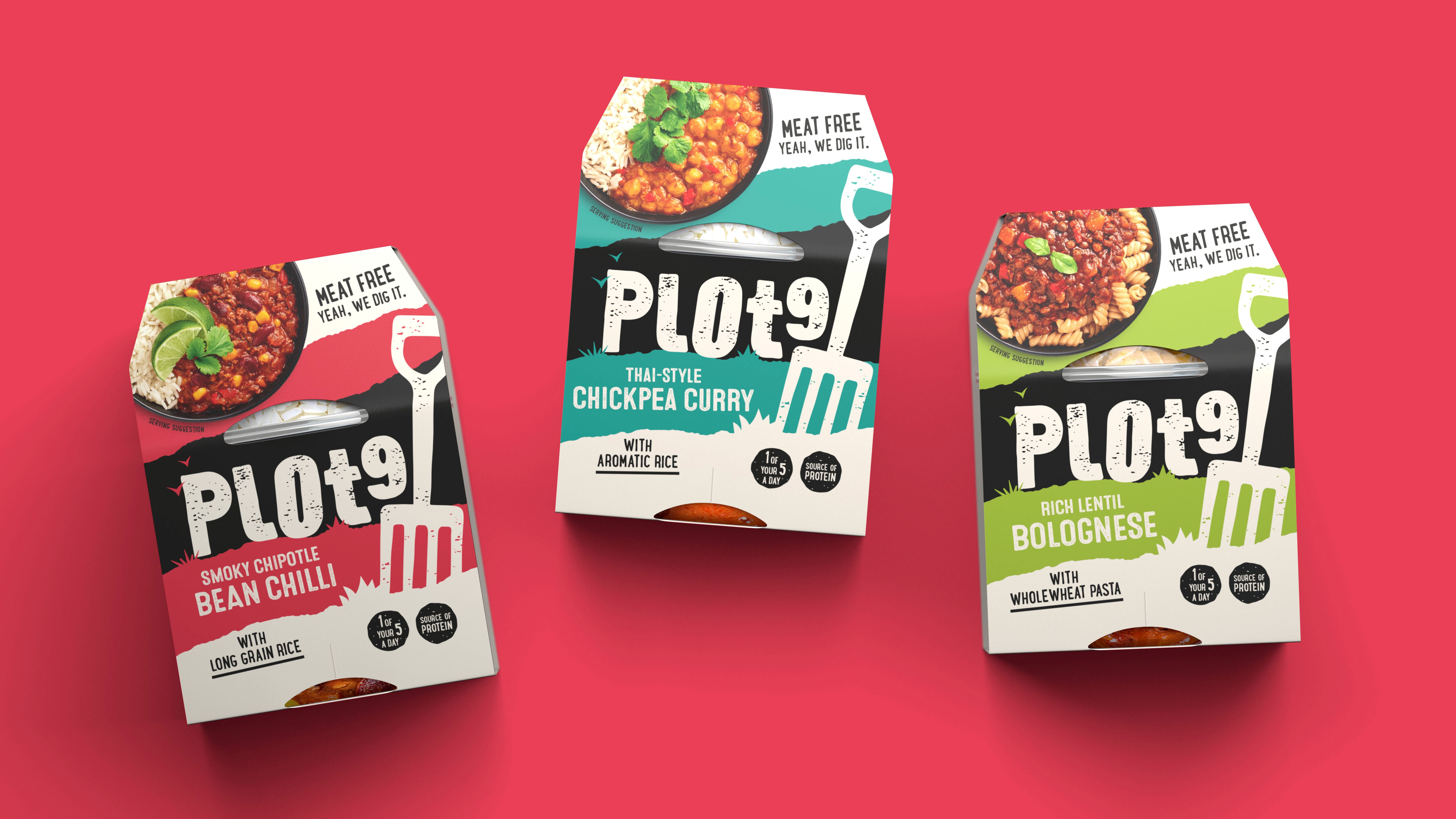
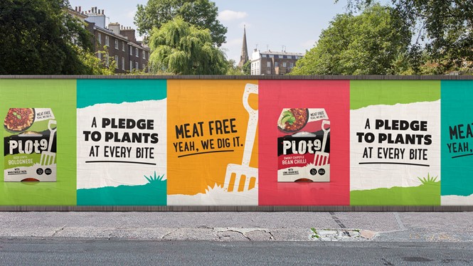
The black and white identity is set in colour blocs of ripped paper, encompassing a vibrant colour palette. Coding each flavour variant, it aims to create a strong distinctive on-shelf presence – standing out from competitors who opt for neutral or moody tones. The earthy graphics of grass, birds and the stamp texture were chosen to bring to life the feel of the surrounding allotment on pack, giving another nod back to the natural origin of plants.
The bold and playful tone of voice seeks to echo the brand’s ‘embrace epic’ attitude of no vanilla and no comrpomise.