Dragon Rouge repositions Reed Group as ‘thought leaders in world of work’
Reed, a UK recruiter, worked with independent brand agency Dragon Rouge to reposition the brand as ‘thought leaders in the world of work.'
Dragon Rouge was tasked to support Reed Group, home to 11 organisations with the purpose of ‘improving lives through work,’ to define an overarching brand story that encompasses all of its operations, answering the challenge of maintaining consistency while enabling flexibility between sub-brand businesses.
Reed already had a purpose and values that it was keen to retain, but was missing the creative idea that positioned the brand story and set the character and ambition for evolving the identity.
Understanding the breadth of services that Reed provided within the world of work, the different roles they played and benefit they delivered for their customers, partners and co-members, was key. A mix of research, and internal and external stakeholder engagement across each of the Reed business conducted by Dragon Rouge, culminated in defining the brand idea, ‘What’s next.’
‘What’s next’ is both a provocation and a resolution, aiming to be equally open and assertive. Supporting the brand idea of “what’s next” are three key character traits of curious, dynamic and optimistic, all of which govern Reed’s brand behaviour across all its touchpoints.
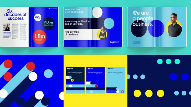
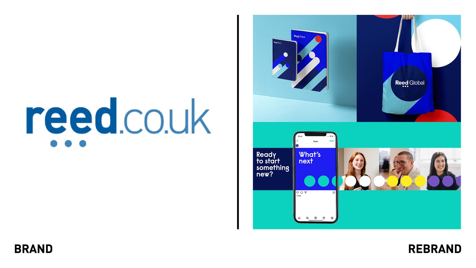
The evolution of ‘What’s next,’ needed to be balanced with and grounded in the equity that already existed in the brand. The Reed “dots” have always been a recognisable part of the brand and were an opportunity to strongly link to the brand idea with the concept of the ellipsis. The dots aim to be a literal representation of ‘What’s Next’ taken from conversation – suggesting more to come, encouragement to always move forward and the start, middle and continuation of a journey.
The dots have been heroed in the evolved logo and as the foundation of a broader distinctive and flexible graphic language, extending to create a number of graphic styles and communicating individual concepts for both the masterbrand and the sub brands.
To create differentiation, each sub brand uses their own colour palette and has specific benefits which have been translated into a creative word or direction that they will use to inform their graphic language. The new typeface, Raisonne, a geometric sans-serif that included unexpected letterforms, was chosen to provide distinction and personality for all Reed brands, and to add a softer human side to the business.
“The vibrancy of the colour palette and the creative direction has given our businesses an exciting new look, coupled with the creative freedom to have their own distinct identity within our family of brands,” says Lily Drake, group head of customer experience at the Reed Group.


