Counter Studio develops new identity for Atelier Ellis
Bath-based brand design agency, Counter Studio, refreshed the brand identity and packaging for Atelier Ellis, an independent paint maker.
To develop the company in a more sustainable way, founder of the brand, Cassandra Ellis, decided to bring the paint mixing in-house, setting up a workshop in Battersea, London. In addition to gaining more control over the production process, Atelier Ellis felt it was right moment to reassess the name, the brand identity and packaging to reflect the changes happening in the business.
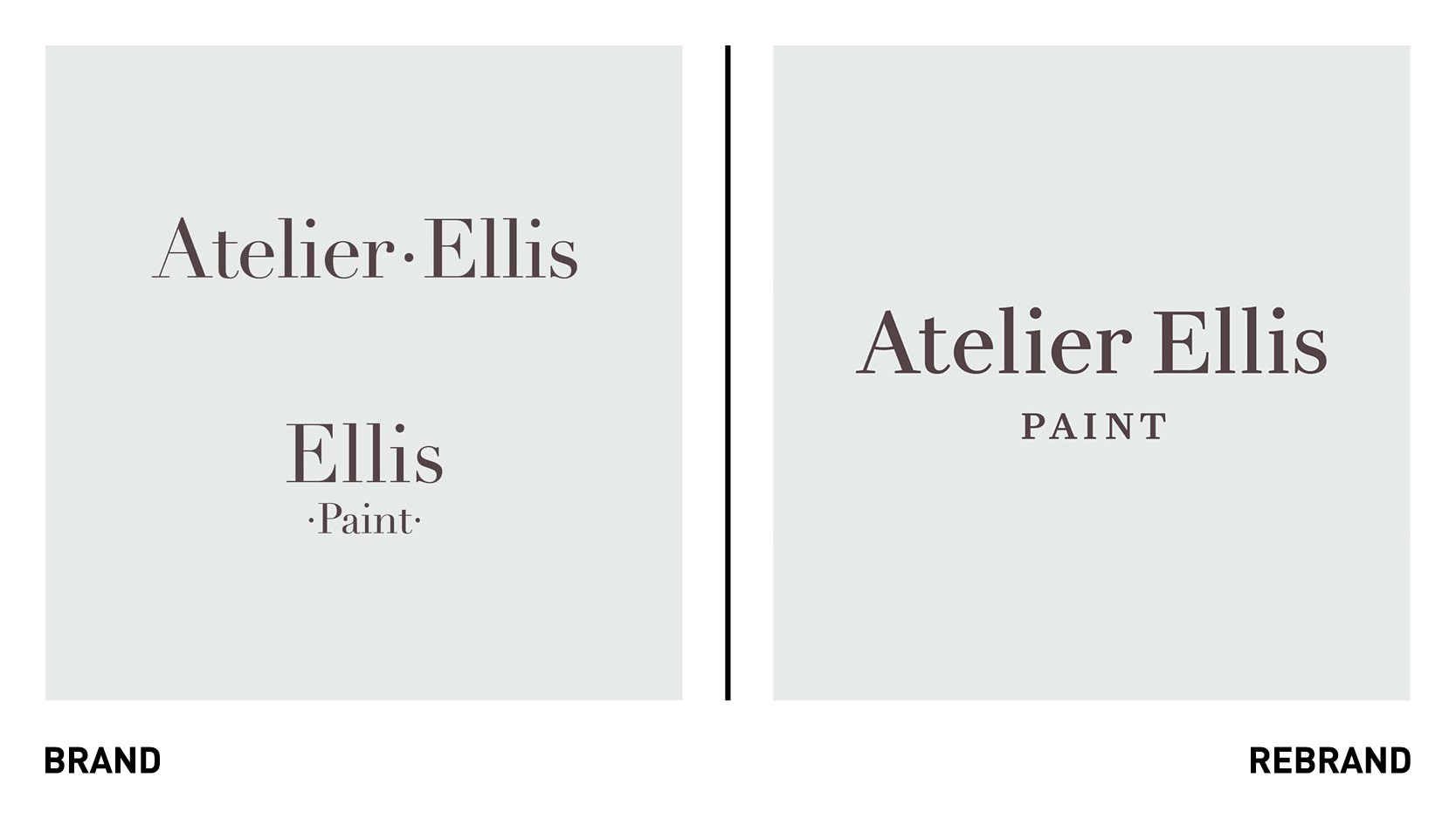
The first change Counter Studio made was to align the two different brands into one simple story – with the paint business dropping under the main Atelier Ellis name. This allowed them to focus on building a stronger, more unified brand and a simpler customer experience.
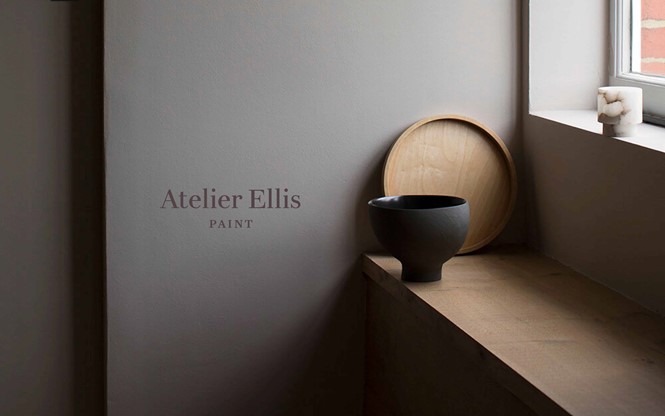
At the heart of Atelier Ellis is the idea of people living in safe and beautiful homes that tell their own story, and creating the perfect backdrop to how they wish to live. This core thought of ‘telling their own story’ became the starting point for the refreshed look of the brand.
“Taking story-telling as our inspiration, we developed a refined and calm design direction that draws on the visual language of books – the design of the labels subtly echoes a title page, while a classic style of typography allows words and space to become the low-key heroes,” says Counter Studio founder, Elizabeth Ellis.
“We introduced a modern interpretation of traditional book typeface, which was used alongside a sophisticated colour palette of Bitter Chocolate, Warm White and Smoked Green-Blue from the Atelier Ellis Paint collection,” she adds.
Counter Studio redrew the work mark based on the same characteristics found in original logo, but refining the shapes and adding a sense of warmth to the letters. The aim was to make it more robust and legible at any size, and in doing so modernising a traditional classic.
“The whole identity is deliberately understated and quiet, allowing the individual paints and the stories to take centre stage,” Ellis says.
Moving the paint production in house was an opportunity to rethink the design of the tins from the ground up. The new fully recyclable metal tins needed a design solution that would work across three different sizes, three different paint finishes and more than 50 different colours.
“The system we created allowed for an elegantly simple tin design that works effortlessly across the various sizes, with a single-size label applied by hand to the front of each tin to distinguish the different paint finishes and colours.” Ellis says. “The identity has been design to allow the colours and the stories around them to shine.”


