Coca-Cola reveals evolved packaging design
Coca-Cola has unveiled a new design system for the Coca-Cola trademark that brings all Coca-Cola, Coca-Cola Zero Sugar and Diet Coke together in an evolution of ‘one brand’ strategy that initially launched in 2016. The aim is to provide a simple and intuitive navigation system that carries all the brand’s variants while also celebrating the logo.
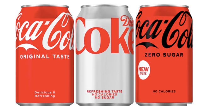
The new design is simplified, removing added elements such as the red disc, to elevate the iconic trademarks with global consistency. The new packaging also features a raised logo to the top of the label, as a symbol of the brand’s ‘uplifting.’
The brand’s original and universally-recognised colour red, a symbol of the refreshing and authentic Coca-Cola taste, is paired with different colours to mark the three different brands. The Coca-Cola Original features the red paired with white Spencerian script. The Zero Sugar sees the red paired with black, leveraging the trademark and typography in a different way to indicate the Zero Sugar variety coupled with other details like the black bottle caps. Diet Coke will also sit within the Coca-Cola trademark design family, with its signature silver background and red logo.
The updated design will be led by Coca-Cola Zero Sugar, which has also debuted an evolved recipe that brings it close to the Coca-Cola Original taste.


