#TransformTuesday: 11 August

Here is this week's selection of rebrands from around the world. For more from #TransformTuesday, follow @Transformsays on Twitter.
Dianomi
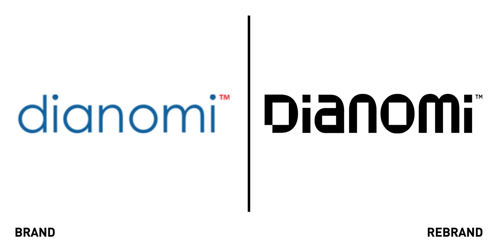
Technology specialist Dianomi, which provides online native advertising for the financial services and technology sectors, worked with independent global branding agency Living Group to create a new brand identity that would bridge the gap between what their previous brand represented and who they became today as a standout competitor. The creative rationale for the new brand positions Dianomi as a premium tech firm that provides a highly relevant and brand-safe product and the new logo and visual language represents just that. The use of overlapping lines represents the unique contextual nature of Dianomi’s product and the seamless service their clients receive. The visual language developed by Living Group includes icons and thought-provoking imagery that work across presentations, animations and the website, while the colour usage is deliberately limited to communicate the premium aspect of the brand. This is further emphasised by the new, modern logo, created by a black and bold typography that gives off a sense of professionalism and doesn’t go unnoticed.
Inner circle
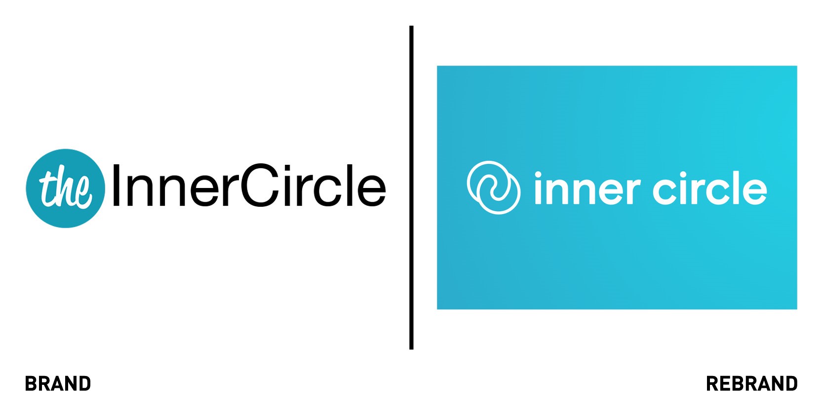
Dating app Inner Circle worked with Kraftwerk Isobar agency to re-launched the brand, as it was in need of a spruce up that puts it next to the big players in the dating landscape. The brand wanted to distance itself from the ‘elitist’ past and create a bold, sophisticated and welcoming look, with a simplified modern app user experience to focus on helping people meet their match in real life. To do so, it introduced a new Meet your match narrative, the idea that while you should meet your matches, singles should also meet someone they match with on a similar level. By doing so, Inner Circle is challenging singles to up their dating game and take dating more seriously. This proposition will come to life through future brand campaigns and creative activations, sparking conversations and encouraging singles to be the best version of themselves.
All imagery used across digital and outdoor campaigns will feature real people currently using Inner Circle. The new logo, which replaced the ‘The’ with two interlocking circles, representing the engagement and connectivity Inner Circle provides to its members.The rebrand also includes UX updates which make the app more engaging and interactive for members and allow them to discover new people, new questions prompts to help singles make the first move and spark conversation, and additional filter options to ensure users meet other like-minded singles.
“Inner Circle is a community for single people who know what they want. They aren’t afraid of a challenge, want to make the most of opportunities, and are looking for a partner who has the same mindset. Our new brand is designed with these singles in mind. For singles who are committed to dating seriously, we are on hand to be the ultimate wing(wo)man, providing conversation prompts, date ideas and IRL events,” says David Vermeulen, CEO and founder of Inner Circle.
Entrepreneurs' Organisation
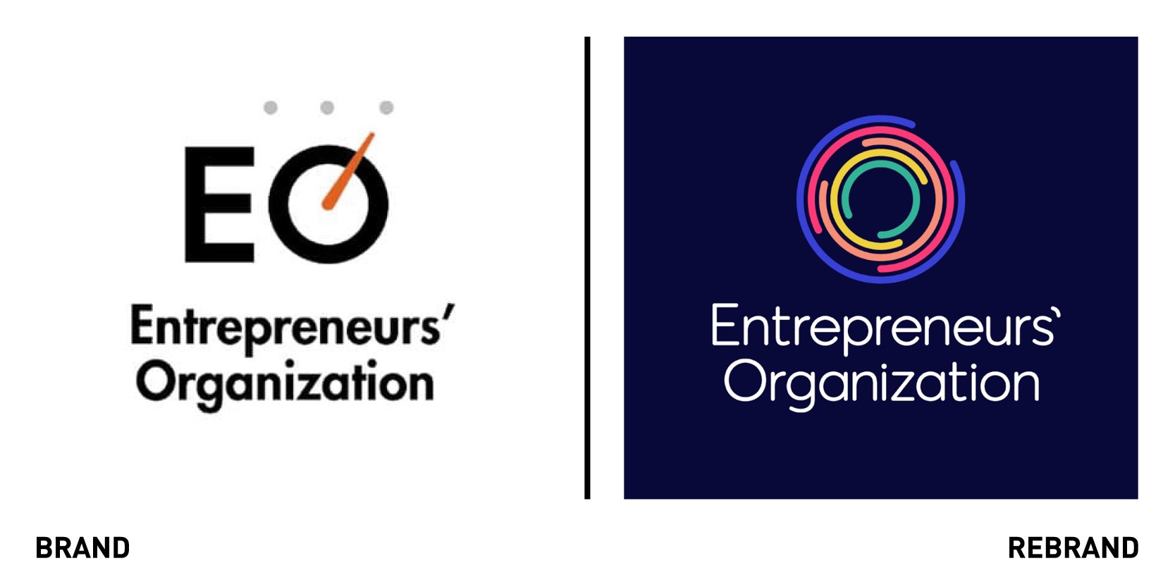
Global consultancy Brandpie unveiled a new purpose, positioning and differentiating identity for the Entrepreneurs’ Organisation, the world’s only peer-to-peer network for entrepreneurs. The new identity effectively conveys EO’s vision to help entrepreneurs connect and grow together. Having outgrown the brand identity adopted fifteen years ago, EO sought to revaluate the organisation’s positioning to better serve the brand, its goals and members. To do so, Brandpie focused on understanding what EO represents as an organisation and what its mission and strategic plans for the future are. The result was creating a brand strategy rooted in a deep human insight: EO helps bring entrepreneurs together to build close personal relationships. To unite the elements of the new brand, the agency and EO developed a new creative idea: ‘together we grow,’ which proposes a clear solution to the loneliness often experienced by many business owners while also highlighting the community that differentiate EO from other membership associations. The new visual identity includes an abstract and dynamic new logo that embodies the ‘together we grow,’ a graphic representations of the connections formed by members of EO. The different lines within the logo, which appear to be influencing and interacting with each other, also hint at the nature of the relationships that form.
“This transformation reveals the core of human connection that lies at the heart of EO, and will help them achieve new heights through a purpose-led strategy.” says Rik Haslam, “I believe it goes to show the power of diving deep into what a brand is at the root, but also critically looking at how that identity connects to wider cultural needs that the brand can authentically help to meet,” says Rik Haslam, executive creative partner at Brandpie.
Metso Outotec
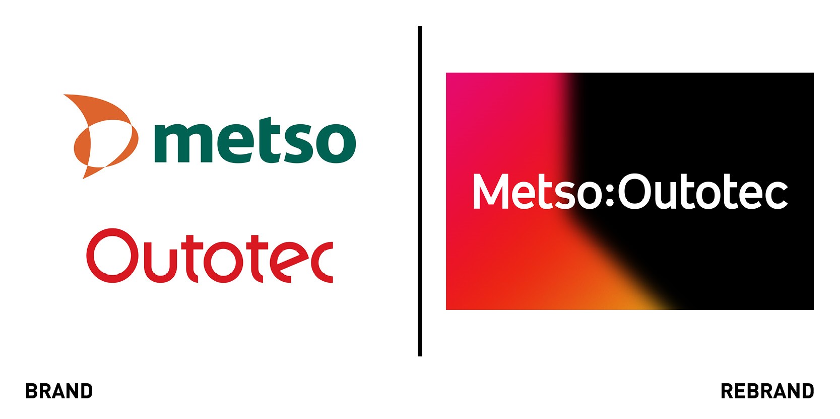
Global creative agency Dragon Rouge London created the visual identity for the new Metso Outotec brand, result of two separate business which have now merged into one global organisation. Although both companies had strong reputations and brands in their respective fields, merging the two together into one business represents one leading brand with a more end-to-end offer to customers, from technologies to solutions and services for aggregates production, recycling and mining. The business, which provides customers with improved productivity whilst reducing environmental and economic risk, positions itself as the ‘partner for positive change,’ and idea which drives the brand identity. The brand balances a focus on the bigger picture change that customers and the planet need, with the grounding in the technical expertise and people to deliver it.
The logo was designed to create visual harmony between the names and a sense of parity of the two respective businesses, aided by the ‘partnership bolts’ between the two words, which become a core part of the identity as they hold everything together. The brand’s core orange colour is a counterpoint to the black and white and is a combination of the two previous brands’ hero colours. The new identity has the brightness and boldness of a forward-driving leader and innovator and the structure that is true to the combined business’ strength in experience within their industry.
Dragon Rouge London was also commissioned to create the identity for Neles, a brand born in the partial demerger of Metso, focused on changing the customer experience for the better in ‘flow control’ for processing industries. Neles’ brand identity was inspired by the idea of looking at reliability, a critical factor in the industry, in a new light, from a different and evolving perspective, which resulted in the core promise of ‘Reinventing Reliability.’
Twister Mini
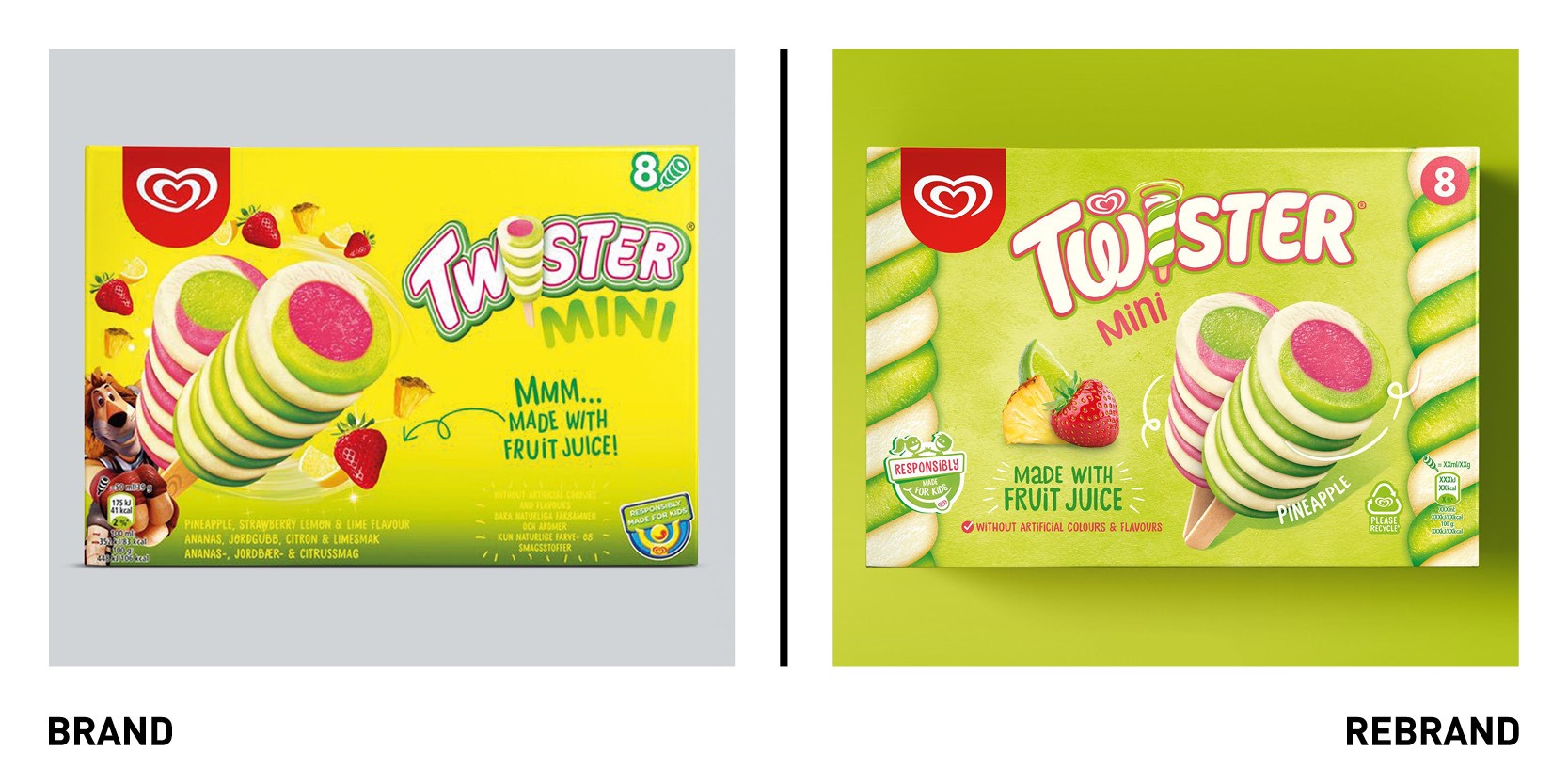
UK Ice cream lolly brand Twister, part of Unilever’s Heart brand, worked with Bath-based independent design agency Sunhouse Creative to create a new identity that would bring out its intrinsically playful personality while delivering a credible message of positive nutrition, in line with Uniliver’s commitment to market responsibly to kids. The updated design needed to appeal to children looking for something fun to eat, parents looking for something guilt-free to give them and adults looking for a carefree moment out of their lives. The new, bold visual language champions positive nutrition, through the use of real fruit images and a more natural textured background, and reflects the ice cream’s playful character in a way that is still recognisable by affectionate fans. The typography, created in collaboration with type designer Rob Clarke is smaller, lighter and more modern. A new icon has been developed and introduced to the packaging to reinforce the claim that Twister is ‘Responsibly Made for Kids.’
“While its current global identity system delivers strong brand presence worldwide, it also sacrifices a bit of the individual brand personality. Thus, Twister may be an iconic product, but its brand and packaging were not,” says owner and creative director of Sunhouse, James Giles. “By simplifying the clutter and amplifying core equities, the brand’s playful confidence can shine through in a way that is refreshingly positive and effortless. This powerfully sends the message of positive nutrition without any compromise on Twister’s spirited character.”
Webbox Naturals
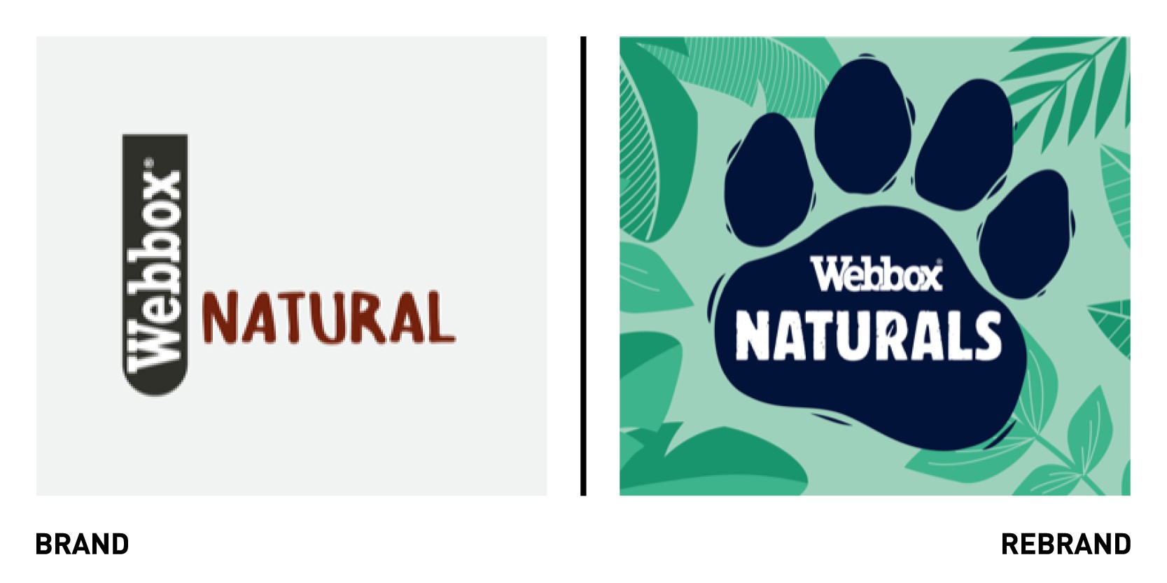
Pets Choice, one of the leading pet food manufacturer in the UK, worked with design agency consultancy Brandon to create a new visual identity for its Webbox Naturals pet food and treats range. While the previous Webbox Naturals range lacking a strong identity that stood out on shelf, the rebrand has changed the category norms and truly takes customers into a new natural world.
“The simple paw print holding device added some bold new brand equity and shelf blocking. Sitting alongside the introduction of a fresh colour palette across the Webbox Naturals range. The name change to Naturals was the simplest part of the job, a no-brainer in fact, as everyone was calling it that in conversations from the outset,” says creative director at Brandon Steve Conchie.
“Brandon has been a fantastic partner from start to finish; they created a number of design concepts that we loved and this one just jumped out as delivering the new face to the Webbox Naturals brand. An identity that could take us forward and drive brand growth in the next 2-3 years, with new listings and an exciting pipeline of innovation ahead. We fell in love with the new design from the outset and can’t wait to see them pop on-shelf when pet owners hopefully feel the same as we do,” says Julie Butcher, marketing director at Pets Choice.


