#NewBrandMonday: 29 June
Here are this week's selection of newly launched brands from around the world. For more from #NewBrandMonday, follow @Transformsays on Twitter.
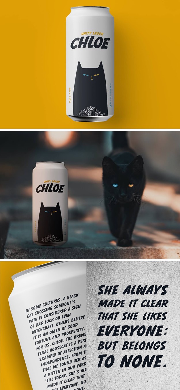
Chloe
Greek Athens-based Polkadot graphic design studio created a new, unique packaging design for new lager brand Chloe. Chloe, the brewery’s feral house cat roaming the city streets whenever she wants, inspired the visual identity for the brand as symbolises affection and independence. Chloe likes everyone but belongs to no one. Like the cat, adventurous and enigmatic, the true craft lager will lead consumer to undiscovered paths of taste. The back of the lager cans explain Chloe’s story, allowing anyone who drinks a can to feel part of the brand family and the journey to its creation.
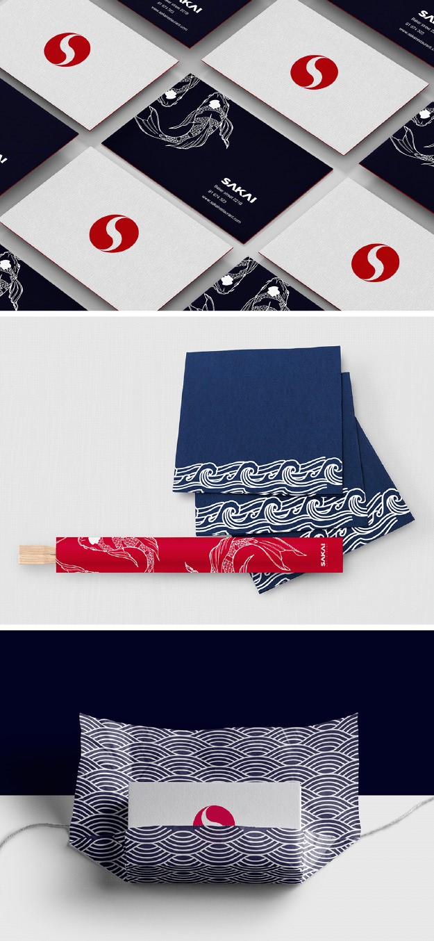
Sakai
William Lovecraft, a graphic designer based in Madrid, worked with new London-based Japanese restaurant Sakai to create a visual language that help the owners build a profitable brand identity. The goal was to create an identity that would both give customers the feeling of being transported in Japan one in the restaurant and be representative of Japanese culture in London, rather than being just another ‘sushi place.’ From this idea stemmed the tagline ‘Welcome to Japan’.
For the name, the designer aimed at a city in Japan beginning with the letter S (to reflect the silence and tranquillity found in the restaurant) that would be short, memorable, and easy to pronounce. The font is bold and squared in spacing, so that its distribution is equal from the top to bottom and left to right, further emphasising the brand’s concept of equilibrium. The logo also includes the letter S while also including key Japanese historical and cultural references such as yin and yang concept of dualism and equilibrium and the iconic red sun. The brand identity also included packaging, such as take away bags, chopstick packaging and napkins, all of which are made using a simple, sea-themed design pattern. The overall result is a simple, sleek and modern brand identity.

Clario
New York and London design agency Conran Design Group worked with Clario, a subscription-based personal security software company to help them launch a new brand that empowers people to take control of their digital lives. Conran’s U.S. and U.K teams worked together to develop the company’s core brand message, bring a sense of clarity and approachability to the subject of cybersecurity and create a visual and verbal identity for the brand that brought humanity to the consumer interaction. The name of the brand itself was created to signal the clear and intuitive nature of their offering. The logo is open and approachable, its informal tone emphasises by the use of lowercase typeface and a split dot that links the letter I in clarion to the full stop that completes the logo, symbolising human connectivity. With Conran Design Group’s help shaping a new consumer-focused brand identity and experience, Clario offers their customers a human-centric alternative that returns digital control to them for good.
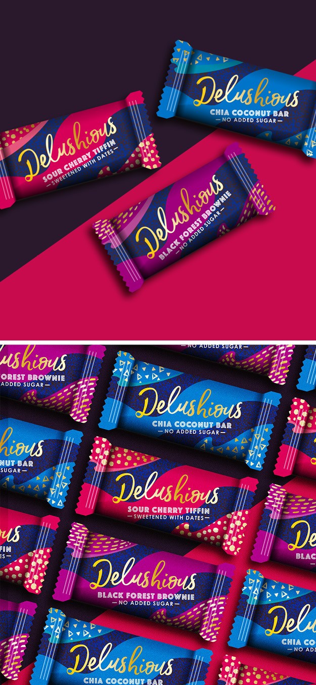
Delushious
The Space Creative, a design and creative agency near Bath, worked with cake and snack start-up Delushious to create a brand identity that mirrors the textures of the product itself whilst creating an indulgent, premium feel. The brand, created by chef and horticulturalist Rob Lewis, focuses on the concept that it is possible to make nutritious and good-tasting cakes while keep sugar levels low, by using plant-based sweeteners. The packaging reflects just this: hand-crafted and colourful, each package includes a line on how the products were sweetened, reading either ‘sweetened with dates’ or ‘no added sugar.’ The golden font and unique colour patterns on the packaging make it stand out in a market that is saturated with similar products.
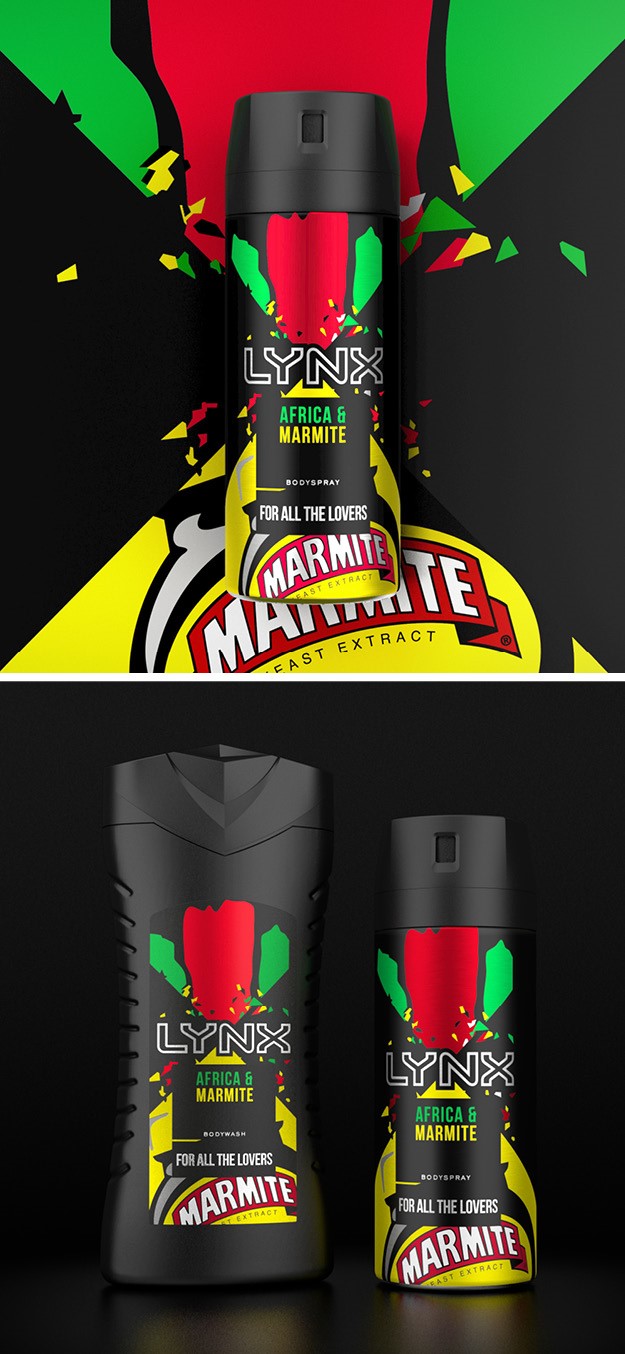
Lynx - Africa & Marmite
Male grooming brand Lynx (Axe in the rest of the world) team at Unilever worked with branding agency PB Creative to combine the Lynx fragrance Africa with the polarising taste of Marmite. The collaboration is a celebration of two highly recognisable brands with strong local presence and British heritage. The packaging includes both the green of the Africa fragrance and Marmite’s iconic bright yellow and the strapline ‘for all the lovers’ which alludes the divisiveness that surrounds the spread- you either love it or hate it. “We’ve developed an eccentric and bold range aesthetic that reflects the unexpected ‘collision’ of these two famous brands both owned by Unilever,” says Azaria Rizzo, design director at PB Creative.
This new range is all about generating fame for our brands with collisions that have maximum local relevance and inspire fun activation in market,” adds Alessandro D’Amico, assistant brand manager at Unilever.
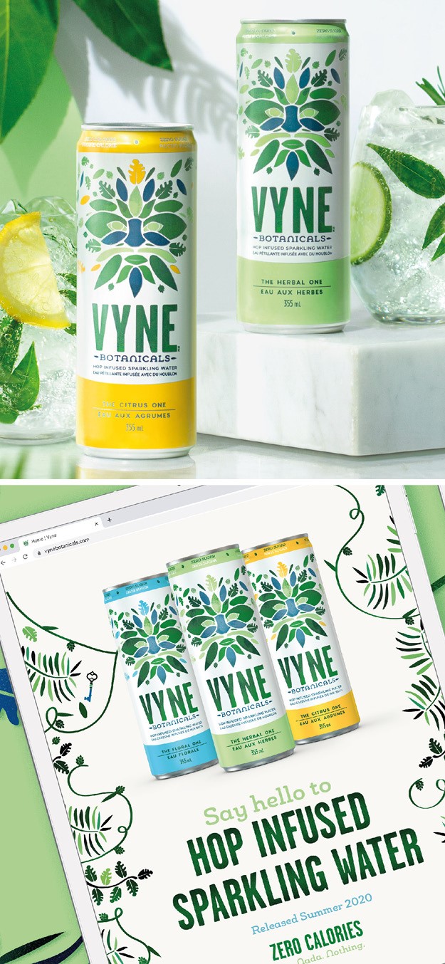
Vyne
Global brand agency BrandOpus worked with Molson Coors international beverage company to create the visual identity and packaging for Vyne, a hop-infused sparkling water. Though made with hops, Vyne is not a no-booze alternative but rather a sparkling water option. The design is a reflection of the curious nature of the drink, with the leaf and nature patterns bringing a sense of mystery and freshness at the same time. The different flavours are distinguished by a contrasting accent colour on the can, with ‘the citrus one’ having a yellow flare, ‘the herbal one’ using a mint green and ‘the floral one’ a blue hue. The logo is the The Green Man, which found inspiration in a historic symbol of vegetation and man’s coexistence with nature. The result, which represents rebirth, is created only by using leaf-like shapes. The brand identity us flexible across all touchpoints, from social media to the website and e-retail.