#TransformTuesday: 30 June

Here is this week's selection of rebrands from around the world. For more from #TransformTuesday, follow @Transformsays on Twitter.
VicenzaOro

The leading international jewellery business event company VicenzaOro worked with global branding agency FutureBrand to develop a new brand identity that would match its international standing a create a unique brand experience. To do so, FutureBrand first focused on the creation of the logo, a monogram of the letters V and O, which reinforces the brand name internationally and enhances its personality as a collector of excellences. With its soft and organic shapes, and blue and gold colour palette the brand acquires a contemporary and powerful look. The result is a brand identity that is easily recognisable yet bold, allowing the brand’s communication to be consistent throughout all touchpoints.
"We are proud to work with VicenzaOro in the process of shaping the future of a famous brand and creating a brand image expressing values such as expertise, heritage and elegance" says Lorenzo Corengia, senior account director at FutureBrand.
“Our image is now stronger and more effective when it is addressed to the jewellery operators across the entire supply chain,” adds IEG jewellery and fashion division director Marco Carniello.
Dmanna
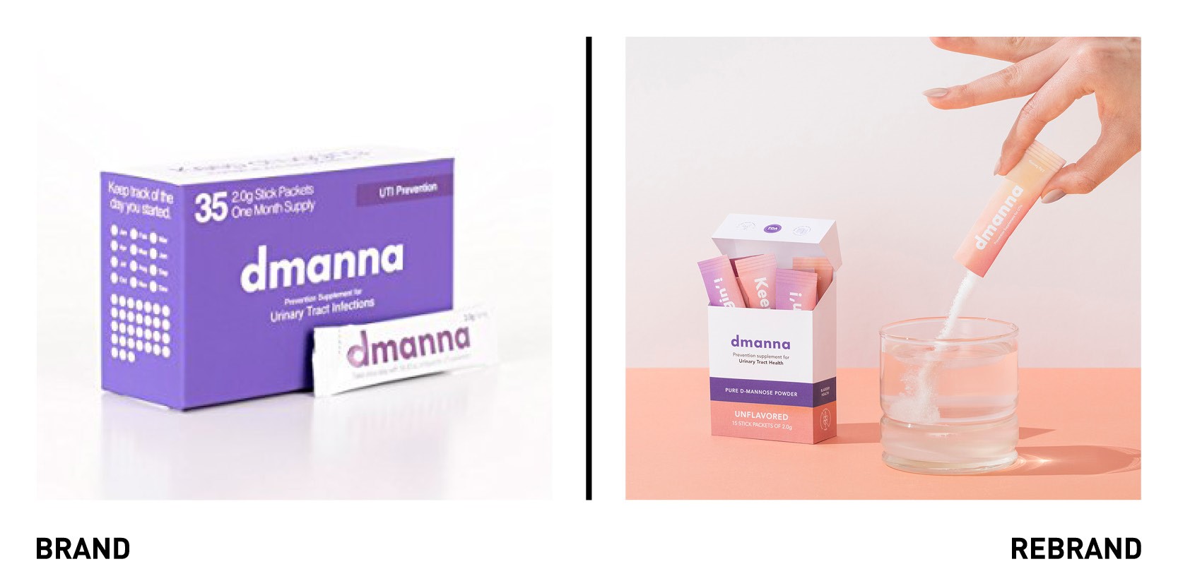
Mexican design agency The Branding People worked with Dmanna, a product created with D-Mannose glucose to prevent and treat urinary tract infections, to develop a new packaging. The colour palette was inspired by fruits and then translated into ethereal gradients, such as lilac and baby pink (usually colours associated to women) and complemented by a clear typeface selection. This gives the brand a radically different graphic approach to a regular ‘medical’ product, allowing the packaging to stand out on pharmacy and supermarket shelves. The packaging, is also unlike other medical products and has a touch of humour to it: ‘buh-bye, UTIs’ reads one, ‘keep chuggin!’ reads another. Branding People’s goal was to help the brand streamline their existing identity through design and boost its communication to reach the people who need it the most, mostly women, who make up 80% of UTI sufferers. The rebrand also included other brand asset such as icons and hand-made illustrations of different women.
Heinz
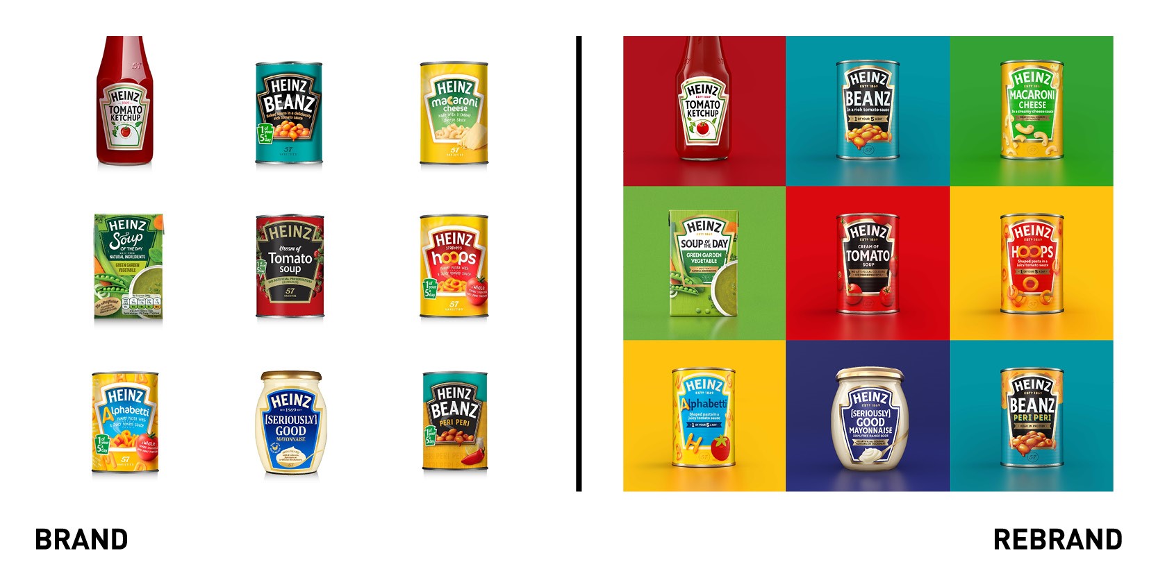
Global brand agency Jones Knowles Richie worked with American giant food processing company Heinz to create the first-ever global master-brand, building one distinctive and ownable proposition for the food brand. The Masterbrand unites Heinz’s expansive portfolio across over 20 product categories globally and includes new touches to the logo, visual identity, brand strategy, packaging and brand experience touchpoints. Each product has its own personality, yet they are harmonised through the concept of ‘celebrating simple greatness,’ reminding consumers of the importance of Heinz products in everyone’s daily lives. The Masterbrand focuses on key elements of a visual identity that is easily recognisable in shelves across the world. Now, all products are united through only one family of typefaces, centring around Heinz’s bespoke font, Heinz Label.
We know that iconic, distinctive assets are key to enhancing the effectiveness of your brand through all channels -whether that be paid, earned or owned. Working with JKR, we have created a cohesive set of assets that will help align the Heinz brand across all markets, uniting everyone behind the brand purpose to help deliver growth long-term” said Victoria Sjardin, vice president of marketing for the international Zone at Kraft Heinz.
For Jonny Spindler, managing director at JKR, the idea was to connect each element of the brand design through key elements such as the Heinz keystone, which before was inconsistent across products. “Heinz is a brand for everyone, loved by everyone. You can find it in Michelin-starred restaurants through to roadside cafes around the world. With that in mind, we wanted to create brand unification across categories, geographies and brand experience touch points so that no matter how or where you experience Heinz, you’re able to celebrate its simple greatness,” he says.
LimeLight Sports
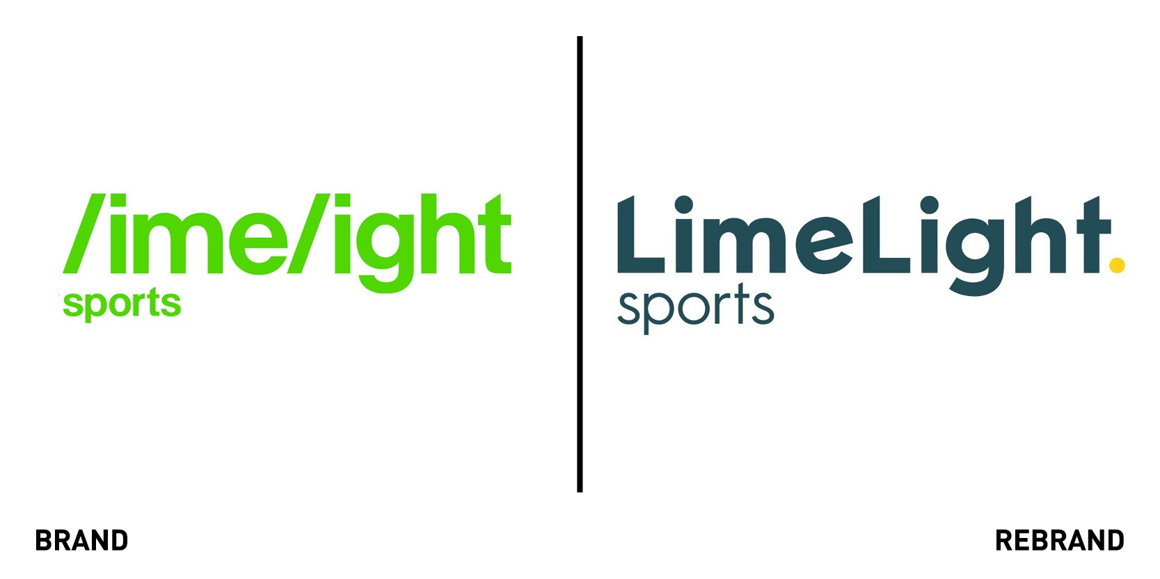
It was 18-months ago when sports marketing agency LimeLight Sports began developing a new brand identity after realising it had a confused identity, which had filtered down throughout the business so that everyone talked about LimeLight sports differently. This change in identity, which marks the company’s 30th birthday became an opportunity for the brand to challenge its foundations, vision, structure and working. The journey began with a bold and contemporary visual identity, centred around the double L’s of LimeLight, which become the cornerstone of the logo and are carried through each of the three brands. Both letters are, in addition to the ‘H’ and ‘T’ are slash cut to create singularity and evoke movement, while the tilted ‘E’ adds personalisation to the typeface and a playful, original element to the visual identity as a whole. The yellow full stop, a burst of colour in an otherwise grey logo, is a point of visual continuity across all three brand identities, represents LimeLight’s confidence. The new brand focuses around ActiveWorldIntelligence, a pathway designed to partner brands with campaigns.
Laka
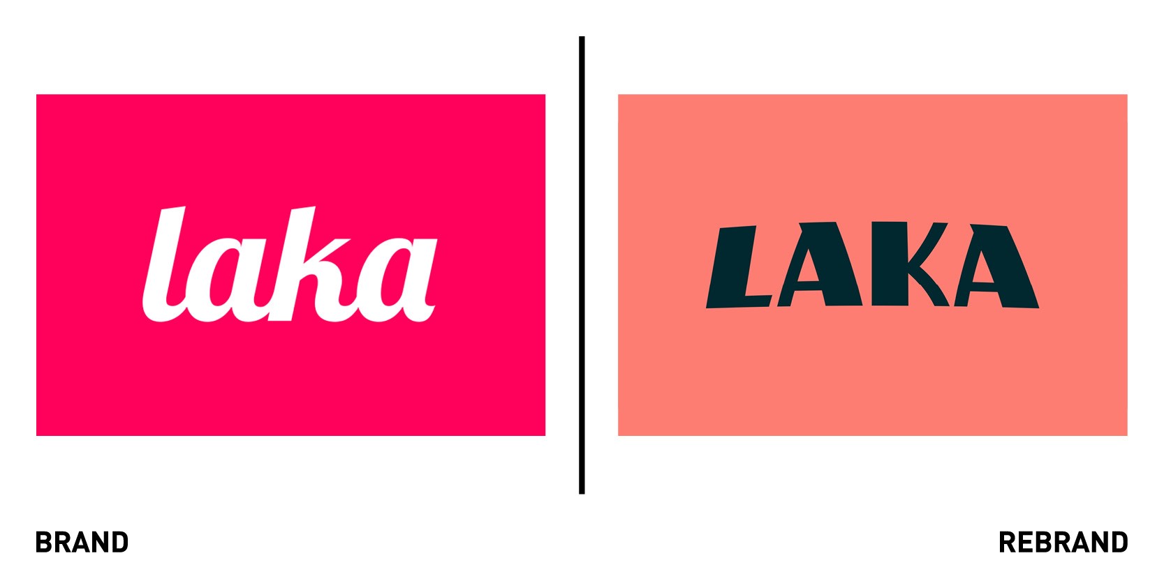
Laka, a community-based insurer of cyclists worked with London-based branding agency Ragged Edge to develop a rebrand that sets Laka up to change the fundamentals of insurance, offering a revolutionary model to turn the industry on its head. Laka sought to develop a new brand identity that could establish collective cover for cyclists in the UK and Europe, as well as set the company up to develop other insurance products in the future. As a countermeasure to the typical insurance industry which is often associated with misfortune and mistrust, Ragged Edge created a fun-loving and characterful identity for Laka, recognising all the different tribes that exist in cycling yet bringing them together to feel part of a community. While the bold portraiture photography champions the collective’s diverse members, the team colours unite them. The landscape-like patterns are inspired by mud, sweat and tears from a ride.
“When we club together, everybody stands to benefit. And that very simple idea is what this brand is built from. Clubbing together reflects their insurance model. It speaks to the shared passion of everyone in the cycling community. And it gives Laka the opportunity to expand into any product, for any collective of people,” says Max Ottignon, co-founder of Ragged Edge.
“Ragged Edge has created a brand that will really resonate with the cycling community but isn’t restricted to cycling. I hate the word disruption, but it’ll really disrupt the industry. And sets us up perfectly for growth as we fundamentally change what insurance means to people.”
One Football
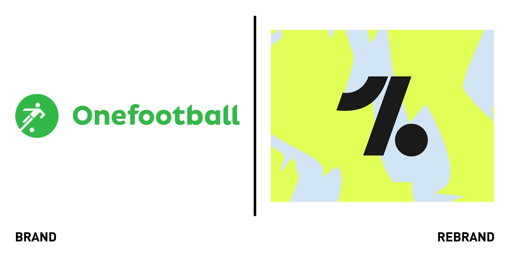
Global football content app OneFootball worked with international design agency DesignStudio to develop a rebrand that would match their ambition and massive recent growth. DesignStudio partnered with research specialist Crowd DNA, to learn more about OneFootball’s customer base, understand their daily rituals, emotional insights and the content they wanted to see and therefore have a greater understanding of what made OneFootball unique. The app needed a brand that would adapt to the constant buzz of being 24/7 always on and up to date and generate a buzz before, during and after the game.
“As football has evolved, so has OneFootball. It’s no longer just about the 90 minutes - but a whole new world where we see sports, music, fashion, gaming and culture bleed into each other. We wanted to adapt to this new reality and have our new brand reflect the lifestyle and state of mind of the new generation of football fans,” says COO of OneFootball Franz Koch.
The strategy ‘Hype The Game’ brought this to life with real impact a ‘Hype generator’, (the ultimate design tool for creating exciting visuals no human could) was the embodiment of this. It has three states: Fracture, Neutral and Flux; anging from jerky, tense movements to smooth flowing motions affecting everything from the logo and type to graphic patterns. OneFootball’s symbol was also updated with a simpler design to represent both the number ‘1’ and show a person kicking a football.
“We assessed our brand from all angles, from visual to verbal. The new brand is bold, loud and truly represents our mindset. A whole new vibe for us and our users that takes us to the next level without disregarding our roots. I particularly love the hype generator, which allows us to easily create and customise design assets that bring our brand to life and help fuel even more passion for years to come,” says Ulf Germann, creative director at OneFootball.


