#NewBrandMonday: 6 July
Here are this week's selection of newly launched brands from around the world. For more from #NewBrandMonday, follow @Transformsays on Twitter.
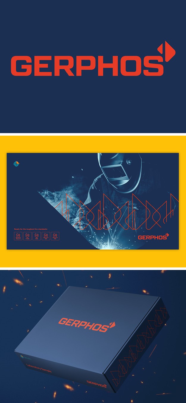
Gulec Chemicals
Berlin-based design agency Startling Brands worked with leading German producer of non-halogenated flame retardants, Gerphos, to deliver a global branding and design solution aimed at changing negative public opinion about flame retardants by increasing awareness of their safer non-halogenated flame retardant alternatives. The visual language and identity is easily recognisable and efficiently communicates Gulec’s message about the product’s novel features in both European and Asian markets. The GERPHOS logo borrow their triangle graphic elements from Gulec’s company logo yet the flame symbol and technical typeface make it less conservative.

Subko
Studio Big Fat, Independent design practice studio based in Mumbai, developed an identity for new brand for Subko, an Indian coffee roastery. The initial step was creating the name, a play on words with ‘Sabko,’ which in the Hindustani linguistic register translates to ‘for everyone, for all.’ The shifting of Sabko with a ‘U’ represents pride in the Indian subcontinent as a region, brining life to the term ‘Subko’: from the subcontinent. As an Asian brand representing the Indian subcontinent Studio Big Fat felt that linguistic diversity was one of the unique markers of the region’s rich culture, which led the studio to include on the visual identity the Latin script, Devanagari script (upon which many Sanskrit origin Indian languages are based) and the Nastaliq script (Persian origin calligraphy seen in written Urdu language). The result is an identity that is rooted in local practices yet has a global vision: ‘from the subcontinent, for all.’ Rich visuals, which include hand-drawn illustrations and high-res photos of the products Subko uses, further celebrate local-grown products.
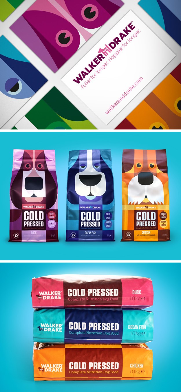
Walker & Drake
Leeds-based design agency Brand Nursery worked with pet food producer Walker & Drake to develop a brand identity and packaging for its ‘cold pressed’ dog food. The brand is very unique as there are very few manufacturers of this type of product in the UK and the benefits of it are higher levels of nutrients compared to that of standard dog food. However, even so, the dog food market is saturated and dog owners are often confused on which is the best product to buy. To make sure the product would stand out, The Brand Nursery focused in the packaging, which includes clear and compelling messages to get across the key benefits of ‘Cold Pressed,’ without giving too much information and over complicating it for the buyer. The overall brand is bold and modern-looking with a messaging that is able to communicate quality and trust at first glance. The unique and eye-catching illustration of different dogs, which uses bold colours like fuchsia and electric orange depending on the flavour of the food, also helps the brand standout on shelves.