#TransformTuesday: 8 January
Every week, Transform examines recent rebrands and updated visual identities. This week's picks are below. For more from #TransformTuesday, follow @Transformsays
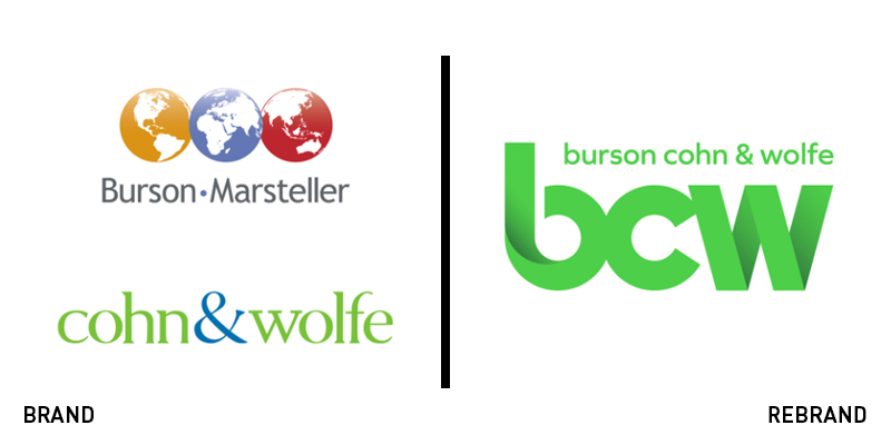
Burson Cohn & Wolf
WPP is on a merging streak. It has spent the last few years developing collaborations and alignments in its portfolio and uniting agencies where necessary. In February 2018, Burson Marsteller and Cohn & Wolfe were formally brought together to lead the WPP’s corporate communications offer. The recently revealed new brand is an interesting compilation of the best of each of the agencies previous brand’s characteristics. Cohn & Wolfe’s signature lime green is amped up a notch and used as the primary colour for the new brand. Burson Marsteller’s iconic three globe icons are eliminated, but their shape is reflected in the curvaceous, lowercase bcw wordmark. The acquisition of creative agency HZ by BCW in August facilitated the rebrand’s development and implementation.
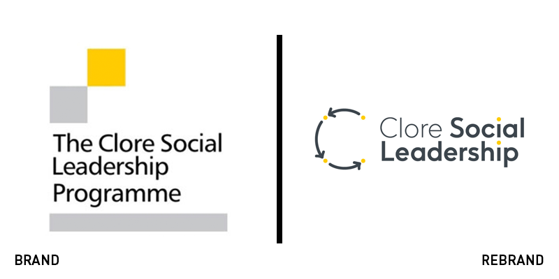
Clore Social Leadership
The Clore Social Leadership programme was founded in 2008 with the aim of developing the best leaders with a social purpose. It now operates numerous programmes to foster leadership characteristics and and improve society through the development of change makers. But, with a brand stuck in a pre-mobile age, it was time for a change. The organisation turned to Supple Studio for a brand redevelopment. The dynamic C monogram is now reminiscent of the peer-to-peer learning approach espoused by the organisation. Icons like arrows and dotted lines indicate energy and movement. The new logo retains the yellow and grey colour palette but reinvigorates the brand with a dynamic sense of fun while still ensuring relevance to Clore Social Leadership’s purpose.
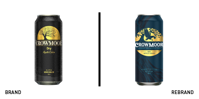
Crowmoor Cider
Once upon a time, an apple orchard was born. Bluemarlin’s new take on Crowmoor’s packaging enhances the brand’s ‘legend.’ With an existing brand that positioned the cider maker as dark and mysterious – among a sea of competitors relying on craft-driven brass and apple icons – Crowmoor stood out on the shelf. But the new positioning helps develop the brand’s playful side and its brand story. The legend begins in a mythical orchard in Finland, but carries through to the supermarket shelves with a deep midnight blue and folk-story-influenced typography. “Crowmoor has always had an intriguing story rich in charm and rooted in tradition,” says Katie Eaton, creative director at bluemarlin NY. “Our design solution elevates this story to legendary status by creating a focus on brand. The new full moon badge helps Crowmoor stand out on shelf, whilst the design details and textures support its shift from a mysteriously dark persona to mischievous fun personality.”
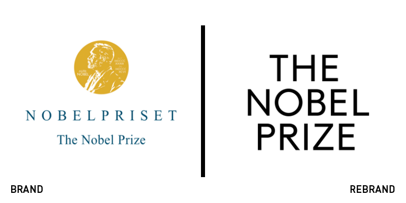
The Nobel Prize
The Nobel Prize may be one of the world’s most well-known brands – with one of the most invisible visual identities. It also required an updated positioning to both emphasise the achievements of the Nobel Prize winners and provide an uncluttered brand that could inspire future aspirants. The Stockholm Design Lab developed the new positioning ‘For the greatest benefit to humankind’ and crafted a bespoke typeface named after dynamite-inventor Alfred Nobel himself. The updated visual identity is clean and understated, but allows for winners and their achievements to be celebrated alongside the branding. Primed for digital uses, the brand is versatile and engaging while still retaining a signature Scandinavian simplicity.
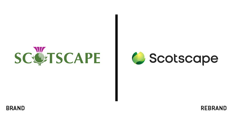
Scotscape
The thistle is iconically Scottish. Its use by an urban landscaping company with a strong Scottish heritage was logical. But Scotscape – which works to counter air pollution and increase biodiversity in cities – was expanding beyond its roots. The business also boasted three sub-brands, Smartscape, Landscape and Groundscape, that needed to be represented in the visual identity. Scotscape thus turned to Designhouse to introduce a new style that retains the simplicity of the original brand, while allowing for growth and diversity to flourish as the company expands. Angus Cunningham, MD of Scotscape, says, “Scotscape has grown into a dynamic SME with a wealth of knowledge and intellectual property that we continue to develop. We are as excited as we are passionate about introducing and maintaining living green and biodiversity into the most challenging of urban areas.”
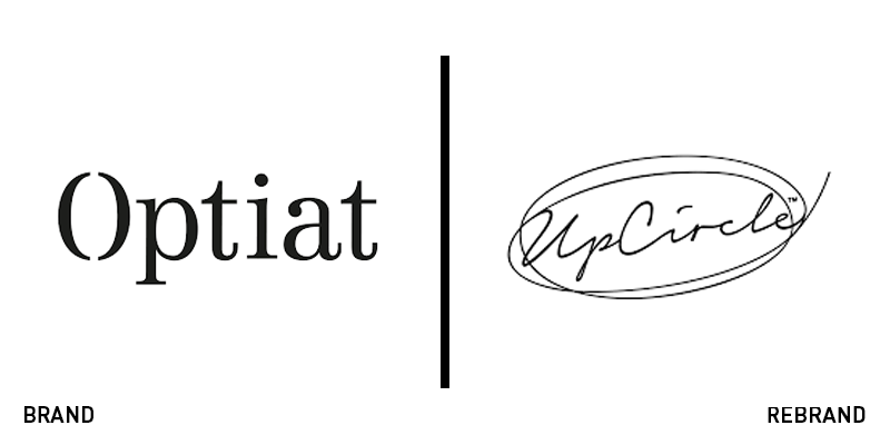
UpCircle
Dragon’s Den startup Optiat made a name for itself by using recycled organic material in premium cosmetics. But, in order to foster growth, the brand needed a rethink. Optiat turned to brand agency Studio More and brand writing agency Reed Words to introduce a new name, brand and verbal identity. Optiat was derived as an acronym of ‘one person’s trash is another’s treasure,’ but, as Orlaith Wood from Reed Words says, “It’s an interesting name but only once you’ve learnt what it means. It needs explaining, which makes it too forgettable to anyone who doesn’t understand it.” The newly named UpCircle highlights the company’s focus on the circular economy, emphasising its sustainability credentials. The visual identity is a lovely upgrade that should appeal to Millennials and Gen Z-ers. The wordmark looks handwritten, with jagged circles wrapping round it. The packaging uses soft tones and simple, to-the-point copy with minimal visual cues to focus solely on the products’ themselves.


