#TransformTuesday: 10 December
From food manufacturers to entertainment broadcasters, here is this week's selection of the latest rebrands. For more from #TransformTuesday, follow @Transformsays
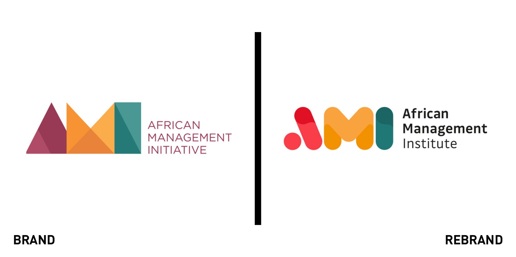
AMI
Learning provider AMI, which supplies practical tools and training to businesses across Africa, enlisted brand agency UnitedUs to create a fresh look and feel for its identity. Having started six years ago as the African Management Initiative, its vision was for a million managers and entrepreneurs building thriving businesses, creating jobs and getting Africa moving. In the process, AMI tweaked its name to African Management Institute, which it says signifies both the quality of its offering and the scale of its ambition. Its new logo is designed with bold colours and an aesthetic that aims to celebrate Africa’s vibrancy and diversity. It has been created to be flexible – the logos and colour can be used in part, in small details, or in big, impactful designs.
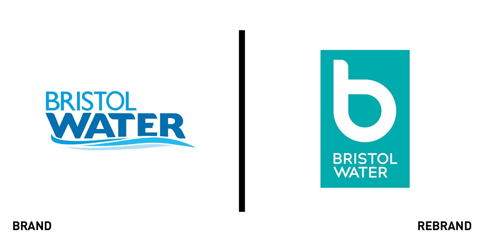
Bristol Water
Bristol Water commissioned creative agency PS London to create a new brand identity to better reflect its ambition to have a positive impact on both people and the planet. Tony Speight, creative partner at PS London, says, “Our goal was to create a new brand to bring Bristol Water back to the unique culture of the region it serves. The new logo features a transparent ‘b,’ which comes to life when placed over commissioned local art and photography, reflecting the passion and creativity of the community behind it. The mark is just a small part of the rich new visual language incorporating colour and the work of local artists to forever connect Bristol Water to the area.”

EBM
EBM, one of Pakistan’s largest domestic food manufacturers, has unveiled its first significant brand refresh in more than 50 years, designed by global branding agency StormBrands. Now exporting to 25 countries across Europe and the Middle East, EBM needed a flexible new identity to support a refreshed brand purpose and global profile. StormBrands created a toolkit to enable EBM to apply its new identity to both its physical brand and across digital channels. It updated EBM’s original three-letter logo to reinforce the company’s brand purpose of ‘nourishing lives, hearts and communities.’ Jonny Westcar, managing director of StormBrands, says, “To modernise the identity of a brand established in the ’60s we had to significantly rethink the brand from its core while respecting its heritage. Over time the corporate and portfolio consumer brands had become indistinct from each other. We introduced a brand architecture to clarify each brand’s role for the business but still allowing them to work side by side.”
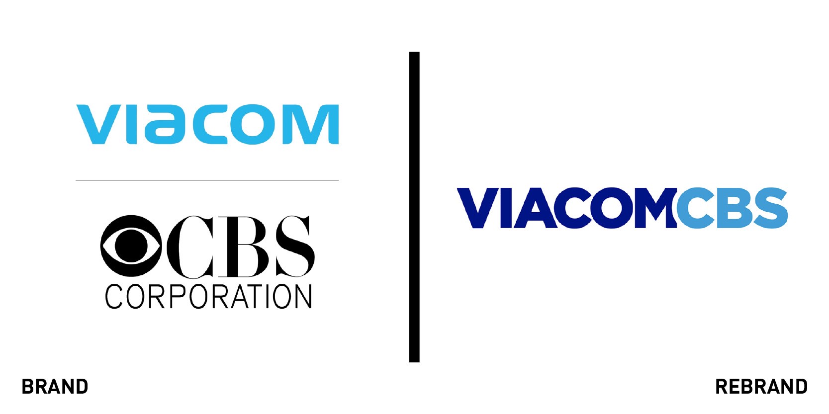
ViacomCBS
Following the merger of media and entertainment giants Viacom and CBS earlier this year, the newly formed content powerhouse, ViacomCBS, has created a fresh logo. The new design features the combined name of the two companies, whose portfolio includes Paramount Pictures, MTV, Nickelodeon and Comedy Central, and has a nod to the previous colour of Viacom’s old logo. The company will account for 22% of TV viewership in the US and hold the highest share of broadcast and cable viewing across key audience demographics, with strength in all categories, including news, sports, general entertainment, pop culture, comedy, music and children’s TV.


