LPAA rebrand introduces structural clarity and modernity
US-based firm Lamoreux Pagano Associates | Architects (LPAA) has announced a rebrand by Clockwork Design, introducing new clarity and a collaborative approach to evolve the old brand.
Following a leadership transition in 2018, LPAA felt the need to refresh its old brand and breathe new life into its corporate identity. The firm turned to Boston-based Clockwork Design, which delivered a new website and a reworked identity for its decades-old client.
LPAA’s new identity is fresh and human, modern yet with an unshakeable eye fixed on the company’s past. It introduces the tagline ‘designed for you,’ putting emphasis on the collaborative approach of LPAA in its community. The refreshed concept is sure to attract the firm’s audience, by keeping them engaged with the company’s mission and history.
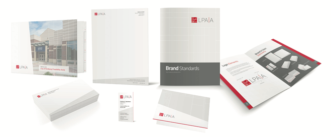
The rebrand focuses on clarity and modernity in its name and image. The company’s name has been abbreviated for ease of use and memorability, followed by a corresponding logo change. Clockwork Design placed a red ‘pipe’ between the two As and in its logomark, referencing the signature colour of the American Institute of Architects (AIA), while its characters are represented using evenly weighted, capped sans typeface.
The rebrand has already been applied across all of the company’s collateral, including its website, redesigned to engage visitors visually and emotionally and to feature the firm’s portfolio.
For more from Transform magazine, sign up for the Transform newsletter here and follow us on Twitter @Transformsays.


