Boots breaks free from 170 year-old brand
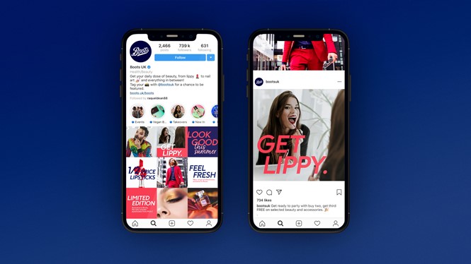
Designed by brand agency Coley Porter Bell, major British drugstore chain Boots’ new identity is bold and vibrant, an invitation to leave the past behind and challenge the rise of online players. With a new logo and a full array of visual applications, Boots’ refreshed brand voice is energetic and full of character, simplicity applied to branding.
Wishing to adapt to the evolving world of wellbeing and to changing consumer needs, the UK health chain has turned to Coley Porter Bell to refresh its identity, which customers had started to deem dated and old fashioned. Boots needed a new look built on confidence and boldness; a statement of character, to drive the company forward and remind its audience about the values of the brand, still thriving with life and relevance.
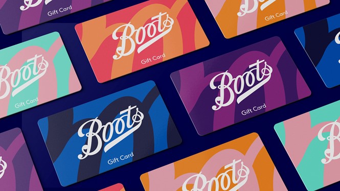
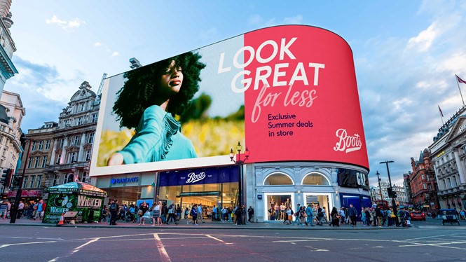
In response, the brand agency has assembled a colourful and vibrant identity which maintains the old logotype’s style and font, yet liberates it from the historical lozenge born in the 1960s. Freed from its constraints, the Boots logo can now be applied throughout tote bags, gift cards, brochures and posters, integrating with a vivid palette of colours and a varied collection of fonts. Albeit simple in concept, Coley Porter Bell’s idea allows Boots to showcase its history with confidence, while displaying and conveying renewed energy at the core of the company’s future.
Coley Porter Bell’s visual identity is modern and assertive, an encouragement for the pharmacy chain wanting to break the shackles of the old brand. It is a lesson in simplicity and confidence, a way to keep being relevant in the ever shifting contemporary landscape.
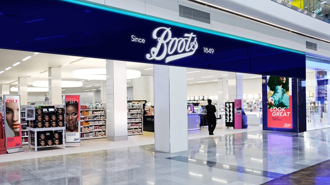
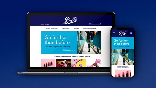
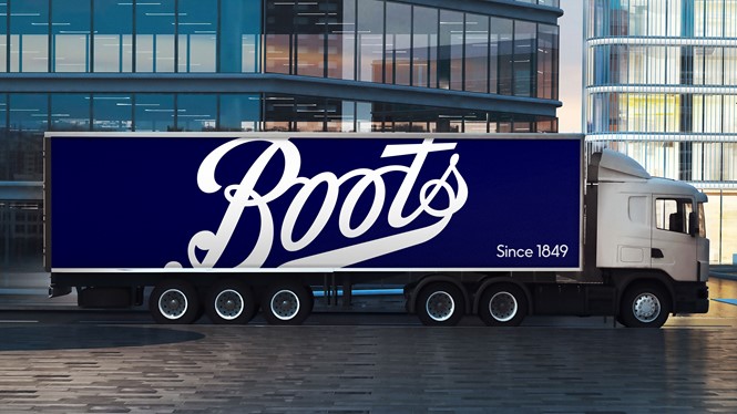
Despite blending in with a colourful array of applications and mediums, the logo maintains the iconic white typeface against a blue background across the main touchpoints of the brand, such as website, store signs and delivery trucks. This choice allows the brand to still be recognisable to its historical customers, while injecting Boots with fresh vigour.
For more from Transform magazine, sign up for the Transform newsletter here and follow us on Twitter @Transformsays.


