#TransformTuesday: 17 April

Every week, Transform examines recent rebrands and updated visual identities. This week’s picks are below. For more from #TransformTuesday, follow @Transformsays
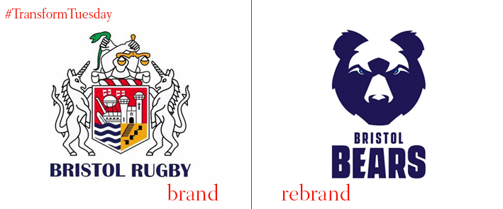
Bristol Bears
Having achieved a berth in rugby’s Gallagher Premiership once again, Bristol Rugby has unveiled a bear-y blue rebrand. Previously called Bristol Rugby and bearing a coat of arms complete with unicorns, turrets, snakes, scales and other insignia, the team’s rebrand helps simplify its assets. "The rebranding is not a knee-jerk decision – it’s a process that we have been exploring for a number of years and everybody involved has worked tirelessly to deliver a strategy that we trust and believe will result in success,” says owner Steve Lansdown. As with almost every sports rebrand in the UK, the change has sparked fan disapproval. But, from a brand perspective, the new approach will help unify the team’s assets, identify it more strongly and simplify its visual identity.
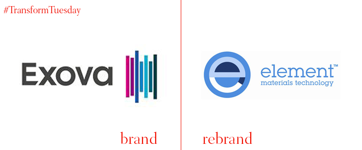
Element
British materials testing and product qualification testing company working particularly in the aerospace and defence industries, Element Materials Technology, has rebranded its US labs. After it acquired lab testing firm Exova for £620m last year, Element has unveiled the first phase of its rebrand. Four aerospace labs in the US and Mexico got the first lick of new paint to unify the Exova brand within the Element family. EVP of aerospace at Element, Rick Sluiters, says, It is with great pleasure that we can officially welcome these first four rebranded laboratories to the Element Group. This is a major milestone in what is a very extensive integration program that involves close to 140 former Exova laboratories being integrated to Element.”
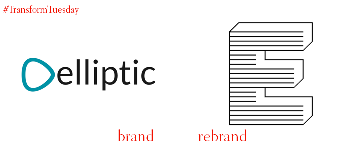
Elliptic
Effectively an elite task force of cryptocurrency cops, Elliptic prevents, investigates and tracks down criminal activity in cryptocurrency deals. With a name that is also indicative of shape, its early brand was little more than that shape and the wordmark on a white field. Having turned to Superunion for assistance, the new brand lives up to Elliptic’s futuristic purpose. The use of negative space and almost illegible typography lends the brand what Superunion calls a “raw digital look.” What it does achieve is to more effectively tell the story of what Elliptic actually does and why.
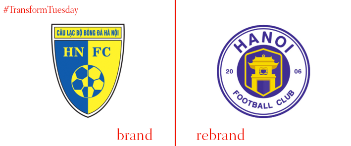
Hanoi Football Club
Announced on Behance, the Hanoi Football Club worked with graphic designer Hiep Nguyen on a modern new identity for the 12 year-old club. Using inspiration from Hanoi’s historical architecture, as well as a circle shaped crest, Nguyen’s work gives the brand a fresh look. Eschewing the garish blue and yellow of its past, a new purple and gold colour palette is introduced across all touchpoints, with complementary black and white iterations of the crest. New marketing material is brash and deploys a handwritten typeface style and passionate graphics.

NKT
Behind every light switch, electrical outlet or utilities company, there is a network of infrastructure that enables the light to turn on, the outlet to provide power and the ability to create energy. Danish brand NKT creates the power cables and wires that, literally, power the world. Copenhagen-based IDna Group worked with the industrial giant to launch a new brand for NKT after it split into two separately listed companies: Nilfisk and NKT Cables. The logo, based on a grid network itself, uses complex letterforms to craft a bold statement about power. The identity also uses the now ever-present suite of icons and sticks with a slate-infused navy blue.
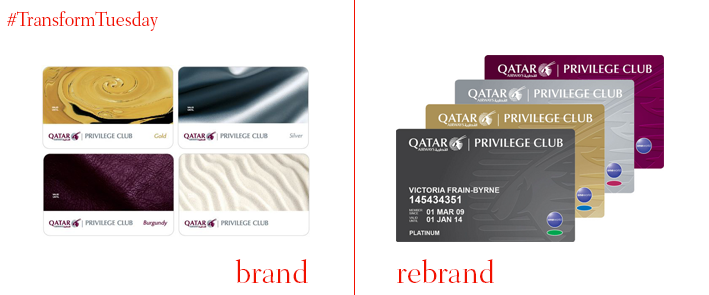
Qatar Airways Privilege Club
Countless airlines have been revamping their membership and airmiles programmes recently. Qatar Airlines is the latest to join the party. In addition to a reformed programme, it is unveiling a brand refresh as well. The more “luxurious” brand will also help bring more consistency between the Qmiles brand and the Qatar Airlines masterbrand. Qatar Airways’ chief commercial officer, Ehab Amin, says, “We are delighted to present our members with a new vibrant Privilege Club that is contemporary and a reflection of our members’ desires to be recognised and rewarded throughout their travel experience. This new brand identity illustrates our continued commitment to listen to our members and make the programme easier and more engaging to the increasingly discerning world traveller.”
For more from Transform magazine, follow us on Twitter @Transformsays


