Rebrand illuminates Tatarstan-based bank’s new identity
Ak Bars Bank, a Kazan, Tatarstan-based financial company, has refreshed its brand identity in partnership with international design agency Landor Associates. Celebrating its 25th anniversary, Ak Bars Bank’s new visual expression will align with its new mission.
After considering the role it plays in its clients’ lives, Ak Bars Bank transformed its brand positioning to reflect its members’ wishes. Establishing a new corporate identity, the company has revealed its new slogan, ‘The Bank of Solutions for Your Life.’ Serving as a financial company, the bank is designed to offer solutions to financial issues; however, with the establishment of this slogan, the company now aims to expand to other areas of their clients’ lives such as entertainment, travel and education.
Committing itself to statistical research, Landor, prior to redesigning the brand, researched consumer groups, tested focus groups and analysed the company’s competitors. By basing its creative concept on data, the design agency was able to align the brand’s internal and external visions.
Landor says, “It was about transforming the brand and setting the company on a new course for the future. We created a strategy that positions the business for success, and we expanded this both visually and verbally.”
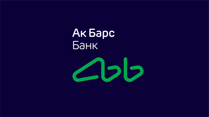
Ak Bars Bank wanted to achieve the right balance between its iconic past design and a rebrand fit for the future. Landor refreshed the design to be lighter and more modern, but it was important to Ak Bars Bank to maintain its basic shape inspired by the official symbol of the Republic of Tatarstan, a snow leopard, and its original colours green and navy blue. The colours continue to symbolise the large role the company plays in the economy of Tatarstan.
The design agency used a light pen to illuminate its visual expression. This addition of illuminated graphic elements conveys the bank’s mission to act as a guide in its clients’ lives as well as creates a memorable identity. The original version having been developed in 1997 by Kazan-based design studio Mian, the refreshed logo helps the bank compete in a modern age and engage with a younger audience.
In its research, Landor found that “there aren’t many [Russian] banks that have made brand an important asset linked to the strategy and overall business vision of the company.” By giving Ak Bars Bank a distinct corporate identity, the new brand serves as a key differentiator in a competitive industry.
For more information on Tatarstan's new place brand identity, read this article.
For more from Transform magazine, follow us on Twitter @Transformsays